HOME | DD
 Robobotnik — Superman Redesign

Published: 2011-10-03 18:21:53 +0000 UTC; Views: 2411; Favourites: 31; Downloads: 92
Redirect to original
Description
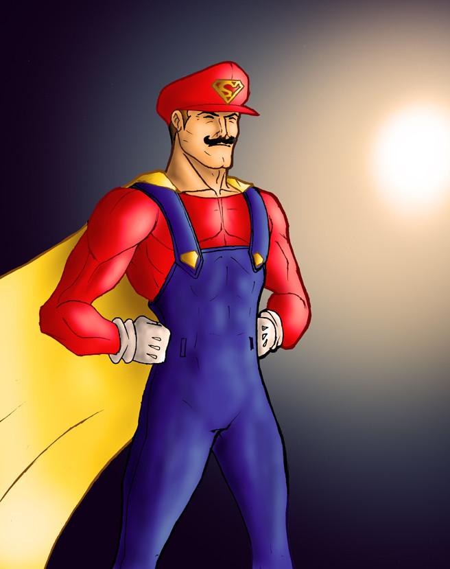
Here is my entry for the Superman Redesign thingymedoodah hosted byI'm in the camp that loves the old look, but I'll accept that some changes may help, though the DCnU version just doesn't cut it for me.
Personally I feel did it much better in his entry here [link] but I thought I'd finish this up and get it posted.
 (Smile)")
Mainly done with my blendable markers and a .5 mechanical pencil.
Also I will be getting my 20k thank you pic done soon, just figuring out what I want to draw, probably something SEGA related.
Related content


Comments: 4

Very good work. Nice redesigned and well done. Iconic element in a new fresh way. BRAVO!
👍: 0 ⏩: 0

Hey man - we really were kind of thinking along the same lines weren't we? Haha!
I do really like the lines of the entire suit. I especially like the extra length of the cape. I was reconsidering mine after it looked a little like an opera cape from Phantom of the opera haha!
It reads instantly as superman for sure which is the main issue I think some people have with other designs. And I think everyone agrees that the underwear are really just no longer necessary to convey the "soul" of Superman.
There is also a military feel to the belt which I think you could capitalize on somehow so don't disparage your design - I always try to see straight through to the idea and not the spirit of what you were trying to achieve.
I would have a super (no pun intended) small tweak - the curve of the "S" is something I might play with to evoke something with the negative space on the chest. The size I think could work just fine especially in the hands of the current crop of DC artists if given this design.
Props!
👍: 0 ⏩: 1

Thanks!
Personally I prefer the trunks, but I'll concede that it's the most common aspect to parody. Plus considering they were an allusion to Circus Strongmen of the early 20th century when he was created, they're not very relevant any more. As for the belt I think the all red version they have in the DCnU is really distracting on its own, it needs some gold, though I felt a dark brown leather look worked better for a classic feel.
I have to admit I'm not overly happy with the "S" myself, if I draw him again in this costume I'll give it some tweaking.
👍: 0 ⏩: 1
You know that influence is an important thing to note. I don't think many people today can actually tell you why we have that engrained image of superheroes.
👍: 0 ⏩: 0