HOME | DD
 RoboticMasterMind — What is this

Published: 2014-02-26 07:17:33 +0000 UTC; Views: 1183; Favourites: 61; Downloads: 5
Redirect to original
Description
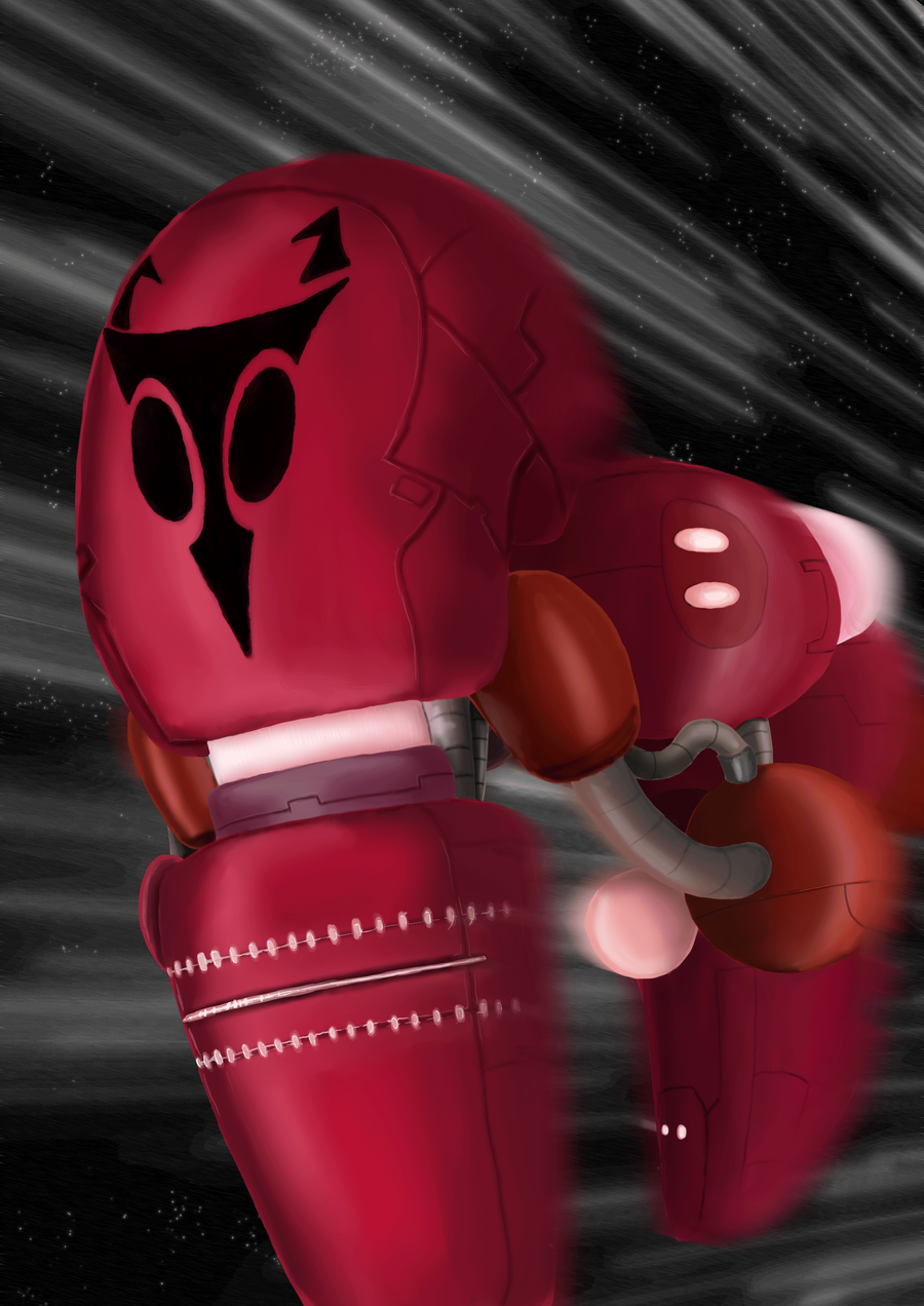
Finally a full painting besides those small sketch things I'm been doing. Used MylaFox 's tutorial for the space scenery thing. It looks kinda weird, but I guess it's a start :'DNyx belongs to me
Related content


Comments: 34

Hey there, guess who? :3
I've been meaning to comment on this piece for a while now, but didn't get the chance to up until this point.
I want to start off by saying that I love the perspective of this piece. I kinda feel like I'm right next to this character in the foreground wondering what's going on in the distance. The two figures above are directly in line with the direction of the surrounding buildings, which brings focus to them, despite their small size. The horizontal lines help to break up vertical monotony, which lends a bit of dynamism to the piece. I find that my eyes are darting around everywhere looking at all the little details in the painting without feeling stuck. I also truly adore the red and blue tones you used for the background spacescape, as they contrast each other nicely. The nebulae look gorgeous, and that one brightly flared star catches my attention without taking away from the rest of the piece. I love the way that dramatic white light reflects off of the character in the foreground.
Now, I want to also help out a bit. Something that I noticed immediately was that all layers of this piece (background, middleground, and foreground) pretty much have the same level of contrast and detail applied to them. This makes it difficult to differentiate between separate elements, and also does not give off the illusion of depth. As a general rule, the objects closest to the viewer should have the highest value. Darks should be very dark, as you illustrated here. However, as objects get further away, they should lose this contrast and become hazy. I realize that this works for us in our minds because of the Earth's atmosphere. Similarly, objects would grow cooler in color as they drift further away from the viewer for the same reasons. This is why it is important to decide on your atmosphere, and use that color to haze out your further elements, to help separate each layer. In this instance, you have a couple of options. You could try simulating dust pickup from the ground level of the city, and sampling some color from the very furthest elements, or you could try and sample some of the darker colors of the sky and use that for your haze. Either way, haze is pretty much necessary to help give you that illusion of depth within the painting. You can use a large 100% soft brush at a low opacity to start bringing in this haze layer. Remember, as objects become closer, they increase in contrast and clarity. Not only does this simulate an atmosphere, but it also simulates human vision. That brings me to my next point...
Having everything at the exact same detail level will make your paintings look flat. To avoid this, I've found it best to work first off at a small thumbnail size. Get your overall composition laid out before proceeding to details. Allow yourself to lay down rudimentary blobs of color. I paint backwards, meaning I start with my furthest elements, and work my way to the front, whilst increasing detail. This method works best for me, but by all means, go with whatever works for you! Just remember that less is more in some instances. If you overwork any aspect of the painting, chances are high that it will show. Just let loose and paint... Pay closer attention to your foreground elements and focal points. Objects in the distance can afford to look blocky... Our minds will fill in the gaps. So long as detail is focused where it should be, the painting will appear whole. This also allows you to spend your time more wisely on the parts that matter.
Anyways, this painting looks great, and I hope to see more like it in the future from you! You did a fantastic job and I can see a lot of improvement from you. Just remember to keep going!
👍: 0 ⏩: 1

Thanks for your feedback, it was very helpful ^^
I'll try out that haze thing next time when drawing. The high contrast is what I was having a lot of problems with. I tried adjusting the colors in the bg, and middle ground but it still ended up looking too high contrast no matter what I did. D:
👍: 0 ⏩: 1
You're very welcome! ^^ Any time, really... If everything seems to be too high on the contrast, you probably need to do a re-paint to cut out some of those edge highlights. I like working at thumbnail size first to get everything laid out so that I can spot problems early and make changes like that easily if need be.
You should check this video out, it is pretty darn helpful... A little bit of insight into how I work, too!
www.youtube.com/watch?v=laD7RK…
👍: 0 ⏩: 0


I think it looks nice! You're pretty good at paintings.
👍: 0 ⏩: 1
Thank you ^^
I'm still in need to work on them especially that contrast issue. I think I'm a bit color blind when it comes to painting too :'D
But I one day hope to get much more better in painting than this.
👍: 0 ⏩: 1
What I do if I don't think something is contrasty enough is fiddle with either the shading layer (if it's not flattened at this point) or go mess with the colors and contrast. Usually when I'm done painting it it has a tendency to looked washed out at first until I mess with the settings. But I still think you did a great job here!
👍: 0 ⏩: 1
I try to do that but I guess I might have to spend more than a hour fixing everything in the future xD I swore it looked better in PS while drawing it. But once I submitted it on DA, somethings turned ugly D:
👍: 0 ⏩: 0

I really like how you've been doing high contrast lighting lately. It really makes your pieces look spooky.
👍: 0 ⏩: 1
Thanks, ^^
I need to vary that more, a lot of the picture I was supposed to be low contrast but for some reason I couldn't seem to lower it even with playing with the settings. I also was a bit lazy, had a blister from drawing non-stop, and didn't feel like going all the way back in and tweaking it manually xD. But still overall happy how I'm actually painting okay now.
👍: 0 ⏩: 1
You should be happy with how you're painting now! It's gorgeous!
👍: 0 ⏩: 0
")
Yes, I take commissions. Information is right here fav.me/d6n3n17
👍: 0 ⏩: 1

...okay, uh, thanks
👍: 0 ⏩: 0

WOAH that background is so AWESOME. its got a lot of detail and lighting! (at least more detail than i can definately manage)
👍: 0 ⏩: 1
I think it would had looked better if I left the color out :'D
But it was a attempt at trying something new. I guess I'm happy that it at least came out sharp xD
👍: 0 ⏩: 1
i dont see why you dont like the color. especially the background- woah. you are very good at lighting. and i like how the irken's eye is like almost glowing. new stuff. new stuff is good.
here, take a minute maybe. this definately inspired me. www.pinterest.com/pin/56513145…
👍: 0 ⏩: 0

It's the convergence!! It happens every 5000 years!!! Thats when all worlds of different solar systems are all aligned! And I know it sounds like Norse mythology! But still their planets are aligning! Or is it about that star?
👍: 0 ⏩: 1
Maybe, probably why everyone in the pic is looking so curious or shocked xD
👍: 0 ⏩: 0

Omg! This looks awesome c: I really like the background and how u coloured this! Really good!
👍: 0 ⏩: 1
Thanks, I really think it looked better in grayscale. Just something about it. But glad you like ^^
👍: 0 ⏩: 1

Whpa...this is too epic for words/ I LOVE it- the lighting and shading's fantastic
👍: 0 ⏩: 2
*Whoa I meant at that first word XD
👍: 0 ⏩: 0

I love the scenery and the perspective makes it look awesome!~ keep up the good work!
👍: 0 ⏩: 1
Thank you ^^
👍: 0 ⏩: 0

I really love the outcome of this one! It was fun watching it in the lifestream. Too bad i had to go tough :/ I really love the effects and use of collors in this
👍: 0 ⏩: 1
Thank you
I went and had to repost this several times since I found out the colors were too high contrast XD. I think there are too many highlights all over the place still, so I guess trial and error there.
👍: 0 ⏩: 1
Well i dont see anything wrong ^^ just a tip to yourself ")
 (Smile)")
I also wanted to say i never really commented on your work just because i was shy to do it 

👍: 0 ⏩: 1
I guess I've been a bit too insecure these past couple of months 
There's no need to be shy, but I know your feeling. I'm also like that with artists I admire a lot. Silently faving and running the entire time.
Sure you can draw Crome
👍: 0 ⏩: 1

And yeah. i really dont want to be a stupid fantard to others. And i know it can be a pain in the ass if people ask stuff constantly :/
Im also scared asking artists like you for opinions about my work or tips and tutrials. Im still trying abit to find my own style. But i know i will get there some day. But right now im making the offical final design of the dragon i were talking about. Because your really good with aliens and stuff im itched to show you the sketch i made while your lifestream. If you want i can dump the sketch on DA and send you a link if you like.
👍: 0 ⏩: 1
I'm cool with people asking me for tips, tutorials and opinions on art. I don't even mind if people draw my FCs or OCs without permission, just as long as they credit me.
But sure thing, I'll take a look at the dragon xD
I probably won't be able to look at it right away though since it's almost 4:30am and I need to head to bed.

👍: 0 ⏩: 1
its fine. And i just wanted to be sure. I dont want to piss off people
👍: 0 ⏩: 0