HOME | DD
 Robotpunch — TOLEDO V23sm
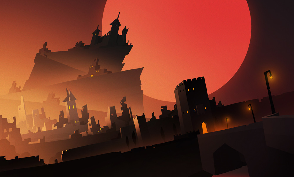
Published: 2013-12-08 20:19:54 +0000 UTC; Views: 4387; Favourites: 302; Downloads: 88
Redirect to original
Related content


Comments: 29


")


Yeah! Its size grew every 20 minutes while I was drawing this one, it was so much smaller in the beginning!
👍: 0 ⏩: 0
I agree, fable has quite similar atmosphere
👍: 0 ⏩: 1

Hope you do more like the feel of this picture
👍: 0 ⏩: 0

nice layout, it's very not even, and it has some movement and interesting colour skeem
👍: 0 ⏩: 1
Yes! This city sacrificed logic in favor of stilization!
👍: 0 ⏩: 0


I love both versions of this!
Each has their own unique, great athmosphere, the other one is darker and more grim. I like this one a little better simply because it's easier to make out th shapes and shilhouettes, but as I said, both are really superb looking!
Your art's always a treat to look at, thanks for sharing it with the world
 (Smile)")
👍: 0 ⏩: 1
Thank you! The other one wasnt quite finished yet, I definetly spent a lot of time to get this shapes to be distinctive enough in this one, but I always love to save unfinished versions as some of them change quite radically.
👍: 0 ⏩: 1
The placement of lightsource make the other, unfinished version look interessting, like there was something going on there, perhaps on a market place or something. A fire buruning, or people getting together with torches and pitchforks to start a riot - who knows?
This one here overall feels more balanced in comparison, especially with the sun (moon? planet?) being bigger. They are both really nice.
And you're very welcome!
👍: 0 ⏩: 0

Cool design and work with light. I love the silhouettes mixed with brightness!
👍: 0 ⏩: 1
Thank you! I really love drawing fogy silhouettes, cant get enough uf them!
👍: 0 ⏩: 0

I am really interested in the angle and overall design. Good work; it reminds of a villain's fortress.
👍: 0 ⏩: 1
Thanks! I dont know why, I always wanted to create this wierd angle even though its not quite logical. And yes it looks quite evil, supposed to be Spanish city Toledo destroyed during civil war, but these colour and red moon definetly makes it look quite sinister.
👍: 0 ⏩: 1
I also really enjoy the building's design. Is it alright if I say they're simplistic? They work really well with the angle and the shading.
👍: 0 ⏩: 1
Oh yes, they are simple! Maybe even a bit too complicated for what I was looking for. I ended up messing some things but in the end I'm happy with the result and it was a good practice!
👍: 0 ⏩: 0

Killin' it. The strong secondary light source (not the moon) lends a lot of implied space to outside the camera.
👍: 0 ⏩: 1
Thanks! That light source kinda saved me, because there was all this mess of shapes and silhouetts, I needed something there to make it more distinctive.
👍: 0 ⏩: 0

Thanks! probably spent most of my time making the lighting look right, sometimes takes a lot!
👍: 0 ⏩: 0

i liked the first version. seemed to have more depth
👍: 0 ⏩: 1
I agree! The other one was more subtle too
👍: 0 ⏩: 1
ya a rich scene. i wanted to jump in and watch it's citizens. this made me want to keep movin. not bad tho.
👍: 0 ⏩: 0