HOME | DD
 rockerdish — Don't need to be saved.

Published: 2010-12-15 10:31:10 +0000 UTC; Views: 1938; Favourites: 39; Downloads: 44
Redirect to original
Description
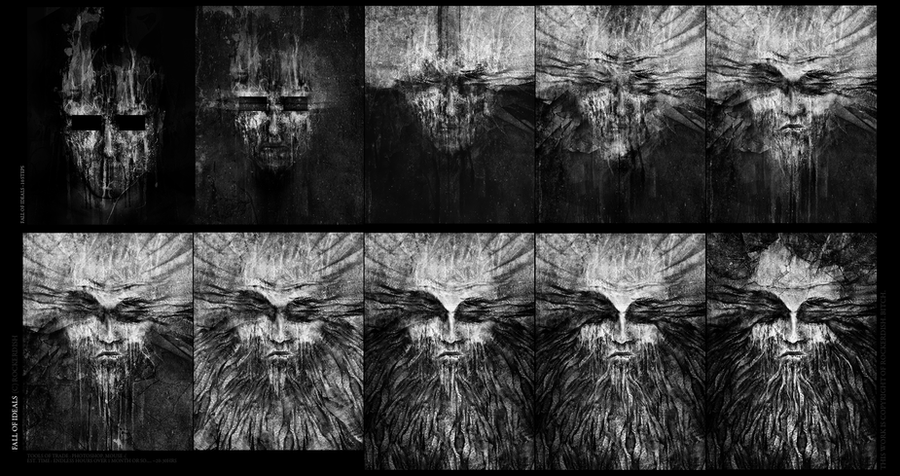
I'm the hero of the story
Don't need to be saved.
Stocks: [link] [link]
....500 Days of Summer
Related content


Comments: 16


Well the low quality wasn't intentional, but great if you like it
")
👍: 0 ⏩: 0

It's alright,It's all,Right it's all, Right it's alright!
👍: 0 ⏩: 0

seriously i like. different from ur recent work. the quality is a bit lacking imo, but i like the concept.
👍: 0 ⏩: 0


Well, i am getting getter... will one day be when i can accept that comment.  (Smile)")
👍: 0 ⏩: 1
 (Wink)")

Very cool style and type treatment. I wuld have chosen some crispier textures though. It's extremely lq.
👍: 0 ⏩: 1
The biggest mistake on my part, yes. Was kind of a spur of the moment thing...this one fit in so i went along. Only to regret later. Would change it though.... this one can be ALOT better.
👍: 0 ⏩: 1
yea but usually it shouldn't be a big deal to change a texture unless you mess up the psd

👍: 0 ⏩: 0

I like the overall aesthetic of the piece. The texture is great, it's got a nice 70's pulp 2D book cover or B horror movie poster feel to it. For as simple as it is, it has great depth as well.
I know that it's classified as a type piece, but I'd like to see more development with the figure. You have all this sophistication and depth with everything else..then this figure. It looks like an icon off of a crosswalk sign. It takes so much away from all the good things that you've done here. Just try to flesh him/her out a bit. Add to the character of the head by giving it a better shape and possibly the essence of hair.
Now the type. I don't think there was really any reason to make DON'T white. That black drip shows up just as well on the red letters and doesn't break the dominant palette. The only other thing is how the N in NEED almost gets lost. I like what your trying to do, but you took it a bit too far. There isn't any reason why you should have to spell it out in your description below the piece. If you feel you have to do that to make sure people know what it says, then you want to go back and re-address if it's finished or not.
I don't mean any of this to sound nasty. I think you've got a great concept and the chops to make it really good. Just offering my take.
Thanks
👍: 0 ⏩: 1
First of all, thanks for such a detailed comment. Love any critique i can get.
I kind of put this whole piece in a matter of minutes, so yeah, some parts got neglected and others rushed through. Why the half-hearted attempt? I saw this movie again that i mentioned and i just want to do a quick typo piece and put it up there, like right now!
Now about the figure, i don't think a realistic 3d figure would have suited the whole piece but yeah, i see what you mean and i intend to improve upon it.
If i had DON'T in red, it would be too mundane and if it was dark like the text above, it wouldn't fit so good. It wasn't made white so that the drip could be visible... it was the other way round.
And even if it was perfectly visible, i would have spelled it out. Some typography is less visible than others... that's not a big deal.
As said before, suggestions well noted and thanked for.
👍: 0 ⏩: 1

very nice. seems like a paperback cover for 1984
👍: 0 ⏩: 0