HOME | DD

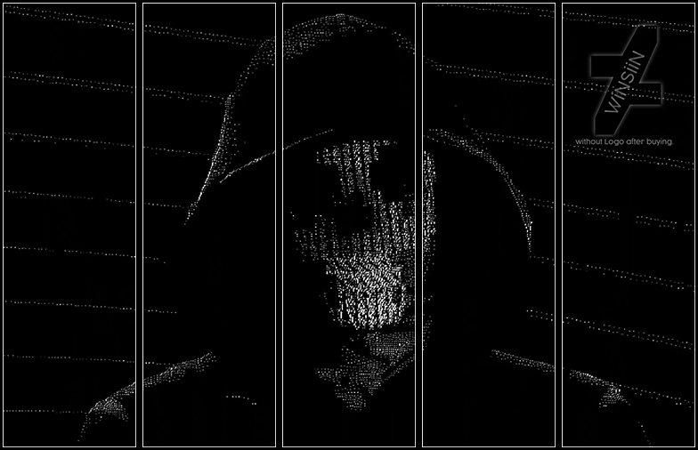
RodTheSecond — Batman - Carter Gift

Published: 2012-11-06 21:50:05 +0000 UTC; Views: 1247; Favourites: 39; Downloads: 18
Redirect to original
Description Made as a request from carter or lookoou @ GfxR
I actually really liked it :3
Related content
Comments: 16

MightyMorphinPower4 [2013-02-25 07:19:35 +0000 UTC]

Awesome

👍: 0 ⏩: 1

RodTheSecond In reply to MightyMorphinPower4 [2013-02-25 14:22:29 +0000 UTC]

Thx

👍: 0 ⏩: 0

Mohamed-HHs [2012-11-09 01:22:03 +0000 UTC]

Great detial, and awesome depth c: ^^

👍: 0 ⏩: 1

RodTheSecond In reply to Mohamed-HHs [2012-11-09 17:46:34 +0000 UTC]

Thx m8

👍: 0 ⏩: 1

Mohamed-HHs In reply to RodTheSecond [2012-11-11 02:21:21 +0000 UTC]

Welcome

👍: 0 ⏩: 0

AshHaZe [2012-11-08 06:48:21 +0000 UTC]

Nice work

👍: 0 ⏩: 1

RodTheSecond In reply to AshHaZe [2012-11-08 16:01:48 +0000 UTC]

Thx m8 :3

👍: 0 ⏩: 1

AshHaZe In reply to RodTheSecond [2012-11-08 17:37:55 +0000 UTC]

np

👍: 0 ⏩: 0

Stealth14 [2012-11-08 02:59:43 +0000 UTC]

Congratulations, you have won 2nd place with this sig on Signature Lab's Daily Signature Competition #647
Here is your award: [link]

👍: 0 ⏩: 1

RodTheSecond In reply to Stealth14 [2012-11-08 16:01:53 +0000 UTC]

Thx

👍: 0 ⏩: 0

whisper1375 [2012-11-07 15:12:01 +0000 UTC]

nice work mate.
+vote

👍: 0 ⏩: 1

RodTheSecond In reply to whisper1375 [2012-11-07 21:19:25 +0000 UTC]

Thx whis

👍: 0 ⏩: 0

FoXusWorks [2012-11-07 09:11:57 +0000 UTC]

Very good depth mate. the only problem is that there is too much negative space around on the edges. Too dark. Also the curvy text style does not suit the render (I mean it's Batman XD)

👍: 0 ⏩: 1

RodTheSecond In reply to FoXusWorks [2012-11-07 21:19:35 +0000 UTC]

Thx a lot for the feedback m8

👍: 0 ⏩: 0

TH3M4G0 [2012-11-07 01:03:34 +0000 UTC]


Congratulations, your sig has been nominated to be entered in the Daily Signature Competition #647 on Signature Labs: [link]

👍: 0 ⏩: 1

RodTheSecond In reply to TH3M4G0 [2012-11-07 21:19:41 +0000 UTC]

Thx ^^

👍: 0 ⏩: 0