HOME | DD
 roguephoenix — ID 1

Published: 2004-01-07 11:44:39 +0000 UTC; Views: 1593; Favourites: 16; Downloads: 289
Redirect to original
Description
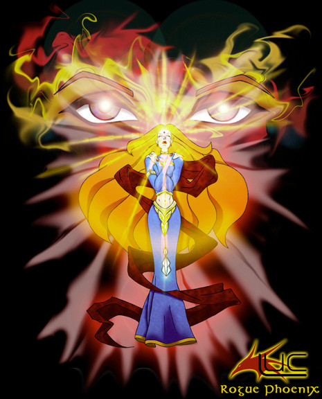
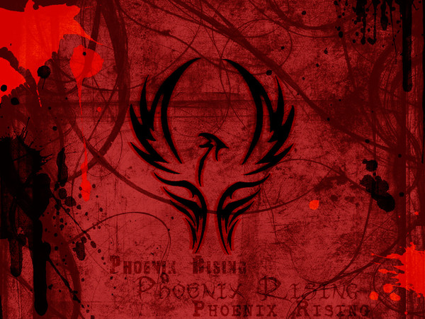
just my logo and name. nothing much to say reallyRelated content


Comments: 58

wow. thanks. yea, i was going for the tough yet regal look. thank you. still missing something so i'm working on several new ones which i think are much better.
👍: 0 ⏩: 0

Gah I hadn't finished my comment before..
I meant to add that the background, in its wonderful smoke-like complexity and dark red hues really complement the colour and shapes of the form of the phoenix. And the fact that you've echoed/repeated the phoenix-shape in the bg is also an awesome effect, it definately gives the impression of live fire.
And it's interesting that around those small circles right by the body of the phoenix, the 'flames' look more like lightning bolts, giving this an even more powerful and perhaps violent effect.
👍: 0 ⏩: 1
wow. thanks for all that. ")
👍: 0 ⏩: 0
That is so stunning.. Those shapes you've used to symbolize fire are so incredible; they look haphazard and violent, like flame itself does, and yet they have such thought-out forms and beautiful shapes.
And the image of an eagle's head and sliver of a body is very cool, the fact that these shards aren't touching each other is really impressive, it gives this such a unique look. ~anti-praxe has some designs which use the same 'seperated' technique, it's pretty different from this and more futuristic; I've started using a similar style as well.
But this is by far the best ID I have seen of anybody at dA, I must 

👍: 0 ⏩: 1

 (Wink)")
thanks. i've decided to work on another different one.
👍: 0 ⏩: 0

Wow ! That's awesome work ! You're very talented ! ^^
👍: 0 ⏩: 2
thanks so much. welcome to my gallery. hope you come back again.
👍: 0 ⏩: 0
thanks so much. welcome to my gallery. hope you come back again.
👍: 0 ⏩: 1


lol. thanks so much. glad you like it. i'm still refining it to be a tattoo someday
👍: 0 ⏩: 0

Yah, this rocks the house!
i love the stylizaion.. you are too good!
👍: 0 ⏩: 1


thank you. glad you like it. welcome to my gallery. come back again soon.
👍: 0 ⏩: 0


thanks to you. he he.
👍: 0 ⏩: 0


cool, did u mean there to be a face in the middle of the design?
👍: 0 ⏩: 1
i did see that, but i don't mind.
👍: 0 ⏩: 0

thanks. glad you liked it. welcome to my gallery.
👍: 0 ⏩: 0

That is wicked really o.o; I should make me a logo some time
👍: 0 ⏩: 1
thanks. he he. yea, make a logo.

👍: 0 ⏩: 1
I just might do that xD ... but I dun know what to make 
👍: 0 ⏩: 0

very very nice. I love phoenix shit. good on ya mate
👍: 0 ⏩: 1

Did you design that logo all by your lonesome? oh God, I am being in the jealousness!
👍: 0 ⏩: 1
yup. did that all by myself. he he.
👍: 0 ⏩: 0

That's a great picture of Phoenix. Kinda reminds me of my ID but yours is the best.
👍: 0 ⏩: 1
yea, i saw your id and i was glad to see phoenix on it too. he he.
👍: 0 ⏩: 0

your id is much snazzy cha! *stares and pokes* its very cool indeed.

👍: 0 ⏩: 1
Mwaahhh! It's Beautiful! Ilove the background! That dark-blood sorta red is my fave colour! I love the Phoenix thingie, and he writing....bleh...I love it all!
👍: 0 ⏩: 1
lol. that's my favorite color too. ")
👍: 0 ⏩: 1
mmmmm.....bloooood reeeeeed
👍: 0 ⏩: 0

nice! i like it...very prettyful folds and stuff...
👍: 0 ⏩: 1

^^ Sweet, you have a dev id now!! And I reckon it's cool!
👍: 0 ⏩: 1
thanks.  (Smile)")
👍: 0 ⏩: 1
^^ Yip! I need to do another ID..
👍: 0 ⏩: 0

very nice, but shouldn't rouge de rogue?
very cool though...
👍: 0 ⏩: 1
| Next =>