HOME | DD
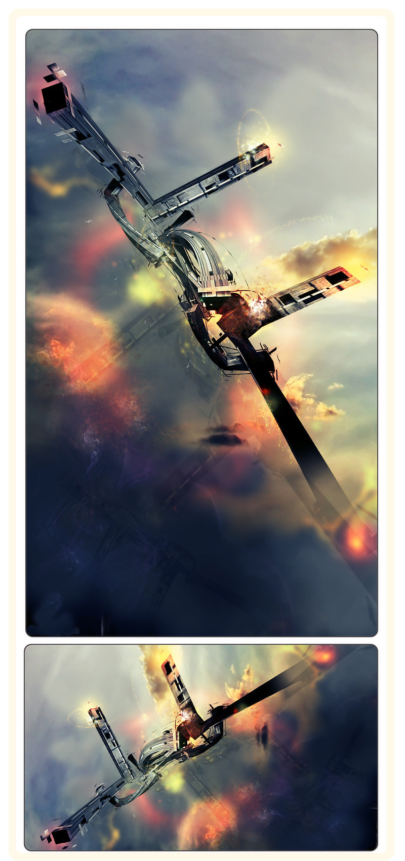
 RoidMonkey — Fly Away

Published: 2008-02-10 05:40:04 +0000 UTC; Views: 1456; Favourites: 21; Downloads: 852
Redirect to original
Description
1.5 Hours in Cinema 4D.3 Hours in Photoshop
------------------------------
The material in this was very tricky. I had some help from Lucieed's Material tutorial. Other then that its all Roidster!
Fav and collect if you like!
Edited the piece.
----------------------
My C4D
[link]
You can use it if you credit me, fav me, comment me, and watch me.
Related content


Comments: 37

lookin good, have u tryied toning down the gradient a little ?
👍: 0 ⏩: 1

Nope. I can try it. Thanks for telling me. I do see i now i should tone it down some.
👍: 0 ⏩: 0


Thanks man it means alot that you like it.
👍: 0 ⏩: 0

i really like the texture. some of the shapes even look like they could be hidden letters.
could use a little more color contrast, though
👍: 0 ⏩: 0

it could use more variation in the composition, as well as more contrast.
👍: 0 ⏩: 0


I really like it. The variations of red and the blue really went well in this piece
👍: 0 ⏩: 0

nice job! i faved it also ")
👍: 0 ⏩: 0

Makes me think of shards of colored glass. Also see a wolf like face in it if I stare enough. Or a bits of a map with weird tron-like digitized colors scanning it.
👍: 0 ⏩: 0

not normally a fan of pink but this is interesting.
👍: 0 ⏩: 0

 (Smile)")


Neat! I like it a lot. I would want that as my desk top wallpaper XD
👍: 0 ⏩: 0

wow,very abstract image! its great work for many interpretations.
👍: 0 ⏩: 0


its awesome and very abstract. It rapes my mind
")
👍: 0 ⏩: 0


It's like abstract stained glass. It's really quite interesting. I really love the blending.
👍: 0 ⏩: 0

The colours you achieved in this are fantastic. Every time I look at this, I see something new in the pattern. Keep up the great work.
👍: 0 ⏩: 0

I dig the colours and texture used here, there's quite a bit of negative space on the top right, if you want you could put in a signature logotype of some sort.
👍: 0 ⏩: 1
I was thinking of putting some thing there for like the title but i suck at text placement.
👍: 0 ⏩: 0


Very nifty. It reminds me of some kind of colorful bird for some reason....I dunno, I'm weird like that
👍: 0 ⏩: 0

very cool colors - for some reason i think of a guitar...
👍: 0 ⏩: 0

this is cool... it kinda looks like a chinese character in a way
👍: 0 ⏩: 0


Nice work. It's intriguing not really knowing what it is.. or what the pattern is on it... Looks good though!
👍: 0 ⏩: 1
Thanks. I want to make it more complex with some fixes here and there and some textures.
👍: 0 ⏩: 0