HOME | DD
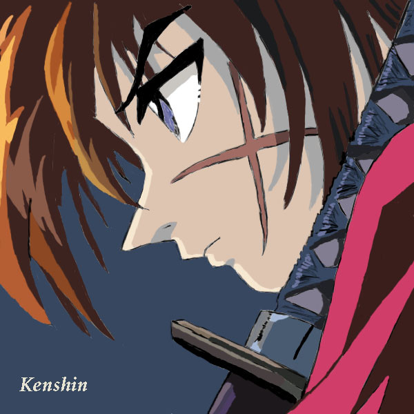
 RoLLeRbOoTs — Hellspawn

Published: 2005-01-02 07:25:15 +0000 UTC; Views: 1491; Favourites: 42; Downloads: 13
Redirect to original
Description
-phew- finished (i think). so many accessories O____o blargh. spawn's so hard to colour (and draw for that matter). there's still something i don't like about his head. grr.Related content


Comments: 16

EH- you're genious O_O did you color it at photoshop?
👍: 0 ⏩: 0

I agree with Montana (^^) I liked the first one better. And couldn't you have done something with the background? {glares} You're really talented you know, you can waste a bit of time attempting to make the background more detailed ")
👍: 0 ⏩: 0

OKay okay...nice drawing dude. I like the somewhat sketchy style. Looks tight. Ive drawn spawn in the past never in color and this is probably better than any of mine. It has the feel of the comic to it but keeps its own uniqueness which i find very intrigueing...yes i annihilated alot of words.
👍: 0 ⏩: 0

Come on! You made Spawn that damn detailfully and the background? o_O
Anyway, Spawn rocks again!!!
👍: 0 ⏩: 0

this is good i like the messiness on it my brother is like wow he is impressed.
a fave for me damn you gal such talent!
👍: 0 ⏩: 0

Thank GOD I didn't have to draw Spawn :3
>__>;;
I'll give you a comment nonetheless... even if you DON'T comment on my pictures anymore. -shrugs-
Hopefully you'll accept critiques. Don't bite my head off. I'm only trying to help. -snorts-
Anyway. The colours you used are very nice, especially in the background. It ties the picture together. I agree with Tan, that there are wonky bits here and there (namely the skull on his belt, the white thing on his head and the gun in his right hand). The eyes don't really seem to align right. His left eye seems to be a bit further down than the other one. Unless, of course, the picture you used to draw this was like that.
The background colour is nice, however a lot more can be done to it to make the picture more effective. It just seems to be a little boring, just being a plain solid colour. A more dramatic-type background would suffice, particularly with this character. You can argue that some pictures have plain colour backgrounds that suit the subject. But this one doesn't really suit with Spawn, if you know what I mean. It makes it seem like you rushed the background part.
But you don't have to listen to me. Do whatever you want. And some comments:
I like your sketchy lines that you used. They're effective for this type of characterisation. It's nice. It makes the whole thing look slightly cartoony and like something you'd see from a comic. The soft effect you achieved is good, you can easily distinguish the clothes and accessories from the body.
I also like how you coloured the image. The slightly subdued colours work well with the lines. Full-on colour wouldn't really work with this... would it? Anyway, your light source is easily distinguishable. The shading is nice, done really well. The shine on the metal and the spikes is good too.
Overall, it's a nice picture.
Excuse if I've offended you in any way by giving you constructive critisim. If you don't like me doing that, I'll just give you pointless comments that you can read in about 2 seconds.
Have a good day.
👍: 0 ⏩: 1

wow- what a long comment! -phew- thanks sushan! haha yeah the eyes ARE demented but i couldn't really fix them
")
👍: 0 ⏩: 1
Ooh :3
So... do you want me to give you crap comments (eg. "cool!" and "ur so talented!") or would you prefer one of my lengthy ones? I seriously don't mind. Anything will do xD
-pegs a tomato at you-
Draw!
👍: 0 ⏩: 1
i don't mind. the lengthy comments are good (i don't really get offended if people give me critique because hey, there's always gonna be something wrong with a picture right?) but i don't want to be wasting your time or anything. (are you online by the way? -goes to check- )
👍: 0 ⏩: 1
Nah. Whenever I'm on, I give people random long comments.
They like it xD
And I'm a big time-waster anyways. It's no big deal :3
👍: 0 ⏩: 0

"Hellspawn..." ooh scary name Sas ")
👍: 0 ⏩: 1
haha tan you can read my mind! that's what i was thinking (what you said)
👍: 0 ⏩: 0

It's nice, but too much like the movie version for my liking.
I prefer the cartoon/comic style Spawn, when he was always engulfed in shadows.
Your drawing is great for a superhero picture, but it falls short for a Spawn picture.
👍: 0 ⏩: 1
hmm....yeah i agree 
👍: 0 ⏩: 1
yeah... but ur still incredibly talented.
keep up the good work, bre
👍: 0 ⏩: 0

Very Unique. I like this style ^^ GREAT job! +fave! Imma go see your other stuff now! ^^
- X
👍: 0 ⏩: 0