HOME | DD
 romanshoubu — OSCP03 Colour Insert
Published: 2009-02-06 02:58:52 +0000 UTC; Views: 3616; Favourites: 125; Downloads: 25
Redirect to original
Description
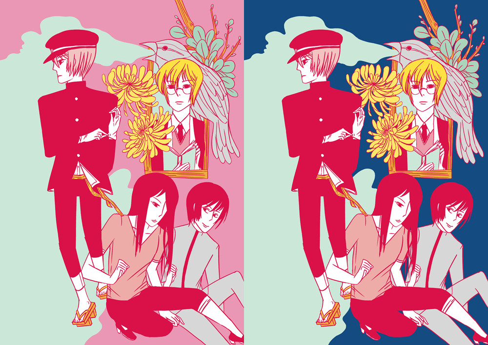
If I have money I will use this as a colour insert for the next issue of my comic .I made two versions. I don't know which one to use. Let me know your opinion!!!
You can now read the online version of OSCP at Smackjeeves .
Related content


Comments: 95

Thanks for your input! Yeah- I guess the contrast of the blue works better overall.
 (Smile)")
👍: 0 ⏩: 0

Beautiful! The pink seems to really bring out the detail, but the blue is so punchy. I love them both.

👍: 0 ⏩: 1
Thanks for your input! I really appreciate it. (^^-
👍: 0 ⏩: 0

I actually really like the pink one but I guess that's because it looks so shoujo-esque and suits so well... But I guess everyone is right when they say the blue stands out more. Ahhh.. I don't know.
👍: 0 ⏩: 1
Yeah, I'm kind of wondering how both will look printed out. XD Pink is all shoujo-esque and is crazy eye killing but I guess everyone is right about blue standing out a lot better. ha ha. *A*;
👍: 0 ⏩: 0

I think the blue one, because there is already a lot of pink on the picture and you don't want to drown out the characters. This help?
👍: 0 ⏩: 1
Yes it does! Thanks for your input. <3
👍: 0 ⏩: 1

ohmygoodness.
This is so amazing! ;A; I,I love pink, so my first impulse is to go with that, but my eyes were definitely first drawn to the one with the blue background.
The pink almost... I dunno... I don't want to say "washes it out", but something along those lines.
HMM. it's a mystery... but whichever you choose will be fantastic! ♥♥
👍: 0 ⏩: 1
Thanks for your input! Yeah- the pink kind of blends everything in because of the reds and pinks in the other parts of the illustration- but I guess that makes it seem warm- like a summer day that I am missing right now in the midst of the Canadian winter. ;A;
👍: 0 ⏩: 1
Ahhhh summer *cry*
Where abouts in Canada do you live? ♥ I live in Vancouver, so winter isn't as bad here as other parts. Just lots of cold and lots of rain XD (it's brightened up the past couple of days, though!)
👍: 0 ⏩: 1
I am in Ottawa. Actually the snow has been melting recently. Maybe spring will be coming? *A*;
👍: 0 ⏩: 1
Hurray! Let's hope it comes soon. ;u;
I want to wear t-shirts again. HAHA
👍: 0 ⏩: 0

OH GOD. This is so gorgeous. I am just staring at it but the tears of joy are making everything so watery. ;_____; Roman, you're so amazing. It's so intricate, I love it! Ngghf, and your characters are beautiful.
Mmm, I think they are both spectacular but if I had to choose, I'd try the blue!
This is stunning, I love it, I love it<3
👍: 0 ⏩: 1
Oh my! I hope that you aren't really crying- and if you are I'm kind of flattered because I never expected something I made would make someone cry. *A*--- AH--- you're the amazing one!! I'm glad that you like it. >O<;;
Thanks for your input!!
👍: 0 ⏩: 0

I... I LIKE BOTHHHHH
maybe you can jsut make 2 versions orz /lame
though TBH I think the blue makes the image very stark and I think that is more eyecatching ;v; <333
BUT I LIKE BOTHHH
👍: 0 ⏩: 1
Maybe I'll make both just for you--- <3 <3
Thanks for your input.
Looks like blue is winning out because of the contrast!
")
👍: 0 ⏩: 0

oowah this is hard, i don't know which one i like more >>
the blue one makes the flowers look REALLY good and goes well with the pink, but the light pink one blends the smoke stuff better....i think the blue one is my favorite though!
also, i loooove the composition of this :'D
👍: 0 ⏩: 1
Thanks for your input!!! Yeah- the flowers really pop out better in the blue one. I originally chose the pink based on the color of the smoke actually.
👍: 0 ⏩: 0

Both are so very nice. *_*
I would go with the blue one, I love the contrast in that version-- it's very striking. The bird breathing out smoke is very hot as well.
👍: 0 ⏩: 1
Thanks for the comment. Yeah- the bird breathing out smoke is one of my favorite parts of the illustration. <3
👍: 0 ⏩: 0

At first I was leaning toward the dark blue version, but now that I've looked at them for a while I like the pink more for some reason. I like the softness of the pink, where as the dark blue is very stark in its contrast. They are both very striking in their own ways, however, and I'm not strongly for either or the other. Because they're both lovely,
I love the flowers and the blonde boy with the book *A* He tickles my fancy very much
👍: 0 ⏩: 1
Thanks for your input! I really appreciate it!
Yeah- the blonde boy is a character in my comic. He's one of my favorite characters ever. I have a soft spot in my heart for him. <3 <3 I really enjoy drawing him. (^^
👍: 0 ⏩: 1

AH, how wonderful...!!! <3
I think I favor the dark blue. It a bit more dramatic and sets off the other elements in the picture nicely.
👍: 0 ⏩: 1
Ah- thanks for your input!
Yeah- I think the blue does a good job of bringing out the details more than the pink. I might end up printing both versions and insert them into the copies at random though. *~*
BTW, have fun at NYCC. I'm so jealous. ;_; I wish I could go. *sob*
👍: 0 ⏩: 0

I like the first the most. (on the left)
👍: 0 ⏩: 1
Thanks for your input. (^-^
👍: 0 ⏩: 0

Ahhh I'm hot for both pieces! <3 I do love the blue though, It's very striking, and it draws out the figures/compliments the rest of the pallet.
This is suchhhh a cool insert. ;____; I need a job. So I can buy your comics sob sob.;;;;; The flowers and birds and things look so beautiful, and I love the solid, graphic colors. It has the feel of a fantastic,vintage manga. <3
👍: 0 ⏩: 1
Ah-- thanks for your comment. ;A; I really appreciate it!
I think I might end up printing the blue one- but the pink is just so crazy! *A*
I hope that someday you will get to buy my comics. ;A; But I'm planning to make a web comic too so you don't need to get a job anytime soon. XD;;;
If only my comic were like a fantastic, vintage manga! That would be really wonderful. >o<-
👍: 0 ⏩: 0

- I think this is ABSOLUTELY stunning~!!
and I think the pink version brings on about a rare delicacy in the characters
👍: 0 ⏩: 1
Thanks for your comment. What a wonderful way to describe it!
There is indeed something about the pink that is warm and bright. ^^
👍: 0 ⏩: 1
- you're welcome~!!
I wish you the best in luck in schoolwork
: ]
👍: 0 ⏩: 0

Thanks for your input! *A*---
👍: 0 ⏩: 0

very beautiful!
I love the abundance of pink in this piece. <3
the two versions are equally captivating!
👍: 0 ⏩: 1
Thank you for your comment! Maybe I might end up with the pink background. There isn't enough pink in the world. XD;
👍: 0 ⏩: 1
np. ^^
ahah~ You said it! xD
👍: 0 ⏩: 0

I like the blue because of the contrast, but I like the pink because of the color... D:
👍: 0 ⏩: 1
Yeah- I'm really torn. I think that it is an awesome shade of pink- but the blue and the contrast--- *A* What to dooo---?!
👍: 0 ⏩: 1
What if you try a more greenish blue? So it matches the tone of the other blue more, but you can keep it dark without it blending with the pinks?
👍: 0 ⏩: 1
That's idea! I'll try that tomorrow then. Thanks for your input!
👍: 0 ⏩: 0

<= Prev |