HOME | DD
 romanshoubu — OSCP03 Colour Insert
Published: 2009-02-06 02:58:52 +0000 UTC; Views: 3616; Favourites: 125; Downloads: 25
Redirect to original
Description
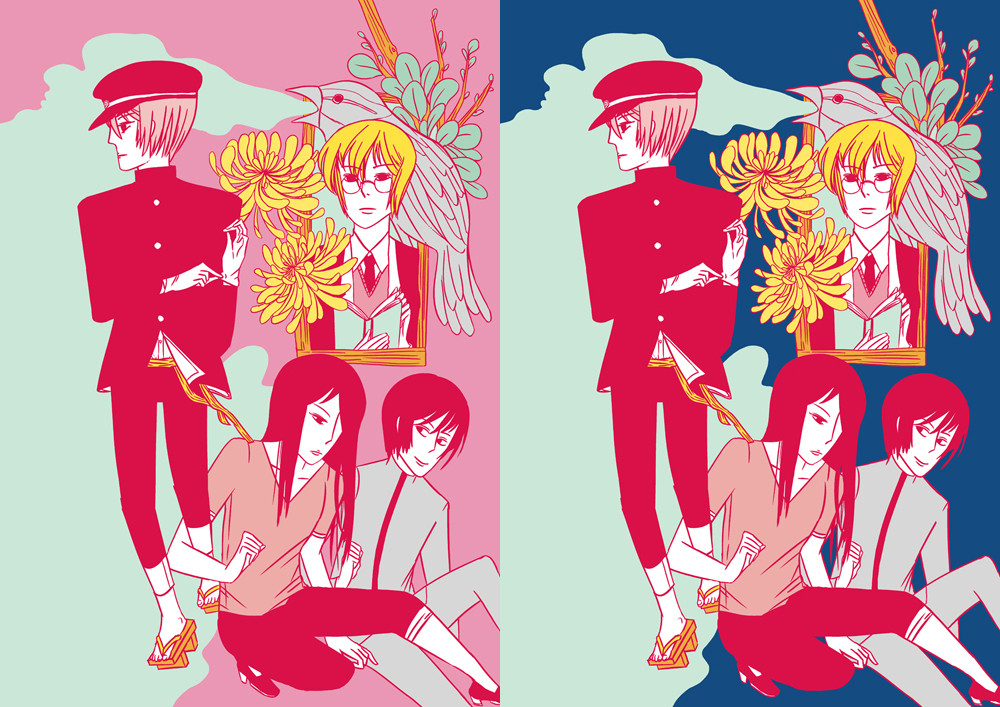
If I have money I will use this as a colour insert for the next issue of my comic .I made two versions. I don't know which one to use. Let me know your opinion!!!
You can now read the online version of OSCP at Smackjeeves .
Related content


Comments: 95

you're welcomed, I'm sorry for not being very helpful on choosing hahaha
👍: 0 ⏩: 0

Hello! ")

👍: 0 ⏩: 1

Thank you for the feature! I really appreciate it.
 (Smile)")
👍: 0 ⏩: 0

I like the one with the blue background myself XD
👍: 0 ⏩: 0


This is gorgeous! I hope I'll be able to buy it soon 8D I am curious~
👍: 0 ⏩: 1
Thank you for your comment! I hope that someday you will be able to read the comic. ^^
👍: 0 ⏩: 0

Thank you very much!
👍: 0 ⏩: 0


rrrghhffhfh, this is beautiful!
I love your colors, linework and e-everything.
that sideways glance of the character on the bottom right is really cute, too..i am definitely wanting to read your comics.
the blue one pops more, even though they are both very pretty!
👍: 0 ⏩: 1
Ah--- thanks for this awesome comment. *A*;
Yeah, after printing both versions out I decided that the blue one is the best version after all.
That character on the bottom right is full of nothing but silly antics. He is totally planning something devious and silly to do when that girl isn't watching. LOL
👍: 0 ⏩: 0

Thank you! I think I will end up using the blue one.
👍: 0 ⏩: 0

aa these are so lovely.. i like both, a lot, however everything stands out more against the blue background, i think.
👍: 0 ⏩: 1
Thanks for your comment. >o<
Yeah- In the end, I decided that the blue one was the best after all. (^^-
👍: 0 ⏩: 0

Great colours! ;; I like the one on the left more, the colours work better together (in my opinion). x3 Great composition!
👍: 0 ⏩: 1
Thank you for your input! XD I really appreciate it. (^^-
👍: 0 ⏩: 0

These are both really pretty
👍: 0 ⏩: 1
Thanks for your input!
👍: 0 ⏩: 0

i prefer the blue in the back (the one on the right.) they look lovely together, both versions. the flowers are so cool and the composition is the shiznit.
👍: 0 ⏩: 1
Thanks for your input! *A*/
I'm glad that you like the composition!!
I really enjoyed drawing the flowers- I was going to put in more but decided that two was enough. XD
👍: 0 ⏩: 0

Thanks for your comment!
Looks like blue is going to win out...
👍: 0 ⏩: 1

The pink looks pretty, but the blue is better on the eyes. But maybe the pink is just as good on paper...
👍: 0 ⏩: 1
Thanks for your input. Yeah, the blue is definitely easier on the eyes than the pink. XD
👍: 0 ⏩: 0

I like the blue more too! The guy in the bottom left is up to no good *A*
you are so hardcore, but I love you for it <3 <3 good luck honey!
👍: 0 ⏩: 1
Thanks for your input. Alex is always up to no good doing silly things like putting bunny ears on Vivien and making silly faces at her during exams. LOL
👍: 0 ⏩: 0

KAfkjdfhafd your piece designs are as beautiful as ever. I like both versions of the piece, and I think both give off two different moods. Personally, I really love the pink one because it's so crazy and flamboyant, but I tend to enjoy pieces like that more. The blue gives it a bit more of a serious feel.
👍: 0 ⏩: 1
Yay- I'm glad someone understands the craziness and flamboyancy and crack wonder of the pink version. <3 <3 I think I am like you in that I like those kinds of weird, crazy pieces. Actually pink was my first choice but I decided to try out the darker blue for fun.
👍: 0 ⏩: 0

obviously the only answer is to make the bg lime green
:v
👍: 0 ⏩: 1
OMG-
I did ittt----
with red lines
with blue lines
XD
👍: 0 ⏩: 1
omg, yes
.. weird thing is, i actually think it looks good like that ._.
👍: 0 ⏩: 1
Yeah- I guess there is something nice and soothing about it?
👍: 0 ⏩: 0

I think I like the blue one. It has better contrast, so the image pops more!
You're really spicing up the book 8D
👍: 0 ⏩: 1
Thanks for the input! XD
Yeah-- I think I might have some extra cash to make it all fancy and awesome. <3 <3
👍: 0 ⏩: 0

blue one! it definitely enlightens the red lines of the picture! (ya know the contrast and stuffxD) lol funny. good job as always^^
👍: 0 ⏩: 1
XD Thanks for your comment!
Yeah, I think I might end up printing the blue instead based on what others have said.
👍: 0 ⏩: 1

hmmmm i like the first one better :3
good luck on your comic!!
👍: 0 ⏩: 1
Thanks for your comment!
Yeah! I'm trying my best!
👍: 0 ⏩: 0

well, i like the blue version, cuz it's less err..."eye-raping"
👍: 0 ⏩: 1
LOL Sorry about the pink doing that to do. ha ha
Thanks for your input.
👍: 0 ⏩: 0

I like the way the pink version looks on the left, but the characters stand out more in the blue version.
I really love that "window" area a lot!!!
👍: 0 ⏩: 1
Yeah- I really like that window bit! It was a lot of fun to draw, especially the parts with the leaves. <3
👍: 0 ⏩: 0

gah~i love
i like the blue one better cuz of the contrast...it's vibrant....
👍: 0 ⏩: 1
| Next =>