HOME | DD
 rosync — C: YuiiKun
Published: 2012-09-16 14:19:50 +0000 UTC; Views: 2328; Favourites: 201; Downloads: 18
Redirect to original
Description
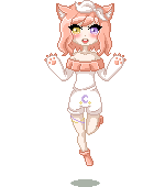
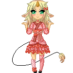
Pixel-Point-Commission forYumi (c) Airi-Nii
Related content


Comments: 30

Overall


Vision
Originality
Technique
Impact
This work isn't half bad. While it probably wouldn't hurt to try to vary the hues with each shade, this makes me curious to see what sort of stuff I can do with that color of orange.
I believe the blink could be executed better as I would imagine that it's more realistic to have the eyelashes shrink as this character blinks:
[link]
Going an extra mile to move other body parts and not just the hair might also make the animation more believable.
Then... here's something I'd like to bring up that not many people seem to be aware of, and that would be staircase banding. Staircase banding is something you see a lot on deviantART. You'll see it in works of beginners, but also on Daily Deviations here, as well as works of professionals who are paid to create game graphics.
Since it's very difficult to describe what it exactly is, I'm gonna need to make visuals out of your work. Take a look at this: [link]
There are actually two ways of seeing the area which I've roughly outlined: you can see it as three lines piled on top of each other, or you can see it as pixel rows that are shifted up and down to try to create a curve.
Pixels do not exist in real life; there is no grid when you look at anything. It is unecessary to create things that look like shifted pixel rows. The pixel rows I'm talking about can be as thick as those three lines or maybe thicker, or it can have two lines hugging each other. We can possibly just one line that appears as a shifted pixel row if we were to draw a simple line without any antialiasing. One line isn't a huge, huge problem, but be wary of amplifying this visual effect by piling lines next to each other.
How would I solve this? Look at this: [link]
I've drawn a few lines to show you a few lines that are created when we pile these lines next to each other. As we can imagine, these lines might not make very much sense. Why do they need to appear on those places? What I've done to try to avoid this is to displace the pixel line's ends with the line on the bottom, and add a bit of antialiasing to the middle line to make the pixel ends harder to see. I was also tempted to make a few more changes to avoid having pixel ends line up with each other to create these lines, but you can see what my edit looks like at the very zoom level this is meant to be viewed in:
[link]
There may have been a better edit, but I think it's good enough to make my point. My edit looks much less like shifted pixel rows. It is much harder to see any imaginary lines that may exist. The results are more realistic.
Not many people have written much about banding. Trying to look it up often gets me results that lead right to my own stuff. (lol @ what I get when I look up 'pixel banding'. You'll find a work I was commissioned to make at the very top of the list.) One of the few sources I've ever found was written by Helm, a pixel artist who's usually regarded as one of the best: [link]
From experience, banding is not something you avoid like the plague, but it's always a good practice to avoid it when reasonably possible and when avoiding it doesn't make your art look worse. The link I provided does mention the 'fat pixel' which is basically two pixel rows that are two pixels large hugging each other. You can see it on this character's hands (paws?), but I would imagine that trying to get rid of these fat squares won't do anything great.
So pretty much, now you're aware of an issue that a lot of people aren't even aware of (and sadly shows up in a lot of pixel DD's), so you should be now be more aware of how to achieve a more realistic look with pixel art. Consider yourself lucky that you should now know better than some professionals out there. e.deviantart.net/emoticons/r/r… " width="15" height="15" alt="
")
👍: 0 ⏩: 0

")

NYAA YUMI-CHAN! -posts on page- nyaaaa thankies soo muchh
👍: 0 ⏩: 1


^^ actually it is kinda a bunny? but the most ref were cat ears so i wasn´t sure...
👍: 0 ⏩: 1


👍: 0 ⏩: 1
 (Smile)")


Thats so pretty! Love how the hair floats, and the shadow is so cute, lovely work

👍: 0 ⏩: 1
^^ thanks~ i would love doing more animations like this... but the people mostly commission me for my normal pixels xD
yet i hope i never have to make a animation like this with multicolored-long-hair.... this may be much work

👍: 0 ⏩: 1
Oh god, it would be hard... 
Your most welcome

👍: 0 ⏩: 1

