HOME | DD
 Rovas117 — Fire and Ice
by-nc-nd
Rovas117 — Fire and Ice
by-nc-nd
Published: 2012-01-22 13:11:08 +0000 UTC; Views: 1102; Favourites: 20; Downloads: 12
Redirect to original
Description
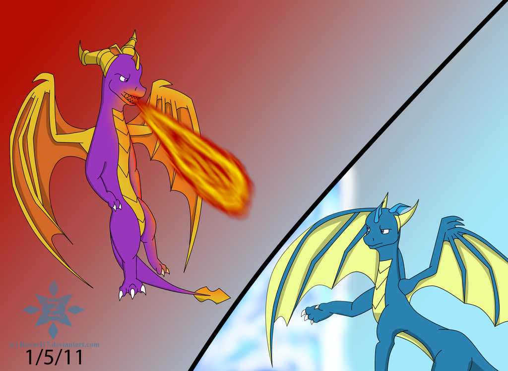
FINALLY!!! After weeks of procrastinating, I've finally finished this artwork of mine! It's an old one, made during the first week of the new year! One of my first few serious sketches this year! I love it!The fire effect was rather dull in my opinion, but then again, I don't exactly know how to do it in the first place! As well as the ice effect, I had no idea what to do with it, so I just decided to do an ice wall of sorts.
So yeah, here's a pic of mine! Of Spyro and *gasp* Zayril!? They're FIGHTING!? NO!!!! What happened!?
I guess will find out soon enough.
--------
Please leave me a constructive critique/comment! I really appreciate them!
Sketch finished on: 1/5/12
Digitalization was finished on: 1/20/12
Tools used:
My Sketchpad
Pencil and Eraser (I don't have a tablet like some)
Photoshop CS3 and a Computer Mouse.
Disclaimer: The Legend of Spyro characters as well as Spyro the Dragon characters, are owned by their respective companies.
Related content


Comments: 16


Vision

pretty good maybe you can put in a comic someday it is alot better than any of my drawings the vision is okay it is kinda difficult to make a fireball im pretty impressed on how you made both the fire and the ice if you are planning on doing earth and electricty i would really like to see it i really dont have much else to say about this drawing well thanks again for the pic xD xD XD XD XD XD XD XD XD XD XD XD XD XD XD XD XD XD XD XD XD XD XD
👍: 0 ⏩: 0

Overall
Originality
Technique
Impact
Ok, this is one thing that has nagged me, when you draw the dragon's wings, you make them look more like bat's wings, you need to give the a more, sprayed about the area look, if you get what I mean.
And also, you draw female dragon's better, you are very good with the slim line type of drawing I will give you that one, but with the male's you keep the slim line style, try adding some muscle to the chest and arms, they look too 'Fragile' in a sense, hope my advice help's in future project's.
Zeuskywoo.....AWAY! *flies off to space*
👍: 0 ⏩: 0

i could point out many things to improve here but i m a bit shy for ya.
i have suggestions for every part of this pic. but i think saying those makes me feel that im saying that youre not good enough
but no dont take that seriously, i cant this of a proper way of saying that
still youve improved alot from your previous paintings considering that you dont have a tablet, im impressed
👍: 0 ⏩: 1

Why thank you! But I'd really appreciate it if you tell me what I should improve!
👍: 0 ⏩: 1
okays then, here i go:
first thing that i noticed, zayril's hand. the thumb is a bit to low there or maybe its too short, or maybe both. and i also see that all fingers are too short, pardon me if that was made on purpose
2nd thing that i noticed, spyro's arms, theyre a bit short. and also spyro rarely does that pose (i think thats not counted XD)
okays about the wings, zayril's right i think is too big, plus if they were angeled like that then he wouldnt have seen anything unless he was trying to block and attack
spyro's left horn, too much sharply angled sideways
besides those everything seems to be fitting at you current level so no issue about the fire and ice
ratings
vision: 4 stars
i give this 4 coz i can see the amount of idealism that you used in this
originality: 4.5 stars
totaly creative, i have not anything that has there concepts
techniques: 3 stars
okay so 3 stars means that this is the part that you should focus on
a little concept art studying should make it easier for you to do the anatomy
impact: 4 stars
totally eye catching, the color blending is just so cool to look at, nice choice of colors
overall: 4 stars
overall thats a very nice piece that you got there, it was actually more fun to look at your "more than one character" pics coz you always have the perfect scene to cope with those characters
GOOD JOB. IMPRESSIVE
👍: 0 ⏩: 1
YAY! I don't exactly know how to draw the other horn, the one not facing the looker, in these kind of poses. Zayril's blocking the attack. And the hands are my fault. Not good at it.
👍: 0 ⏩: 1
just like me back then.
but practice always works
👍: 0 ⏩: 1
 (Smile)")

You're doing really good at 'stretching' your character's muscles with the poses, keep it up and they'll be able to walk normally again

👍: 0 ⏩: 1
Uh...
Is that a good thing? Or a bad thing? Are you saying that it's good that I'm trying more radical poses unlike before where I stuck to simple standing and sitting?
Is that what you're saying?
👍: 0 ⏩: 1
It was meant to be comedical review
I said that you're limbs are gaining rotation and becoming more fluid and realistic. sorry about that confusion

👍: 0 ⏩: 1
I guess it's a good thing then! YAY!
👍: 0 ⏩: 0

well, epic pose, epic elements = epic deviation! X3
👍: 0 ⏩: 1