HOME | DD
 RowanWithAPen — Circular Machine
Published: 2019-05-28 21:14:04 +0000 UTC; Views: 299; Favourites: 40; Downloads: 2
Redirect to original
Description
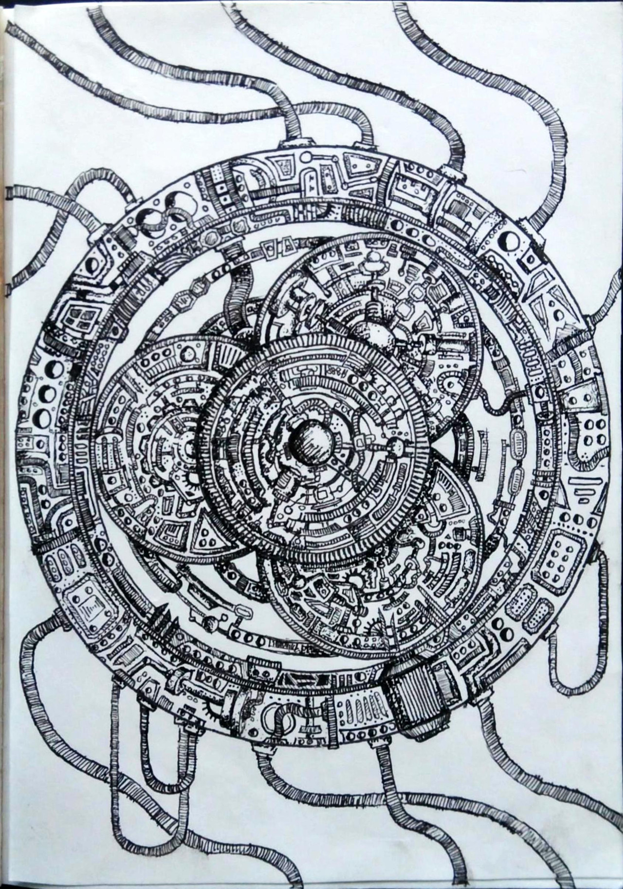
This...took a whileThere wasn't an awful lot of inspiration that went behind this. It was much more of a 'keep adding detail' affair, but regardless I like how it turned out. My 0.03mm pen definitely helped out a lot when producing the fine detail, and I experimented by using various pen shading techniques (Mainly hatching and stippling) in order to create a good effect (I feel)
From start to finish this took me about 4 hours, but that is the roughest of estimates, and the entire detail is in pen however I used a compass for some of the circles (The outermost ring and the four in the centre)
Materials used:
Helix thumbwheel compass
Pigma Micron pens (0.1, 0.03)
Size:
A6
Related content


Comments: 22

👍: 0 ⏩: 1

👍: 0 ⏩: 0

Hi! I'm here from
This picture drew my eye due to the exact and neat-looking geometric patterns, which make this drawing immediately pleasant to look at. The relationship between the different parts of this contraption is harmonious and the way the picture gets more detailed the closer you get to the center leads the viewer's eye to the knob in the middle, which is drawn in appropriately high contrast and seems to reflect a light that falls on it. To me personally, the picture is very aesthetically pleasing, like a kind of "mechanical mandala" and the knob in the middle is reminiscent of a jewel in the center of an amulet.
The way the tubes suggest a kind of movement in a clockwise direction also makes the image more interesting (it makes me think of various symbols like ancients sun wheels etc. - again with a mechanical twist) but it also makes me think about how this machine would function. I would imagine that the outer wheel turns quite a bit, maybe just back and forth since a full rotation might mess up the cables. I can't imagine the purpose the inner wheels would serve though. They touch the outer wheel and seem to overlap, so I imagine they're on top of each other. If they were cogs, the lower three could maybe turn a rod that carries the upper wheel and transfers momentum somehow...
Anyway, that's just speculation ")
In conclusion, this drawing is very satisfying to look at and combines universal symmetries with a mechanical theme. The image would make a great design for the outer shell of a steampunk-style pocket watch if it's small enough
👍: 1 ⏩: 1
👍: 0 ⏩: 0

i'm here from and i just have to say, this piece is super cool!
i love all the mechanical details, that must have taken so much time, love, and care. i can tell that you really love drawing things like this. if you don't, then it's so skillful that you made me believe that you do!
this circular machine is such a cool and interesting concept, and you jumped right into it. the tubes, inner circles, and exposed circuitry really made this image into something that i could look at for a while and not even get bored.
in the future, something to consider would be consistency. while you have a great deal of that in the details, the tubes on the bottom look slightly rushed, and not as consistent in length and size, making it look like you didnt spend that much time on them or even that they were afterthoughts.
despite my constructive criticism, i really do feel like this piece is really impressive. you did a great job on you, and i'm going to watch you and send you a llama!
good luck in the future, keep up the awesome art!
👍: 1 ⏩: 1
👍: 0 ⏩: 0

Hello, commenting on behave of ProjectComment ´s Big comment contest.
I have to say that the amount of details in this drawing is really impressive.
I like the overall look of something mechanical, yet foreign, which makes the object look very interesting. Some of the shapes on the surface remind me of old runes and ancient symbols like that. I think that these abstract runes can make the viewer think about the purpose of the thing, it can be even inspiration to think up a story hidden behind the object.
As for the shading itself, I think that you did great work. The tiny details are well visible and thoughtfully shaded, which had to take a lot of time and effort. It´s great that despite it´s pencil drawing, you managed to make good photo of it to upload here. The little blur is only visible after clicking on picture for full size, but default size is well focused and clear.
My only suggestion is to play with contrast a bit, because the paper looks a bit gray in this photo. More contrast/brighteness could make the details better visible.
👍: 1 ⏩: 1
Aww thank you for your kind words!
The paper is just your standard, white, slightly-thicker-than-printer-paper stuff but its a really small sketchbook, which might have been why there was some blurriness
I use MS OfficeLens to photograph my artwork as it tries to brighten the paper automatically, but it isn't really a very good application
I think I might start scanning them to get a better image quality, because I will admit that the image quality of what I upload here has never been the greatest.
Thank you so much for your advice, I shall happily take it into consideration
👍: 0 ⏩: 1
You´re welcome. (Smile)")
👍: 0 ⏩: 0

Quite the machine.
I can picture that as a nice-looking amulet.
But... uh... What does it do?
👍: 0 ⏩: 1
Good question.....
erm....
I didn't have too much in mind when drawing it but I would say if anything then it would probably be involved in some kind of space tunneling device. I can see this thing opening up a wormhole to another dimension but as of now its serves no purpose
👍: 0 ⏩: 1
A wormhole generator. Interesting.
👍: 0 ⏩: 0

This desing is so sweet!
I have nothing bad to say about it.
👍: 0 ⏩: 1
Thank you so much!
👍: 0 ⏩: 1
No problem man.
👍: 0 ⏩: 0

Someone mentioned steampunk. But I think otherwise: this reminds me more of an ancient Mayan motif typically associated with their famous calendar.
👍: 0 ⏩: 1
Interesting interpretation. If I'm completely honest with you, I'm not exactly too sure what this is even supposed to be myself honestly
I tried to go for cyberpunk but its just more of a weird machine than actual cyberpunk. The circular geometry is definitely a common feature in mayan art though, I see where you're coming from.
👍: 0 ⏩: 0

Wow, I'm not only impressed by the level of detail, but the drawing's textures were very eye-catching as well. I also got lots of steampunk vibes from the use of shading, especially near the center. They make the whole piece seem a lot more "solid" and complete, and I'm very impressed by the way you combined multiple shading levels into one piece. I've been trying to do the same in my own artwork, and I think you did a great job at making them more naturalistic.
👍: 0 ⏩: 1

holy shit this is detailed, none of my "keep adding details" things work out sadly, this looks like something you'd see in an alchemist's house nice job!
👍: 0 ⏩: 1
Adding lots of detail like this is more about simplicity. The individual shapes I've added are incredibly simple but its the amount and the layering that actually gives the effect. In fact, the disk in the middle has sections where I just drew some curved lines that followed the shape of the circle that just add to the effect at a distance. Also, when adding detail like this, Its important to make sure everything is of the same level of brightness (Ynow, I only ever used black ink for this) but to use line thickness to give shading and appropriate detail. Stippling is also incredibly helpful for this. A really thin pen usually helps give the lines more clarity (If you're looking to get one, I recommend Pigma Micron (sakura) because if you're using pencil (especially HB) then small detail will just look like a grey smudge. Your success rate is probably less about your level of skill and more about how you go about producing the artwork. This kind of thing takes confidence as it is all completely in pen. If you mess up then its up to you to try and fix that issue, but you shouldn't face too many issues if you just trust in your ability to make something like this. Keep persistent and you shall succeed
👍: 0 ⏩: 1
Wow, a detailed response, I will take this into consideration, but I believe another one of my shortcomings in this field is that you can only add so many veins and extra limbs to something until it just looks messy.
👍: 0 ⏩: 0