HOME | DD
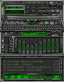
 rsp — Ultraviolet Winamp Skin

Published: 2002-01-10 20:34:04 +0000 UTC; Views: 892; Favourites: 3; Downloads: 306
Redirect to original
Description
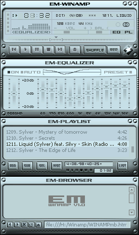
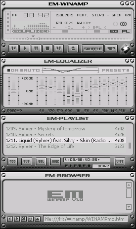
This was my second skin. I've created this one two years ago. I thought I could publish it here.It was done for UltravioletSounds.com . An australian band.
For more informations check out their website [link]
Related content


Comments: 16

skin looks really nice!
... maybe if you change that pink it would look better!
hey, it's samy! i won the award at the mtv-europe-awards ... respect!
👍: 0 ⏩: 0


well, nothing new, but very cool style on this on!!
joneonline.com
👍: 0 ⏩: 0

it looks like an old amp! all the skins looks like this for about 2 years ago.
nice job rsp.
> mikkeh.com
👍: 0 ⏩: 0

Could have been better...
.:THK:.
[:Beauty Resides Only in the Eye of the Beholder:]
👍: 0 ⏩: 0


It burns! it BURNS!!!!! AHHHHHHHHHHHHHHHHHHHHHHHHHHHH!!!!!
.:Jack-Dirt:.
Abduct a deviant!
follow this link for more info https://forum.deviantart.com/155555
We are eternal all this pain is an illusion.
TheARS Coming VERY SOON!
Its a swift kick in the ARSe!
http://engeluriel.tripod.com
👍: 0 ⏩: 0

Creative, Simple, and Deviant...
..:: DeviantFoob ::..
👍: 0 ⏩: 0

very nice and classic looking
its going into my cycle
The Darkest Realms Exist Within The Brightest Minds.
👍: 0 ⏩: 0

this aint my cup of tea, but the technique you used looks very good. Eq=very nice, and the trick with the sliders is cool too, like one whole lcd screen. very good work.
👍: 0 ⏩: 0

Very nice! I like it a lot, although the sharpness of the buttons isnt as sharp as it should be
-- Dredwerk
I love you all, appart from the ones I dont
👍: 0 ⏩: 0


That are the basic colors they want to have. So it must be!
[RSP]
👍: 0 ⏩: 0

I think it looks pretty good. The eq looks sweet, and it like the overall design, all I don't like is the few little purple texts and so on, but that's probably because I hate the color purple.
[-:s h a d o w f u r i:-:shadowfuri productions:-: http://www.shadowfuri.com/:-]
👍: 0 ⏩: 0