HOME | DD
 Ruffu — Draw This Again - Goodbye Angel
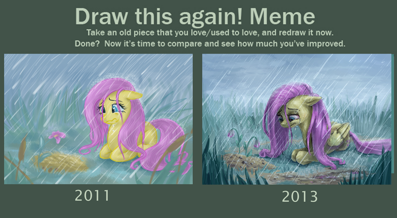
Published: 2013-11-14 20:18:43 +0000 UTC; Views: 5791; Favourites: 51; Downloads: 44
Redirect to original
Related content


Comments: 24

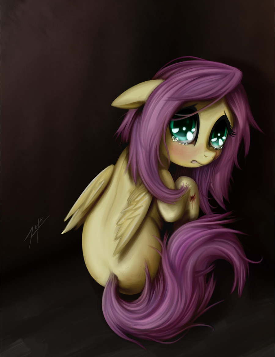
Really great progression! It's a really sad picture, which I assume you were going for, so great job!
👍: 0 ⏩: 0

I do agree that the 2013 version is a better work artistically but personally I prefer the older version.
The 2013 version just looks makes me sick.
👍: 0 ⏩: 1
just the way it is made.
Fluttershy just feels sick.
👍: 0 ⏩: 1

Oh, then in that case, I did my job right ^_^ That's what I kind of wanted the painting to feel like.
👍: 0 ⏩: 1
yeah, and I don't like that feeling.
👍: 0 ⏩: 0

wow what a huge improvement. Looking at the 2011 pic its hard to tell that's she is grieving for Angel. She looks sad but after losing such a close friend you would expect her to be devastated. Now the 2013 pic? Yea you freaking nailed it. Even the flowers on the grave look wilted and beaten down, well done sir
👍: 0 ⏩: 1
Thanks man ^_^ I learned a lot those past two years and continue to learn now. That what happens I guess when you're never satisfied with your work.
👍: 0 ⏩: 0

The 2013 version looks better in all ways but one for me. The shape of the head, the jawbone is too thin, also the nose could stand to be a little wide.
Atmosphere and style hands down goes to 2013!
👍: 0 ⏩: 0

I like the old one... the way you did the face in the newer one looks sort of weird.
👍: 0 ⏩: 0

i like the 2013 scenery and the 2011 fluttershy personally
👍: 0 ⏩: 1


I actually prefer the old one, the new one still looks good but I just think the old one is better.
👍: 0 ⏩: 0

Wow thats really inspiring!
I do have two questions though, do you draw out a base sketch first and, what sort of brush do you use if you do?
I have a lot of trouble with base sketching.
👍: 0 ⏩: 1
Thanks ")
With the base sketching part, you want to be quick and accurate. Just quickly draw whatever you want first then fix it up later. I mean, there's a lot more going on there but it'll be a good start.
👍: 0 ⏩: 1
Thank you so much for the advice!
👍: 0 ⏩: 1

well, the old one was more cutesy, but in a sort-of dark tone, the newer one just looks more of that darker tone, which i do quite like..also, hello, my name is dark, i live off of the interwebs. :c
👍: 0 ⏩: 1
Funny thing is that I wanted it to be dark the 1st time I painted it but I guess it came out cuter than what I wanted. The 2nd one is more what I had in mind when I was painting the 1st one.
👍: 0 ⏩: 1
while i do like dark paintings, and the theme of dark, depressing, ETC, i do quite enjoy something cute every once-in-awhile
👍: 0 ⏩: 0

