HOME | DD
 Ruth-Tay — The Two Captains Fight.

Published: 2006-08-23 01:28:19 +0000 UTC; Views: 4591; Favourites: 119; Downloads: 22
Redirect to original
Description
FULLVIEW PLEASE!As the sun comes up
They start to fight
full of fury
and dispite
Who will winn this battle
between these two?
I wonder who?
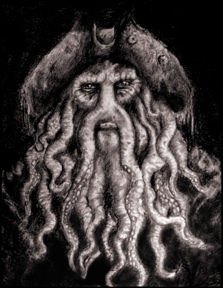
Yes I finnaly finished the second edition of the two captians. This is the fight between them.
As you can see they are more detailed en look more realistic. This took me about 16 hours to draw.
The upcoming sun is a great time for a battle as a upcoming sun is. It shows more emotion and it nice to see.
I'm even happier with this one than the first.
The third may be better... I have no idea.
The swords were difficult, I just coulden't figure out how to get them right.
The mouth of jack was really irritating! and i'm stil not really satisfied with it.
It's done on Ps Cs2 with the mouse. No lineart. About 20 layers.
Anyway I hope people like it and if you have any critics go ahaid and say it! I need some tips.
Greetzz Ruth.
Edit: I've made the swords more detailed and gave jack his gold theeth, I think it's better now.
Related content


Comments: 84

Oh, wow. The detail and colors in this are just amazing. I love it.
Great work!
👍: 0 ⏩: 0

thats super good. insane. you know normally the Jack's teeth or anyone's teeth when the are held together you can't see the bottom row (know what i mean), but it looks fitting here. i think the mouth looks great. sword are ok, but who cares about them the important part are the faces, and they look SPECTACULAR!
👍: 0 ⏩: 0


This'll probably happen in POTC3. I'm only saying that it might, but I'm not saying it will. Anyway, I always thought a sword fight was inevitable between those two.
👍: 0 ⏩: 0

It's great, but isn't Jone's sword a little short? Other than that, it's perfect.
👍: 0 ⏩: 0


The details are very impressive! looks like a thing who could happend in
pirates of the carribean 3

👍: 0 ⏩: 0

very very cool work! I like the blur of Jacks open hand, it makes the pic deeeeep^^
hmmm, the sabre-hand of Davey mayby a little bit bigger and rotate it more...
my english is very limited, sry^^ but I´m sure you handle this
again thats a verrry nice work
👍: 0 ⏩: 0

oh - wow... that's frickin awesome!! i'm definatly faving it!! no wonder it took you... 16 hours was it?
nice, great and awesome work!! ^-^
👍: 0 ⏩: 0


Oh man, this is gorgeous! I love the idea and the composition... the expressions are very well-done as well. *pokes Davy Jones's face* Damn, that's one pissed-off squidman!
👍: 0 ⏩: 0

That's so good! I love the faces! Great work.
I don't really believe the swords though... they look a little too fuzzy. But I like all the other fuzziness, it really enhanses the amazing detail in the faces!
👍: 0 ⏩: 0

Great job! I love Davy Jones' expression. Swords are a tough thing to do; these look pretty weathered, which is a good effect to capture, but they also seem kinda off... the closest analogy I can make is Davy's sword looks a little like the inside of a banana peel. 
")
👍: 0 ⏩: 0


I like davey jones in this. But jack seems a little sketchy, still really good though. My only real problem is that the teeth on jack are a bit out of places. What I mean by that is there maybe should be crease lines around the mouth/forhead, to show more...anger. I suggest you make the same face as him in the mirror, then note where the creases in your face and such are. Hmph. I dunno, I am sortof...an...experienced but not fully improved artist at the moment!
")
👍: 0 ⏩: 0

Looks great. quite advanced for 16  (Smile)")
(I love pirates!)
👍: 0 ⏩: 0

 (Wink)")


how do you get the rough skin texture? im goign to charcoal a real drawing of him
👍: 0 ⏩: 0


Great detail!!!
The sequil! Yaaaaaaaaaaaaay!!!
...now if PotC 2's sequil was only here, just as soon...
👍: 0 ⏩: 0


Whoa, Definatly one of the Best Potc fanart pics I've seen. And I've seen my fair share to be sure.
Davy looks especialy evil & awesome. Nice work!
👍: 0 ⏩: 0

OMGEE!! Love it, love it, LOVE IT!
I loved that movie so much...seeing this really made my day
👍: 0 ⏩: 0

this is great in full view. so detailed. nice shading and you've got their facial expressions real good. very good job.
👍: 0 ⏩: 0

This is incredible...You have an amazing eye for detail, not to mention a lot of patience!
The texture of the tentacles are incredible...
👍: 0 ⏩: 0


I love this one! The detail you put into it looks really good

👍: 0 ⏩: 0


That's... wonderful. 
👍: 0 ⏩: 0


Amazing texture and detail, expecially on Davey Jones. 
👍: 0 ⏩: 0

The swords and Jack's right hand seem a bit blurry in contrast to the crisp detail of the rest of the picture. You did a great job on Davy Jone's though, I love the insane amount of detail in his skin
👍: 0 ⏩: 0

the hands and arms are out of proportion to the head, watch that, the swords i think should be longer, and sparrow's face could be more expressive.
nice work on the octopus dude.
👍: 0 ⏩: 0

i like the detail on "cthulhu monster". i think the pirate's arm should be a bit higher, now it seems like it's comming out of his belly. however, it's really great job
👍: 0 ⏩: 0

You are indeed very talented, so just keep it up!
Got some few thoughts about this picture of yours:
*Do not blur Jack's right hand, destroys the perspective.
*Background (fires and such) gets kind of cliché, if you know what I mean.
*Do not blur the swords, would have been nice with the same detail here as on the faces.
*Nice detail on both faces, and generally good drawn! looks very good.
Good luck in the future!
👍: 0 ⏩: 0


I like it alot, but the edges around the two characters are a little rough, and the background doesn't match the two characters very well. Still, a 
👍: 0 ⏩: 0

amazing detail! great job, very well done and accurate.
👍: 0 ⏩: 0

That's wonderful, I haven't seen Pirates of the Caribbean related stuff in a while. I especially like the eyes, well done. All I would say about it, is to maybe make the swords look a little more metallic looking and not as smudged, but it looks great.

👍: 0 ⏩: 0

I'm already bissy with the swords, I'll edit this piece some time. nad jac mouth, I forgot his golden theeth!
stupid me!
👍: 0 ⏩: 0

I haven't seen the sequel yet but, damn, it looks awesome as seen from this one!
Jack looks sweet here. Heheh!
👍: 0 ⏩: 0

I love the detail in Jack's hair and the skin texture of Davey Jones. My only gripe is that the swords seem out of place-they seem a bit too blurry. Other than that, awesome job!
👍: 0 ⏩: 0

I like it. The details on the skin and hair are amazing. The only thing that could be changed is their eyes. To me, it doesn't look like they're looking at each other.
👍: 0 ⏩: 0

oo, very nice detailing on Davy Jones, but the mouth on Jack looks awkward where's his gold teeth? and his bottom teeth are sticking about a bit much.
👍: 0 ⏩: 0

Omg, this is really great! I really like the monsters face, especially his eyes.
Some feedback. Background: the under half is a bit to basic. It doesn't seem like fire, but more like clouds. Monsters hat: it looks a bit like an Afro haircut.
Jack's face: perhaps it need some more scruffyness, afterall, he IS fighting
Here's a link to a picture where you can see him from the side. It might help improve your art.
[link]
Anyway, well done.
👍: 0 ⏩: 0
| Next =>