HOME | DD
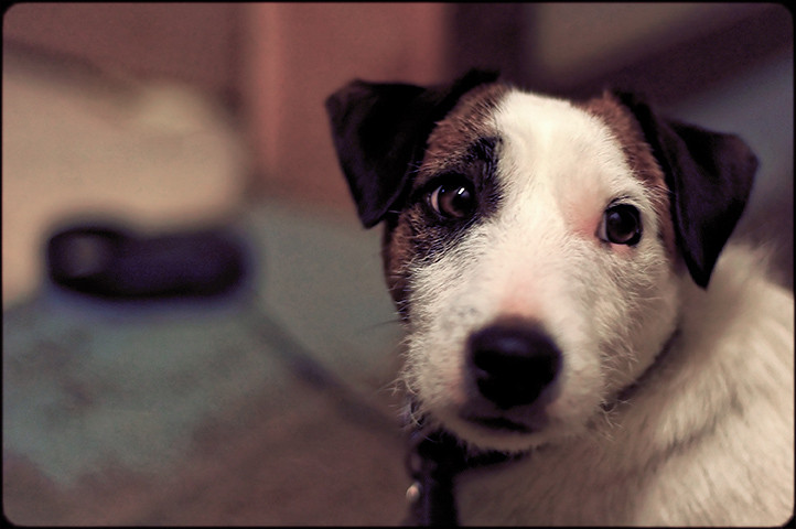
 rwallette — Look Out

Published: 2006-04-29 07:23:29 +0000 UTC; Views: 402; Favourites: 10; Downloads: 30
Redirect to original
Description
Kodak CX7300 3MP
So the majority definately liked the color over the B&W. I stopped counting at like 8-2.
Black and White version [link]
Re-cropped version [link]
Still kind of torn between which one I actually like better. the original or the re-cropped...
Related content


Comments: 39

i like this one better. i think the frame is cool. maybe yous dog's head is a little fuzzy...
👍: 0 ⏩: 1

")

I like this version best out of all  (Smile)")
👍: 0 ⏩: 1

hey hey nice pic, the boarder came otu quite nicely

👍: 0 ⏩: 1

Color works out a lot better then the B/W as goes the framing, which I really like!
👍: 0 ⏩: 1

I agree with theGhostrider - I like the b&w better. I think the old-photo look gives the picture more character : )
👍: 0 ⏩: 1

oh alright, thanks for the input
👍: 0 ⏩: 0

Good picture

👍: 0 ⏩: 1
ahhh someone likes my borders! lol
thank your for comment and for looking
👍: 0 ⏩: 0

very good presentation of the photo
👍: 0 ⏩: 2
since i didn't take the photo with more space on the left do you like it cropped something more like this --> [link] , or not?
👍: 0 ⏩: 0
thank you. I wish I had the camera pointed more to the left, but this is how I took it. He just moves so fast and my camera is so slow
thanks for the comment
")
👍: 0 ⏩: 0


lol you wish.... but you cant have him

👍: 0 ⏩: 1

Colour definitely. There's lots of nice subtleties in the colour of this pic which are lost on the b&w.
I like this shot. He's small and sweet looking but very heroic.
👍: 0 ⏩: 1
thank you, and thanks for the feedback

👍: 0 ⏩: 0

i like the color one better.
ok here is some advanced critique.
1) personally i like simple borders better, like solid white or solid black. i don't know about everyone else though
2) it definitely needs to be cropped. because diesel is looking left the open space in the picture should be to his left...not his right.
3) use some mad photoshop skillz and edit out that leash.....you can do it!!
")
👍: 0 ⏩: 1
ok so is this what you mean? I did do anything to the leash yet just cropping.
[link]
👍: 0 ⏩: 0

I love the color version! It is so vibrant it reminds me of a movie.
👍: 0 ⏩: 1
👍: 0 ⏩: 0

You have been nominated for our monthly feature called: Sharin' the Spotlight! Which means a thumbnail of your artwork could be in our journal for an entire month 

(Don't wish to have your art displayed in our feature? Just reply to this comment saying so. Thanks!)
👍: 0 ⏩: 1
woh sweet. thank you
👍: 0 ⏩: 0

I may be crazy, but I like the b&w, it gives it a timeless almost classic look. They are both really great though.
👍: 0 ⏩: 1


 (Wink)")
thank you.
that's 3 for color; zero for b/w
👍: 0 ⏩: 0

I like the color better, the black and white makes it look really grainy.
Very heroic looking shot. Great job.
👍: 0 ⏩: 2

Whats with that you never counted my vote!! Whatever I like the sig
👍: 0 ⏩: 0
AH ok 1 for the color...
(actually 2 counting my wife ")
thanks for looking!
👍: 0 ⏩: 1