HOME | DD
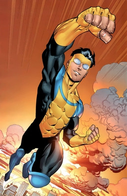
 RyanOttley — Invincible poster

Published: 2006-09-22 22:16:26 +0000 UTC; Views: 33654; Favourites: 855; Downloads: 901
Redirect to original
Description
This big splash is a POSTER, our first one, WOOOOOOOOOOO! It was a tuff one to do, quite time-consuming. I worked on it off and on for a couple weeks so I'm not sure EXACTLY how long it took me. I put my ALL into it so I hope you guys dig it. Colors by Bill Crabtree.WyA
Related content


Comments: 192

👍: 0 ⏩: 0

"hope you guys like it"
Now stop and take a minute tae think how someone can NOT like it!
👍: 0 ⏩: 0


Thank you for letting us feature your Amazing work!
👍: 0 ⏩: 0


Out-Standing perspective and style such awesome detail and Bill Crabtree Awesome job!!
👍: 0 ⏩: 0


Who do I have to kill or kiss (please not Kirkman, please not Kirkman) in order to get a desktop-sized version for my computer?
👍: 0 ⏩: 0

This drawing is on the cover of my reader from school (grafisch lyceum rotterdam)
Did they ask you?
👍: 0 ⏩: 1

Really? What exactly is a reader?
👍: 0 ⏩: 1
It's like... a small book, used for teaching material. It's not being sold as a book, it's just printable for every student here. But it IS buyable at school for like... a few Euro's. For people who are too lazy to print it themselves.
Your drawing isn't used for the teaching material itself, just for the cover of the reader. I thought, as a school of art, they would have asked you at least.
You can download the reader here (it's Dutch tho): [link]
Oh, and by the way... Your stuff is really sweet  (Smile)")

👍: 0 ⏩: 0

Man the details in this piece are mind blowing. This is an awesome monument to all the work you've done for the series. I wish I could buy it! I bow in respect and admiration Mr. Ottley.
👍: 0 ⏩: 0


I really like the pose and perspective of this one, looks awesome.
👍: 0 ⏩: 0


holy muther of GOD. that city scape is something i could never imagine!
👍: 0 ⏩: 0

It looks like you showcased what you're made of admirably.

👍: 0 ⏩: 0


this picture is so good it makes me not want to draw anymore, the proportions and perspective are so good i get sick to my stomach... kick ass work man this is rediculous!!!
👍: 0 ⏩: 0

great perspective and shot. the city backdrop looks great. must have taken awhile.
👍: 0 ⏩: 0


👍: 0 ⏩: 1
Read issue 36 to find out.
 (Wink)")
👍: 0 ⏩: 1
....

👍: 0 ⏩: 1
No thanks. I'll take a hot cocoa though.
👍: 0 ⏩: 1


Awesome, you can really feel the height. A lot of flying pictures don't do that.
👍: 0 ⏩: 0

I love the perspective in this drawing. it gives it so much life.
")
👍: 0 ⏩: 0


good work man, wish you were headin to philly this year so i could cop a signed piece, bleh
👍: 0 ⏩: 0
dam, the copy of this image i have is a lot more flat, this one is so much more rendered and alive! I wish it were bigger to replace the one i already have as my wallpaper!
👍: 0 ⏩: 1
Yeah the flat version was a double page spread in issue 36. The rendered version is the poster.
👍: 0 ⏩: 0

Did you create INVINCIBLE...?!
i thinks his a way cool character..
All the time you took is worth it..!!
This looks so AMAZING..!!
GREAT WORK..!!
👍: 0 ⏩: 1
Robert Kirkman and Cory walker created him, I am the current artist for Invincible, over 3 years now.
👍: 0 ⏩: 1
ah...Best of luck with this project..!!
you do a great job..!!
👍: 0 ⏩: 0

Wow is that ever awesome...
I love the background.. the detail work... I don't know if I could ever have the patience for all of that! 'Specially with all the buildings farther off in the distance...
So perfect it's scary.
👍: 0 ⏩: 0

It's on 2 pieces of bristol board butted up together, so total it is 22x17.
👍: 0 ⏩: 0


ooP.S. great colour work Mr Crabtree, especially the skin tone ; )
👍: 0 ⏩: 0
Fantastic Linemanship...great sense of perspective, distance and height...city detail is fantastic and to me is the main character, for want of a better word
👍: 0 ⏩: 0

| Next =>