HOME | DD
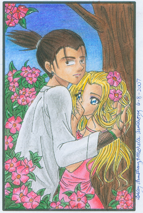
 Ryoko-and-Yami — Shikaino: Embracing a Flower
Published: 2007-06-10 00:45:07 +0000 UTC; Views: 4592; Favourites: 187; Downloads: 51
Redirect to original
Description
Ryoko and Yami:I took this pose from Meru Puri v. 3. It's just so cute! I really like how Yami drew Shikamaru and I like Ino, but I keep thinking her eyes are too far apart! >_< I like the little flowers. I drew them on it in APCP class. I colored it with color pencils. I'm trying to improve at blending and shading.
Tools:
copic ink pens, white ink, color pencils
Related content


Comments: 54


This is absolutely beautiful! I especially like the way you drew Ino's hair; very exotic.

👍: 0 ⏩: 0

8D that looks liek one piece mixed with Kodocha animation *8*
👍: 0 ⏩: 0

i was lookin at random shikaino piccies...and i was like "woah....merupuri much?" i absolutly LOVE that series and vampire knight series
--
A TRIBUTE TO ZERO KIRYU OF VAMPIRE KNIGHT! (he's hawt!):
Blood tablets ....
they won't help him...
only her blood he will drink...
the one girl he loves....
only she can tame him.....
yuki....
👍: 0 ⏩: 1

Yeah I looked at that picture for reference
👍: 0 ⏩: 1
lols matsuri hino is the best!!
👍: 0 ⏩: 0


LOVES IT!! i think it looks... GREAT!! i am a 100% ShikaIno fan and your drawing skills are A oh kay in my book!!
👍: 0 ⏩: 1

Shika looks a bit weird, but besides that, good job!
👍: 0 ⏩: 1

lol love the pic u did an awsome job, colorpencils
👍: 0 ⏩: 1
...ok...im making the keyblade
👍: 0 ⏩: 0

sweet!! ^^ you guys decided not to put the shiruken or something?
👍: 0 ⏩: 1
lol yeah. Thought it ruin the mood and I was lazy....
👍: 0 ⏩: 1
well i guess it was a good decision.....the flowers make it "graceful"...!
👍: 0 ⏩: 0

Its cute, improvements could be further made though, but still great job!  (Smile)")
👍: 0 ⏩: 1
Thanks. yeah, I see my mistakes! >.<
👍: 0 ⏩: 0


awwww :3 I think its nice that you two realy does the art together^^
👍: 0 ⏩: 1


so cute. shikaino is so much better then shikauglymanwoman.
👍: 0 ⏩: 1
Uh, thanks. I kinda like shikatema too though...
👍: 0 ⏩: 0


wow, this is really good...as always! lol the title fits shikaino so well! and i love how ino's hair was done. it is so cute wavy like that!
oh, and btw, i think the spacing of ino's eyes is fine! with that angle, and looking at the eyes of a regular person compared with the eyes of regular anime/manga people's eyes, i think it is fine!
well, great pic!
👍: 0 ⏩: 1
Thanks so much! : )
👍: 0 ⏩: 1
you're welcome!
👍: 0 ⏩: 0

For color pencils, you don't use a darker color of the same shade.
:] Instead, you use the complimentary color. Color theories work in paint as well as color pencils. Take for example my color pencil pic....(insertlinkherelater). For the blanket, I use red a prime color, then to make it darker, I add green, then red, then green, till we get to a point where you get a pretty dark brown. For intense shade, you'd add A TINY BIIIITTT of black. :]
For white, you add first a blue, light blue, like a REALLY SMALL LAYER of it. Then you'd add grays, then blues, then gray :] Till you get to the same effect as the red and greens did.
👍: 0 ⏩: 1
Don't make fun of my horrible color skills. My art teacher told me to use darker colors and blend and stuff. Like add a brownish red then black to make the colors warm.
👍: 0 ⏩: 1
OwO;;;;; Your art teacher doesn't use color theory...?
👍: 0 ⏩: 1
Well he never mentioned that before. O.o
👍: 0 ⏩: 1
O.o;;; Color theory is um:
-The mixing of colors using the primary and secondary colors.
-Using the complimentary colors to create shades/depth
-Using white to create lighter colors
..........>W<;;; It's a lot more smart sounding...but I just can't remember most of it. LOL
👍: 0 ⏩: 1
I used it in painting!
👍: 0 ⏩: 0

i love it i love it it goes under my shikaino collection cause i just love shika ino!
👍: 0 ⏩: 1

This is really good! I don't see anything wrong with the eyes. I'm not very good at eye placement, though.
👍: 0 ⏩: 1
You're welcome, it's really good!
👍: 0 ⏩: 0

shika's head looks a bit too round, but it's still a lobely picture, love ino's hair
👍: 0 ⏩: 1
really...? Thanks though
👍: 0 ⏩: 0


| Next =>