HOME | DD
 ryoung — Harmony

Published: 2004-10-21 08:18:36 +0000 UTC; Views: 16489; Favourites: 266; Downloads: 106
Redirect to original
Description
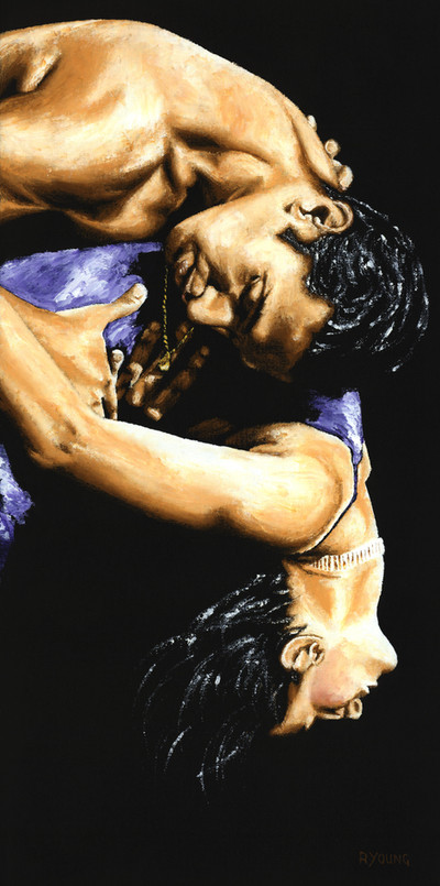
65 cm x 50 cm pastel on 360 gsm 'toothy' black cardThere's many more figurative, dance and portrait fine art original oil paintings, pastels and signed gicleé prints on my website: R Young Art
Re-uploaded and made available as prints following requests.
Related content


Comments: 31

Just noticed this one's also yours. fc05.deviantart.net/fs71/f/201…
(Sorry for raping your beautiful artworks a little, I needed certain colours in my game...)
👍: 0 ⏩: 1

It's OK as long as there's no commercial use
👍: 0 ⏩: 0
Hey there. I edited this to put it in my Sims 2 game (as a painting to hang to the wall). Do you have a problem with me uploading that file for others to download on modthesims.com?
fc06.deviantart.net/fs70/f/201…
👍: 0 ⏩: 1
It's OK as long as there's no commercial use...
👍: 0 ⏩: 0


Wo-ow.
You know, it's strange because the concept, the idea of this picture is supposed to be like burning flames, but at the same time there is a very contrasting smoothness present.
Very lovely use of lines.
The title fits this piece very well.
👍: 0 ⏩: 0

Hi there !
I featured this beautiful piece in my newest journal : [link]

👍: 0 ⏩: 0

 (Smile)")


Wow, excellent work, I really love the colour, so warm and erotically .

👍: 0 ⏩: 0

 (Wink)")

ohhh... I don't know what to be jealous of first, this woman or your talent...
👍: 0 ⏩: 0

")
👍: 0 ⏩: 0

this is incredible. it conveys so much emotion that it makes my chest hurt just looking at it. [which is a good thing]
👍: 0 ⏩: 0


This is one of the most beautiful drawings I have ever seen in a long, long time... O_O
👍: 0 ⏩: 0

beautiful peice i love the contrast and defininition. its soooo good!
👍: 0 ⏩: 1

wow, fantastic! i personally cant use pastels like that and this makes me really wish i could! the monochrome colour scheme works brilliantly!
👍: 0 ⏩: 1

wow. This is absolutely beautiful. The intimacy and passion is displayed not only though the body posiitons and her expressions but its carried through the wrinkles in the sheets and her splayed fingers.. i love this. your gallery is amazing.

👍: 0 ⏩: 1
Thx Eugen. If you use the very 'toothy' type that i usually use, be very carefuly of marks and smudges. Even the slightest finger print can show. I use a light fixative afterwards, before framing, though it doesn't protect against rough handling. Good luck and let me know when you post one in your gallery. Best wishes.
👍: 0 ⏩: 1

Thank you for the advice. As soon as I have one picture I´ll let you know.
👍: 0 ⏩: 0
