HOME | DD
 ryuumajin — Which one do you like better
Published: 2007-10-25 01:26:40 +0000 UTC; Views: 906; Favourites: 23; Downloads: 13
Redirect to original
Description
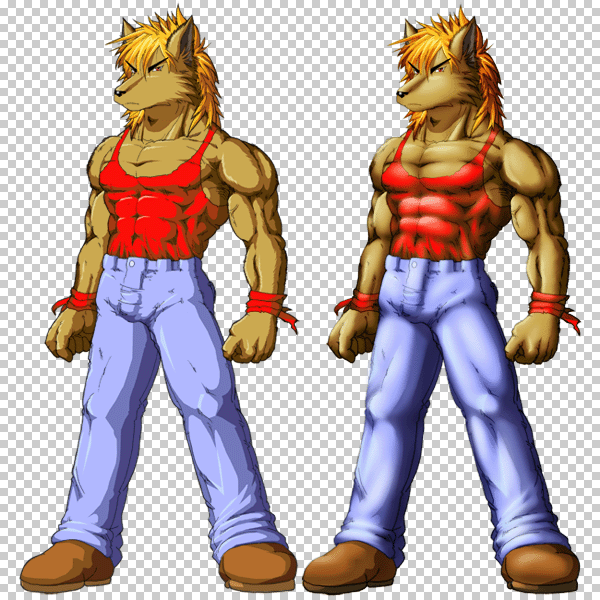
... 'thanks' to how we could do and UNdo Photochopping, sometimes it takes me back to the hardest choice...I still feel like wanna stick on the full cell-shading. It just looks extremely catchy and eighty, showing what you just are, no pretending, but on the other side, I found some burn-dodge touch in the continuance just... looks extravagantly smooth , elegant, artistically addictive, risky yet FUN sometimes.
And it eventually takes me back to the square zero. Which one you like better? Now it's up to YOU, not me.
Related content


Comments: 27

They both look awesome to me, but the one on the right looks just a bit better to me.
👍: 0 ⏩: 0


Well the second one, the one on the right, looks better, more detailed, but the one on the left is... it's just more your style that I've come to know and absolutely adore <3
👍: 0 ⏩: 0


Hmmm, so to me likes both although ..., the left is for me is like in the Anime style and the rights is like in Comic style.
Of the rights likes me best of all!
👍: 0 ⏩: 0

its all about personal taste me thinks. And as the non blurred version looks more crisp the ohther is smoother, but on the same time more plastic looking. Hmm I have a hard time to pick a favorite here.
Very well drawn muschles and such tho!
👍: 0 ⏩: 0


Quite the best way to assure me! 
👍: 0 ⏩: 0


Are you aiming for a high-action anime style comic or contemporary/modern approach? LEFT suits the clean anime-style comic, but RIGHT aims for suitably a more realistic comic. But I see you like anime style more than realism type, so LEFT might work for you, though I see so far, that more people like RIGHT more than LEFT.
👍: 0 ⏩: 0


It really depends on the overall stuff including background or stuff.
👍: 0 ⏩: 0

The first looks more animeish, the second more from a videogame... i prefer the first one ^^
👍: 0 ⏩: 0

mmmmmmmmmm i think the right one, likes the shading ^^
👍: 0 ⏩: 0

I think the right looks a lot better overall, but depending on the style you want, the left could be very fitting.
👍: 0 ⏩: 0


I like old-schoolesque things. I prefer the left. It has the style of drawing I like. Cell shading can make drawings look too... manufactured. Like you personally didn't draw them, but you let the computer draw them for you. Just my opinion.
I think the right is too shiny. The shadows for it look awesome, but if you end up going that way, I'd tone down the shine a bit. Makes him look a bit strange to me.
Also, I think the neckline on his shirt may be a little low. I think it makes his pants look like they ride too high. Maybe you could move it up a bit?
Either way you choose, it looks really cool! (Though my vote is for the left.)
👍: 0 ⏩: 0

")

Gah! I meant the one on the RIGHT! >.<
The one with burn-dodge.
Oh, and I also noticed you wanted an advanced critique.
I would have given him more thigh and less calves. He's almost all lower-leg!
His deltoid is big, but normal for a "buff" character. Sadly, it's so bulky that it seems to have "pushed" the bicep downwards. The bicep should be "connected" to the pectorals. I'm also curious to why you lumped the tricep in such a way that it has two humps.
Finally, the Sternocleidomastodeus muscles (the V-shaped ones on the neck) should meet in the center. You have yours spread out on the clavicle.
I would also try and give your characters more detail on the face. You see, you're doing wonderfully with so many muscle details, but the face has the same cartoony simplistic design that may end up having the drawing feel like TWO styles instead of one.
It's fine the way it is right now, but I'd consider adding little things like lips, maybe some shadows on the cheekbones, etc. Kind of like how you shaded the "bridge" of his nose.
I hope that critique enough for you!
👍: 0 ⏩: 0
Go for the one on the left without a doubt. The burn shading smooths it all out like real shadows would. It makes the character look more realistic and three-dimensional. Plus, it looks much more elaborate, which shows how much time you put into it.
Now, I have to ask two questions: Which one do YOU like the most?
and..
Got any tutorials on how to actually DO it. I'd like to try it, too.
👍: 0 ⏩: 0


I have to say, the one on the right, the shaded, looks great to me. Not saying anything against your skill,,which is infinately greater than mine, but the left looks to be cartoony, more something you'd find in the older cartoons. Something in me loves the right one  (Smile)")
👍: 0 ⏩: 0


Seeing that I CANT do cell shading... there is some kind of mental block as to doing it for some reason, i like the one on the right
👍: 0 ⏩: 0