HOME | DD
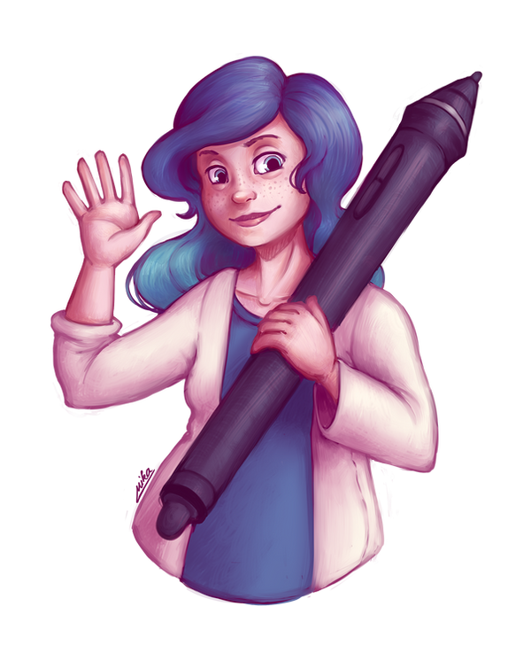
 Ryuutsu — Smile in the age of worry.
Published: 2016-02-02 00:30:55 +0000 UTC; Views: 460; Favourites: 15; Downloads: 0
Redirect to original
Description
I needed a new dA ID")
Related content


Comments: 9


 (Smile)")

I'm alright, thank you! Pretty busy
👍: 0 ⏩: 1

Same here
Got some pretty silly essays to write XD
One of them is so confusing that me and my lassmates can't even recall its name in a casual conversation ;D
👍: 0 ⏩: 0

Heyo!
I saw you posted on FB Level Up! Instead of joining the 'wtf left vs. right' train there, I figured it'll make a better use if I leave a comment here. So, what we do, is a comparison of the previous one to this one. We're figuring out your level upping....
OK, maybe I'll have to say first, that I actually do like the older pic better than the new one, too. Though, your skill improvement is noticable in the next one (but just barely), I'd say it feels like you were bolder back then. The old pic bears a better atmosphere, but that's the least of the matter. Posing of the character - erm, yourself.. - it feels more natural in the old one. The same goes for colours. And the shading... It's not that everything is wrong with the new one, I'm simply guessing that you have put a lot more thought and time into making the last ID, comparing to this one.
It's just a guess, but I have a slight feeling that you gave in to the tumblr colour palette.. not that I'd actually follow tumbrl, but there's that one thing that seems to go with all the artists who use 'tumblr' word when posting anything.. it's this obligatory magenta. Why? Magenta is just one 6th of the spectrum, roughly - i mean generously - said, and that's the one colour all the artists pick? Who even wants to eat the same flavour of an ice cream all the time?? OK, ok,... back to the real thing....
You pushing it, to post it before you go to sleep is maybe the most obvious on the clothes. THere are literally no shadows anywhere. It's just ambient occlusion. Barely just a slight glimpse of light coming from the right. Because highlights.. oh, while we're at the highlights....
You did improvement on the colour side in your drawings, aside from the "make it red (and okay maybe blue)!" mantra that you're enforcing lately. What you seem to neglect (more and more actually) is thinking about materials. Just to make sure it's not just my lack of observation, I copied your ID into the photoshop and dropped saturation all the way down. No doubt, anymore, everything - really, everything, except for the eyes - is made of the same material. Rubber. The skin. The clothes. The Wacom pen. Even the hair... If it wasn't for the colours, that you seem to almost master by now... there's no telling of material. Let's take the pen, for the starts. You're holding it in your hand every day, I'm sure you know what's the difference between the rubber and the solid polished plastic, so I won't go into the glosiness matter. You certainly know how to make something glossy, because you know how to draw eyes.
Fabric, clothes.. The wrinkles you've drawn on this one are merely symbolic, fitting for a comic, yes, but not for the ID drawing that is supposed to represent yourself. You did some neat fabric foldings before - like Paurelie's scarf, or (not as good, but better than here) First Snowfall - although I'll honestly say that I'm getting a slight feeling that you're not really thinking about the folding, but rather cheating by understanding the 'rules'. For now, benefit of the doubt it is, because you can't always get away with cheating.
And then, okay, the hair - dampening down all the highlights makes for the same effect as elsewhere, but slightly less devastating. instead of rubber, it just makes it look like it's hair made of rubber.
Comparing this one to other deviations you made, the biggest disappointment here are the hands. You know how to draw them, but you decided not to bother much with them here. It's kinda sad, thinking about how much attention they pull. The last ID also did a lot better job, and most of the recent deviations battle this well, too.
Okay, that's by far the most flaming I ever did on - probably - any deviation, especially yours.
Don't take it all so bad. Frankly, here's a dump of everything I ever complained about your deviations. Neglecting material behaviour and generic posing for the most part. But what I'm kinda disappointed now is, that you seem to believe you found some sort of a perfect formula that everybody like, and hold onto it... however, taking a second look, things are getting a tad better.
Chimer Vesta, Cassian Noire and Stalker's blade are some deviations, that are bringing some new wind into your workflow, and I'm very excited about it. They are still very portrait-ish, meaning they tell no story aside from the clothes, but it's probably not even their intention.
Bottom line, I'm not sure, if I told you anything new... most of the complaints I've alredy told in your previous works, so I might start to consider it as a part of your stlye. On the other hand, I do believe, that in order to successfully roll with a style, you absolutely need to display a mastery of the things I've listed, and it may not even be all of it.
You know.. one needs to push further, in order to avoid going back.
And, as with all my comments - It's all up to you, how you take them. However, this time, I'll ask you to at least give it a try. You do a lot of drawing lately and I'm very happy that you do! So, please, sacrifice one of your painting, and implement just these two things that I listed. Instead of making a pretty picture, dedicate it to exploring some weird bullshit people told you to do (hoping I'm not the only one bitching over your art).
Thanks for reading it all the way... x) Much luv, Dex
👍: 0 ⏩: 1
Thanks for the critique! You make some very valid points that I am/will be working on some more for sure. I absolutely agree regarding materials, lack of certain shadows, and perhaps the overuse of a similar color scheme.
However, there are some things I do want to clarify though, more for the sake of having my personal viewpoint out there, than anything else: the magenta & the 'perfect formula' are not me going with something that everyone/tumblr likes, but are my personal choice. I've done a lot (and I really mean a lot, my sketchbooks are filled with it
Thank you for the extensive feedback, I will definitely keep your points in mind!
👍: 0 ⏩: 0