HOME | DD
 s00laco — Magdalena sub for contest
Published: 2003-08-29 05:50:06 +0000 UTC; Views: 4977; Favourites: 29; Downloads: 311
Redirect to original
Description
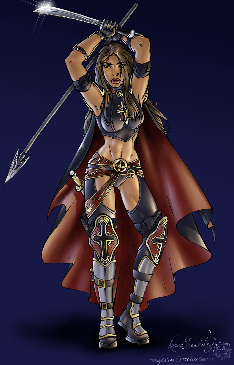
Okay, here's my second submission for 's coloring contest. I actually finished this one before the other one, so I had more time to get this one done. Overall I'm happy with the way it turned out. I had a lot of fun working out all the shadows and lighting angles etc. with this one and I think it rendered out the surfaces pretty okay! (Smile)")
c&c's welcome and appreciated.
Magdalena (c) Top Cow
Lineart (c) Diana Greenhalgh
colors (c) Nolan Holladay
Related content


Comments: 29


The lighting in this is awesome, especially the sword and te left thigh, with the muscle and light play there...
👍: 0 ⏩: 0


Those are some LONG REALLY LONG comments lol gotta read them later (*working on furrie pic right now ")
AH! I love this pic! Mag rocks! ")
*is very busy x.x*
👍: 0 ⏩: 0

trixy!!!!!
only gripe is perhaps some of the pink lighting is too blotched (in a random sense)

👍: 0 ⏩: 1

Pink lighting! where is there pink lighting!? heh.. you referring to my main light from the lower right? I'd assume so since that's the blotchiest that I can see.. yes this was a problem I was struggling with.. it's that damn airbrush! I was stroking with it, instead of just letting it sit there (with a large brush size) and it was wierd, because I could have sworn that before the airbrush was always smooth, even when painting strokes.. and now it was just going all blotchy on me, really pissed me off... so don't know if something changed, or if I just never noticed before.. only way I know of how to fix this prob, and it seems to be only a fix per brush size.. is to change the spacing % for the brush down to something really small so it's stroking the brush more often in a shorter space.. that's the only way I seem to be able to smooth it out now.
You seem to use airbrush exclusively, or mostly at least in your pics... got any pointers with your experience? (using PS 6)
👍: 0 ⏩: 2
heheh... masking.. my best friend.. especially quickmask... it's probably the one thing I use more than even paints! you HAVE to use it when doing comic style coloring... it'd be absolutely impossible.. (okay, NOTHING'S impossible, but it would be rediculous to say the least!) any other way!
When doing this style of coloring like I've done on Magdalena... the first half of the amount of time taken up working on the pic is setting up the masking areas... otherwise known as 'flatting' your image. (or flattening, I always forget which it is)
Also... those hard edged highlights you see on Magdalena's legs as well as the quite defined muscle area on her leg on the right on the inner thigh... would be a lot harder to achieve without masking!
As for layers, that's how I keep my black lineart seperated from the colors... (until the end when I need to do some FX that will sit over the top of the lines) also at the end I'll do most FX in a seperate layer over the lineart.
I've learned from comments and tutorials given by some pro's that if you use much more layers than this, it'll eat up a lot more memory and the file size is much larger... so that's another reason for taking the time to set up the masking areas of the picture to start with, so you don't have to use seperate layers for each area of the pic.
I'll be doing a tutorial here very soon.. it'll take me a few weeks I think... because I'll just be doing it part time; and it'll be showing how all of this is done.
Thanx for the help with the airbrush, much appreciated!!
👍: 0 ⏩: 0
yae!!!!! set the spaceing to zero, then as a result of the new harder overlay of 'dabs' u lower ur opacity.. to say 40
which would give u the same opacity and richness of application of a spacing of 13-14 and opacity of 80
haev u tried marqueeing the affected area? what about masking or layers? (ive never touched mask much .. i hear its most useful!!!!! only used it once or twice.. the ngave up on it lol)
👍: 0 ⏩: 0

Amazing coloring. It really works well. U have certainly paid attention to the detail on the coloring. Would look really good on the front of a comic/magazine.
👍: 0 ⏩: 0

Detailed lesson, I am in your debt! ^^ :
👍: 0 ⏩: 1
heheh no worries... now I wanna see where yer gonna go armed with these new tools!
")
👍: 0 ⏩: 0
Whoa, GREAT pic, I love the highlights and coloring on the skin, and yes xD those pretty flares on the sword are absolutely spiffy! I'd love to learn more on it if you'd be willing to point me in the right direction. By the way, I adore the knee armor, nice design.
👍: 0 ⏩: 1
heh, well you can thank whoever designed Magdalena for Top Cow comics for creating the armor, and you can thank for drawing the picture.. my only hand in it was the coloring of it.
Basically to get those flares, it's a heckuvva lot simpler than you'd think at first....
first, you need to know how to use layers.. (what I explain here is pretty basic anyway, so it's not that hard to do even if you've never used layers before)
Just make a new layer on top of everything else first, and then for each flare you want, make a new layer, that way you can move around each layer/flare seperately from eachother so you can get it exactly how you want it. This is also so you can rotate your flares, as you don't want 'em exactly straight up and down all the time.
the trick is in using very very skinny masks... use the rectangle mask, draw a very very skinny virtical rectangle.. (only a couple to 3 pixels wide) and then after that, while holding down shift ((on the PC anyway)) draw a skinny horizontal mask that intersects that first one like a cross. Holding down shift will add the second rectangle to the first one instead of starting a whole new one. Now you should have a mask in the shape of a cross... both the virtical and horizontal should be very skinny only about 2-3 pixels, or only 1-2 pixels if you're making them pretty small on a smallish picture, while both should be quite long-ish... (like, bigger than the actual area you want the flare to cover).
Now grab your airbrush.. make it have a very low pressure as we only want to add just a hint of color.. not an ugly abrupt splash of it.... make your airbrush size quite large. Here's part of the trick.. instead of painting normally with the airbrush.. change the airbrush's 'mode' (as photoshop has the option labeled) from 'normal' to 'screen' (it's a dropdown box, so just click 'normal' and go down the dropdown menu 'n select 'screen' just under 'multiply')
So now that your airbrush isn't painting just normal paint... when it's set to screen, it's like painting with light! So... select the color you want the light to be... you were using near pure white in your picture, I'd suggest a very light blue, but just enough blue so that it can show through a little bit... 'screen' makes it much lighter than the actual color you choose since it acts almost like light....
Now's where the magic starts to happen... put your airbrush in the center of the mask cross you just made... and let out just enough color til it's where you like it. What I do is I'll do it with the brush size rather largish to start with, and only apply just a faint amount of color, and then I'll make the brush about half that size.. and apply a bit more color so that it makes it look hotter/brighter towards the center without making the outter areas too bright which looks ordinary and bland if you were to do it with just the one brush size.
You'll notice the color only shows up within the masked cross area, creating the four pointed lense flare effect you're looking for. Then what I do is de-select the mask... completely getting rid of it, change to a brighter color, or white itself, and make the brush size just slightly smaller, and just paint a soft little glow at the center of the flare so it doesn't have a harsh center, and it also appears to glow more when you do this as well... it doesn't take a lot either.
I've never done the ring around the flare that you'd painted in your picture, but the way I'd do it is start with the ring, or make it completely seperate from the cross.... and the way to make it is to select the circular/oval mask tool, while using this tool, click in the exact center of where you want your ring to be and start dragging. You'll notice it's an oval first, and it's also not centered around where you clicked either.. don't worry about that.. because now you hold down shift, and alt (on the PC) and it'll both turn the selection outline into a perfect circle, and it'll also make it centered around where you clicked. Make it the size you want, 'n then let go of the mouse button before you take your other hand off the shift and alt keys. This is the outer edge of the ring... now you make the inner edge of the ring by clicking in the exact same spot you did to make the outter one, but first hold down alt before you click.. this will subtract this second circle you make, from the first one.. then while still holding the mouse button down and dragging to make an oval... let go of alt, then hold down shift, and while holding shift hold down alt again.. (it's necessary to hold alt before starting the second circle, once it's started, let go, and then hold it down again with shift to make the second oval a circle 'n keep it centered around where you clicked) Make this second circle just smaller than the first circle.. creating a ring! voila, a near perfect ring! (it'd only be perfect if you were able to click on the exact same pixel you clicked on when you drew the first circle.. but that's okay, imperfect rings look better anyway!)
I know I said above that I've never made one of these before, but I just made one now in photoshop and it works exactly as I've explained so it's cool...
Now paint it whatever color you want with whatever tool you want, paintbucket, airbrush (best choice as you can color in only parts of it, making it look like only parts of the ring are showing.. makes it a little more sparkly looking I think) use yer imagination, I'm sure you can come up with some pretty unique FX!! Once you've made one, you can copy a layer and keep pasting new copies of that layer around so you end up with a whole bunch of 'em... 'n when you get your picture how you want, just flatten all those layers so they don't get in your way anymore. (might be a good idea to flatten all of 'em except for the original so you'll always have it to copy if you need more later)
If you don't know how to move your layers around, or rotate them... I'd be happy to explain that too. Just drop me a line 'n let me know.
👍: 0 ⏩: 0

[A loud explosion from the background] I'm such a ditz... Lol... I had no idea what Magdalena's colours were (lol). You have such great colours, it's stunnning. Really, well deserved. Beautifully coloured and the lighting is fantastic!
👍: 0 ⏩: 0

awyeah .. I like the lighting on that one
👍: 0 ⏩: 0

*gasps!* This be the first Mag drawing ive seen on Deviant, very well represented. I espesh love the belt buckle and knee pads. That cape really does it for me too *drools*
👍: 0 ⏩: 0


You should be.
I honsestly haven't got a clue why this piece didn't place before me. The shading is crystal-clear and all the lightsources all check out fine.
👍: 0 ⏩: 2

The final decisions were made by amalgamating the list compiled by EACH of the THREE judges. So we put them all side by side and looked at where everyone was placed, and depending on where they were on the lists meant which place they'd be in at the end. And both you (Nolan) and Kalle were right there in two of the three lists. Does that explain it?
Later!
Diana
👍: 0 ⏩: 0
Hey, don't sell yourself short... I like your work too because you do nice smooth airbrushes... whereas I sometimes tend to overkill with the gradient cuts a bit in some parts... instead of leaving them for just highlights here 'n there
👍: 0 ⏩: 0

really awesome drawing
👍: 0 ⏩: 0


LOL those lil faces always crack me up...
sure you've got more to say than just that! lol
👍: 0 ⏩: 1

ok ok
both the drawing and coloring are exquisite, they are crylstal clear, sharp, clean and VERY professional!
with that kind of quality I would buy a comic that you did in a heartbeat (given the storyline was any good of course ^_~)
👍: 0 ⏩: 2
oh, 'n one other thing.. I must give credit where credit is due.. if you read the bottom of my description of the picture, you'll note the lineart is not mine.. it was done by who really does deserve a lot of credit for how clean her work is.. it's very open too, which makes it a lot easier for coloring!
👍: 0 ⏩: 0
heh, well thank you for your kind words... I'd love to be able to get good enough to do comics or something similar professionaly.. my current problem is I'm taking ages on just one pic at a time... but I'm workin' on it, and some of my speed problem is due to me still learning new techniques, or sorting out how to do certain tricks etc..
👍: 0 ⏩: 0