HOME | DD
 saevuswinds — Shadows on the Line
by-nc-nd
saevuswinds — Shadows on the Line
by-nc-nd

Published: 2011-12-24 18:48:02 +0000 UTC; Views: 721; Favourites: 16; Downloads: 17
Redirect to original
Description
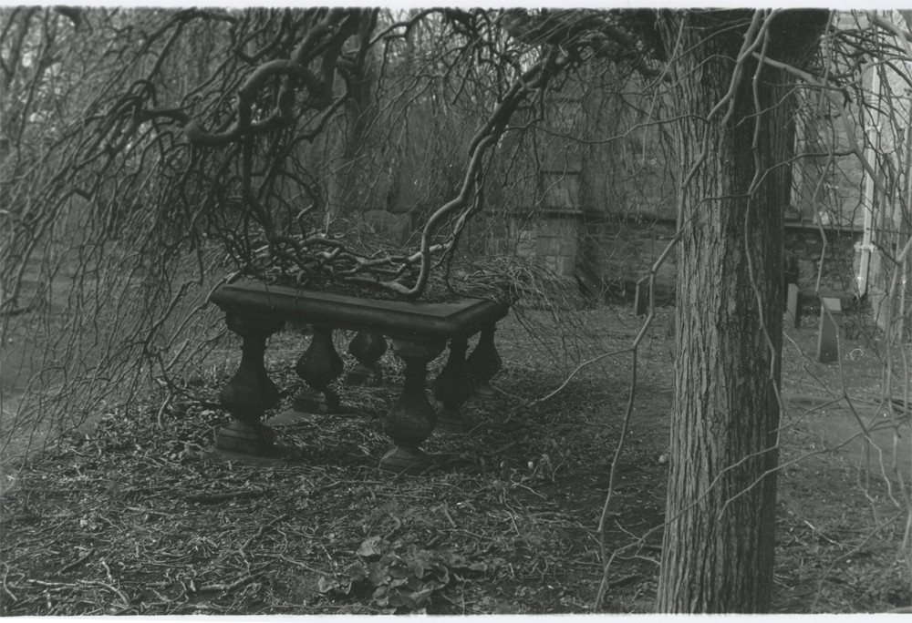
This is my Uncle's Christmas present. I took this picture at my high school, and I'm pretty happy with it. My other pictures are still being held captive by my teacher, the only way I got out of keeping it was the fact I made another print. (Smile)") So, my uncle will have a photo for Christmas this year, which is great, because he loves photos. (Why yes, my family is all sentimental and awesome.)
So, my uncle will have a photo for Christmas this year, which is great, because he loves photos. (Why yes, my family is all sentimental and awesome.)Is there any way to improve on this picture? I am still new to actual photography with a good camera, so any advice is appreciated, I only know the basics.
Done with a Nikon with 35 mm black and white film.
I also developed this in the darkroom as well!
")
I hope you like it!
Related content


Comments: 16

Overall
Vision

Originality
Technique
Impact
Hi!
I think it's really great that you developed this yourself!
The photograph has reasonably balanced contrast, although parts of the tree are overexposed, which I can excuse though, since it was taken on film and it's so much harder to get the exposition right.
What I however absolutely don't like is the composition and the whole cropping (just so we're not confused, I refere to "crop" simply as the line between what was captured and what wasn't, I'm not implying it was done in postprocess).
What you have captured here is a middle part of a tree in front of a brick wall. That on itself isn't very flattering, but you also composed the tree right into the center of the picture. It is one of the most basic rules of composition that one should not put the main subject in the middle, but rather slightly on the side, often according to the golden ratio. Of course, it's a guideline and I can imagine/I have seen many photographs when the subject is centered and the effect is stunning, but that usually comes only when the artist understands the rules well enough the break them and when there is a very particular reason. In this case, it looks sadly uninteresting, unpleasing even.
It is quite the bad habit of today's age of digital format - film has become so special and unusual that when we pick up film camera, we often rely simply on the effect and the air of oldness it will create that we forget that the subject, idea and composition is what makes picture worth.
Overall, I believe that the picture has acceptable lighting, but very poor composition and vision.
👍: 0 ⏩: 1

Thank you! This was very helpful. I'm happy you weren't afraid to be honest,seeing as this really does help me understand how to make things better.
👍: 0 ⏩: 0

Overall

Originality
Technique
Impact
I do like the contrast between the background and the tree. I think the dark brick wall with its straight lines balances nicely with the white tree with its organic shape. However, the tree came out so white that you can barely see the birch marks. The leaves on the tree are also dark like the brick wall so they kind of blend in the wall---I wish they stood out just a little bit more. I would try and make improvements to make the birch marks and leaves stand out a little more.
But you mentioned in your comment that you're pretty happy with it so if you like it then don't change a thing.
👍: 0 ⏩: 1
Thanks for the critique!
👍: 0 ⏩: 0

if you look closely you can see an eye looking down and a nose!
👍: 0 ⏩: 1

I'm not really a photographer so I can't say if it technically good. But I think it's awesome
👍: 0 ⏩: 1

Awesome! You are in photography too! Yours turned out a lot better then mine!
👍: 0 ⏩: 1
Aw~ I'm sure yours was great!
👍: 0 ⏩: 0

Yes! There is a way to improve this photo if you want to................I like it as it is.
You do have a tiny 'focal point' on the bark of the tree where you concentrated on that part.
1. Go into photoshop..............pull up the 'grab' tool........... on mid-tones. Make sure it is on about 5% then go over the darker bits......you will have to figure out what you want here. But you will see as you do it.
2. Next get the 'dodge tool' put it on highlighting .......again fiddle around with the %..usually about 4% Then go over the lighter parts highlighting what you want.
This is a game.......just use these tools as you wish, takes time to get to know them.
Hope this helps.
I use these two tools for drawing, photography etc.
Lol
👍: 0 ⏩: 1
Oh! Thank you! If I ever get Photoshop, I'll keep that in mind! My teacher mentioned and taught us how to dodge and burn in the dark room.
👍: 0 ⏩: 1