HOME | DD
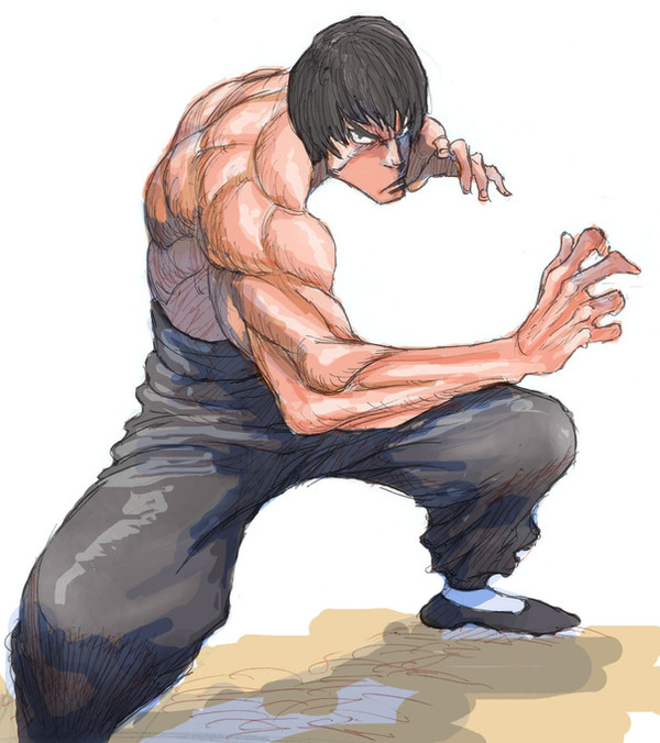
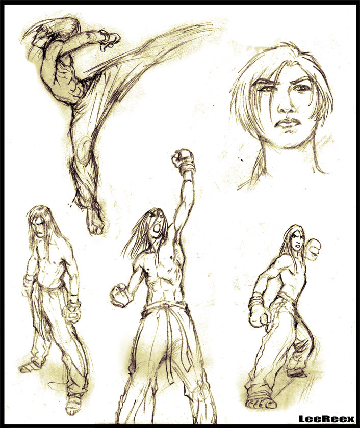
 sagatt — color sketch

Published: 2009-05-06 17:13:33 +0000 UTC; Views: 1449; Favourites: 24; Downloads: 36
Redirect to original
Description
i didn't post anything since a while now...well ; here are some sketchs i made last year...i was traning with traditional colors. but i still don't like my colors....Related content


Comments: 29


thanks bro! glad to read compliment from a great artist btw
👍: 0 ⏩: 0

great sketches dude!
even more impressive is the coloring, i agree with jaredjlee think the colors look like capcom's old school sf stuff.
mixing the blue in with the skin tones is a really nice touch and don't take any notice of some of those other fools, it looks great as is.
👍: 0 ⏩: 1
thanks a lot bro ; specially for the colors ; u're really encouraging me since it's my weak point.however ; about what the others said ; don't blame them... u know if i used a darker blue for the shadow it would have also look cool too ; that's why i think somewhere they are right. anyway thanks for all ur notices guys
👍: 0 ⏩: 1
no worries man.
yeah i guess you have a point, darkening the blue could look cool, but in my opinion it would draw to much attention away from the drawing itself.
if you look at begus's and ikeno's early street fighter work, thay use the same technique but they are very subtle with the blue tones and it really works.
in the end its up to you, i guess it depends on what look you are going for.
👍: 0 ⏩: 0


I like your colors. They remind of Capcom's colors in Super Street Fighter II.
👍: 0 ⏩: 1
really ??it must be the blue shadows ; anyway thanks a lot bro...and that's exactly what i was hardly tryin do make.
👍: 0 ⏩: 0

You really have some nice coloring going on here. I would say add some darker shading, because it looks good. I see only midtone range colors. Also try playing with complimentary colors to pop out the characters more. Like for the character Sean from Street Fighter, try a dark blue to see if it pops put more. It looks great though. Keep practicing because you're getting better  (Smile)")
👍: 0 ⏩: 1
thanks a lot budy ; for the compliments and advices... i'll keep trainin hard.
👍: 0 ⏩: 1
You're welcome and continue to grow
👍: 0 ⏩: 1

")
really ??im glad , so glad... thanks a lot sensei...
👍: 0 ⏩: 1


these are reaaaally really good! very dynamic, love this!
👍: 0 ⏩: 1
looks like u really love my colors...whereas im still not satisfied. anyway , thanks so much sis . encouragements are what i need to go further
👍: 0 ⏩: 1
I think they fit these dynamic drawings
Maybe you can do some darker shadows! The lightest places on the characters are fine to me, but I think you can use some darker shadow so it will stand out.
👍: 0 ⏩: 1
thanks again sis ! yeah..u're right about the dark shadow ; some one else also notice it ...however i used the blue ; coz i wanted to mimic some artist ; u know some people use blue insteed of black for the shadow...but looks like my blue is not too dark ; as u said ; so i'll try not to forget it next time
hey ; btw did u already get sf4 ?
👍: 0 ⏩: 1
blue as shadow is all right!
👍: 0 ⏩: 1
sure...the dark blue ; i'll try it one day ; btw u didn't answer about sf4...
👍: 0 ⏩: 1
oh sorry xD
I'll write u a note tomorrow because there are some private things err... so that i dont have it
👍: 0 ⏩: 1