HOME | DD
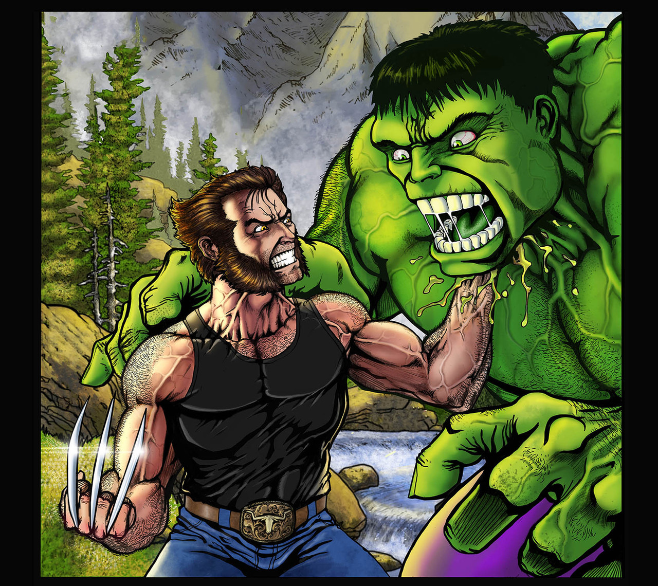
 SageHazzard — Hulk vs. Wolverine by Lakcoo2u

Published: 2004-01-18 04:38:34 +0000 UTC; Views: 2157; Favourites: 28; Downloads: 547
Redirect to original
Description
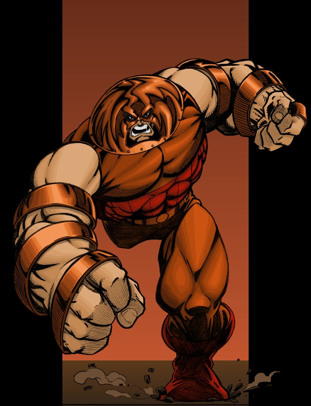
Pencils: ~lakcoo2uColors: ~SageHazzard (me)
Couldn't pass up the chance to color more of Lakcoo2u's stuff. He's got a killer gallery so go check it out. Kind of a quick job on the colors, though I didn't keep time. Not a sign of bad quality, I've just gotten a better handle on how to get it done.
 (Smile)") Comments welcome, good and bad.
Comments welcome, good and bad.
Related content


Comments: 9

I'd love to see this version of Hulk and Wolverine in a Bearhug!
Hope you get to do it, someday ...
👍: 0 ⏩: 0


Good colouring! Though I somehow miss blood or saliva splattering...
👍: 0 ⏩: 0

That is cool!!! I love the way the claws came out, not to mention their teeths. Well, I would've liked to see the colors blend a bit more ( little distracting to me ) but hey, stick to what you like. I'm just happy to see it colored. Thanks again, hope you choose to color some more of my work.
- Lak
👍: 0 ⏩: 1

Oh, I certainly will. I'm glad you like it.
👍: 0 ⏩: 0

The orange doesn't bother me so much (favorite color
The blending . . . can't say I like it, but I'm seeing more of it lately so I'm sure it has its appeal. To me though, it's like looking at one of those relief topographical maps.
Good job though. Great even.
Kevin
Came over from PJ.
👍: 0 ⏩: 0

...my god those are nice colors. great job man, can't wait to see more!

👍: 0 ⏩: 0

good job. the first thing i notice is the bright orange of the background. that, i think, should be a more faded shade in order to further emphasize the charactes in the foreground. in regard to your evident lack of blending, i think that provides for a really interesting texture on the two figures. overall, pretty solid, dude.
👍: 0 ⏩: 1
I could blend it but I like this style better. Just a matter of taste there. I'm glad you like it.
👍: 0 ⏩: 0