HOME | DD
 samborek — OilMaster project

Published: 2009-08-25 11:31:51 +0000 UTC; Views: 9247; Favourites: 51; Downloads: 413
Redirect to original
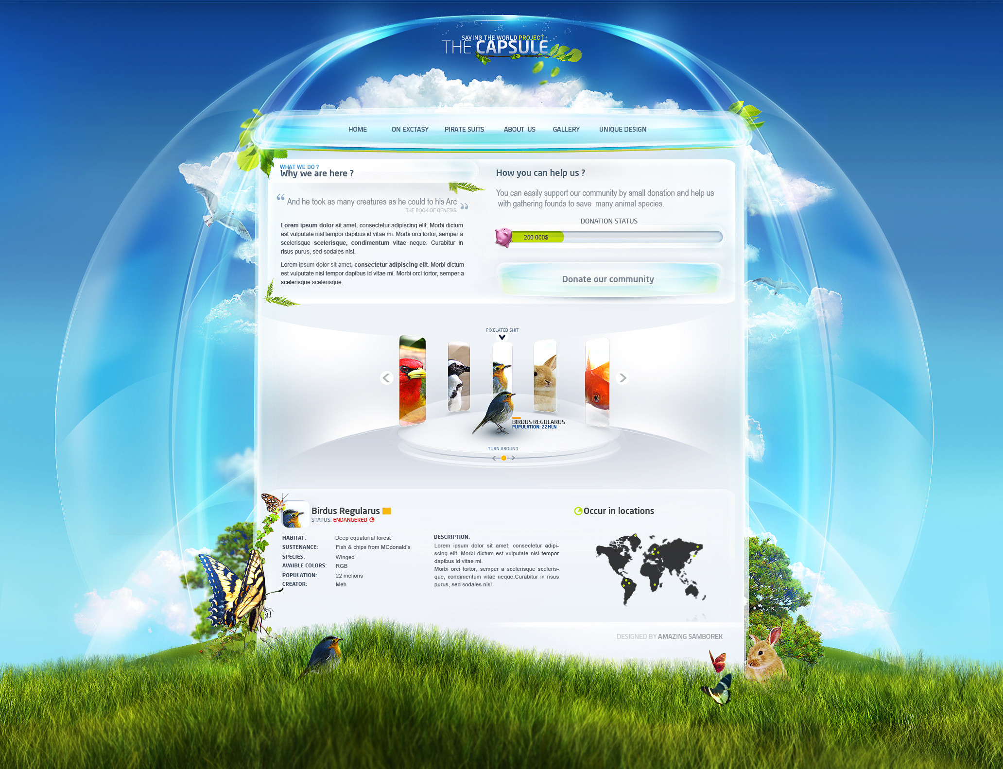
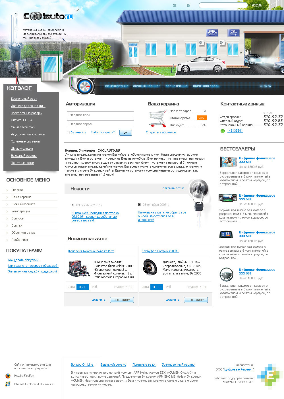
Description
Client wanted it in this shiny modern style , but I don't realy think that will suit this subject ;]so over all I can only tell that subject was pretty hard and in my opinion I kinda failed :/
Logo from client, images kinda too
 (Wink)")
Related content


Comments: 24


hover chujowy jak barszcz (mimo, iż barszcz jest zajebisty)
Reszta luks, ale nie wciskał bym wszędzie szkła
👍: 0 ⏩: 1

ależ Ty masz nie wyparzoną gębę kwuśel
👍: 0 ⏩: 1

Pomijając fakt, że nie pasuje do tematyki
to bardzo dobry lay i chyba wyrobiłeś sobie styl patrząc na ostatnie 3 laye.
mnie się podoba ;]
👍: 0 ⏩: 1
se nie wyrobiłem, se robię jak się podoba klientom i mi ;]
👍: 0 ⏩: 0


")
hehe , kiedyś, za 10000000000000 $
👍: 0 ⏩: 1

A ja napiszę że projekt udany, szklane belki za**biste są tak jak i galeria z produktami. Ofc, na taką tematykę powinny być z deka inne, bardziej agressywne kolory, ale...
-----------------------------------------------------
I`ll write this project is good 4 me, shining-glossy-glass theme looks so great, i see sth like this first one! Of course, for theme like this there are so "child&cute" colours, but... its ok 
👍: 0 ⏩: 1
oh flock, multi language version of post !
may my puppies eat you
dzięki, co nie zmienia faktu z kontaktem kontaktu
chyba lepsze będą nastę
👍: 0 ⏩: 0

Wiem, że moja opinia uj Cię obchodzi, ale coś skrobneę ot z nudów chociażby:
menu + nagłówki goood ... ale poza tym:
najbardziej mi się chce śmiac kiedy patrzę na produkty w modernowatym okienku ^^ bo rozumiem taki styl do jakiś produktów sportowych (howehy, piłkhi i coś w thym stylhu), ale olej?! ^^ W newsach chyba trochę nie potrzebnie dałeś to niebieskie bo się strasznie odcina od dwóch pozostałych i w ogóle nie widac, by to był news.
Jakoś mi w ogóle modern do olejów nie pasuje, ale się nie znam toteż siedzę cicho.
👍: 0 ⏩: 1
ej no myślisz że mi pasuje ? klient chciał to zrobiłem ^^ wcale mi sięwizja nie podobała i jakoś nie wyszła
opchoci :*
👍: 0 ⏩: 0


👍: 0 ⏩: 1
thanks a lot, but , he's not so happy
he thinks that I didn't use my " special abilities" xD
so it means that project should be better
👍: 0 ⏩: 1
I went back and looked over the work that you had done and I think I know how to get it right . I had a client like this I had put some graphic on the bottom left corner just like you had and the client bitched that there was something not right.so I called out for help and a friend told me to remove the left graphic and build the graphic on the top of the page for the WOW effect I still used graphics on the bottom of the page but smaller. I hope this helps you out it worked for me. oh when i get stumped I go to a site named freegine.com and then i type template in the site search and then .... it works for me..

👍: 0 ⏩: 1
gosh xD
everything will be useful  (Smile)")
I probably won't change anything in that project cuz I don't want to mess with this any more
👍: 0 ⏩: 0

Całkiem fajnie tylko hover w menu mi się nie podoba :>
👍: 0 ⏩: 1

Nagłowki ładne, łącznie z menu barem. Reszta do kitu, sorka.
👍: 0 ⏩: 1
no za co mnie przepraszasz ? wal śmiało
widocznie ssie, trudny temat dla walącego po oczach designu
👍: 0 ⏩: 0