HOME | DD
 samborek —
The Nibiru: Ancient Legends
samborek —
The Nibiru: Ancient Legends

Published: 2010-05-17 11:55:19 +0000 UTC; Views: 140212; Favourites: 1370; Downloads: 4777
Redirect to original
Description
DOWNLOAD for epic lookv.2 with more contrast: [link]
Hi guys
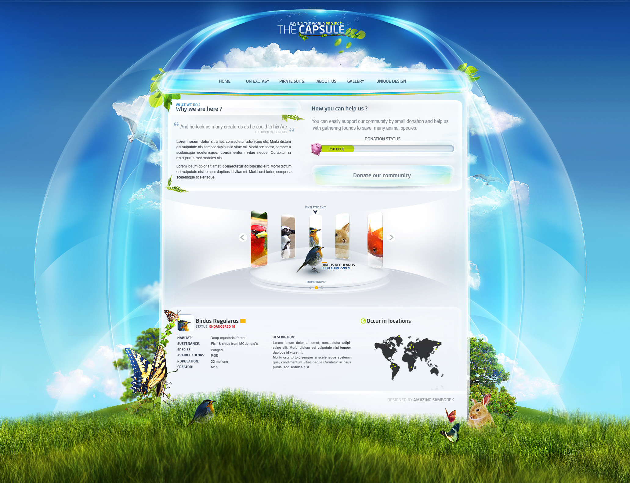
And here I come with my latest and biggest website project ever
") and I'm really satisfied with this - maybe 95% of what I wanted but I'm not sure how to finish it perfectly at current lvl ;]
and I'm really satisfied with this - maybe 95% of what I wanted but I'm not sure how to finish it perfectly at current lvl ;] Site looks sexier from some distance
")
Some details:
Time: 2 - 3 weeks
Layers : ~2000
Software: PS CS4
Stocks: like 7 with textures
Tools: Wacom Intuos 4 M , some beers, food, one dog and Kermit the frog
and some more xD
If You don't know what nibiru is, search on google, read content of my project and watch this film :
It's universal - polish and english version [link]
Go !
New sexy projects soon!
**THIS PROJECT IS FOR SALE**
OMG I've got DD , amazing , thanks You so much

I hope contrast is not screwed
Related content


Comments: 313


 (Wink)")

This is the first time I say somethin like this, but this is an amazing work you done there. Kudos bro.
I just don' know if this is a real website or just a pic of the plans for it?
What ever it is, great and keep up the good work.
👍: 0 ⏩: 0

The level of awsumness went through the atmosphere and blew the moon!
👍: 0 ⏩: 0

Wow.. Amazing work!
Nice menu and datails, I love it!
👍: 0 ⏩: 1
One of the most beaultiful layouts i've ever seen at DeviantArt.
👍: 0 ⏩: 0


This is completely awesome, dude!
👍: 0 ⏩: 0


I don't know why, for some reason.. I remember Diablo 3 when I see this.
👍: 0 ⏩: 0

i would suggest you to change the font of navigation and congrats man other thing are just Perfect

👍: 0 ⏩: 0

Typo ssie po całośći, ale grafika poziom poziom, stopka bajer
👍: 0 ⏩: 0


Przerost formy nad treścią ... ale grafa wygląda ładnie
Typo ssie. Zapewne będzie duużo favów i z czasem DD
pozdro
👍: 0 ⏩: 1

Nostradamus nowej ery się znalazł
👍: 0 ⏩: 0


W chuj nieczytelne czcionki, a tak to zajebiste.
👍: 0 ⏩: 0
pixeltoy In reply to ??? [2010-05-17 14:22:14 +0000 UTC]
wonderfull...from header to footer!
👍: 0 ⏩: 0


O to i przybywa naczelny spamer dA Jestem szczerze rozczarowany, spodziewałem się "ultramegaturbodymo" eksplozji, przełomu, whatever - a niestety tak nie jeest. Trochę za pusto dla mnie. Nie ogarniam jakości (może nie jest słaba, ale szystko w motion blurze takie buu). Stopka rzecz jasna wymiata. Menu też niczego sobie. No, ot - samborkowa przeciętność. Zjedz sobie oczy. Howgh.
👍: 0 ⏩: 0


Skąd żeś pokradł ramki i te takie? Słaba jakość. Albo przesadzone blury. A za czcionkę z Diablo Cię zjedzą
👍: 0 ⏩: 1
se zrobiłem, słaby masz monitor xD , nie ma blurów, nie ma czcionki z diablo tylko darmowe z dafonta
👍: 0 ⏩: 1
Bo czcionka z Diablo została udostępniona dla ogółu.
A czym zrobiłeś, klawiaturą?
👍: 0 ⏩: 1
a tamto , no jest dostępna jakaś podobna bardzo , dam Ci nazwe , przypomnij na notce
👍: 0 ⏩: 0

szczerze myślałem, że będzie lepszy
👍: 0 ⏩: 1
też to czuje i nie wiem o co chodzi, odsuń się od monitora a wygląda lepiej
👍: 0 ⏩: 1

omgaaawd 
👍: 0 ⏩: 0


Wręcz zajebiste, jeden z najlepszych layów jakie widziałem.
👍: 0 ⏩: 0


No nieźle nieźle, ale 2000 warstw to myślałam, że to większe będzie. xD
ale fajnie, już miej tego fava no
👍: 0 ⏩: 0


their work was impressive, very precise with wonderful elements, congratulations!
👍: 0 ⏩: 0


Looks amazing mate  (Smile)")
👍: 0 ⏩: 1
sure , I used some textures and painted ornaments, and use some ornaments too but after advanced post production 
👍: 0 ⏩: 1
okay thanks for letting me know
I first thought you painted everything on your own which would be really impressive
👍: 0 ⏩: 1
<= Prev | | Next =>