HOME | DD
 sameer — winamp skin

Published: 2005-04-16 12:44:06 +0000 UTC; Views: 2183; Favourites: 4; Downloads: 92
Redirect to original
Description
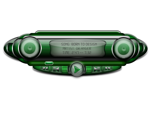
ok guys. its the first screenshot of my new winamp skin.sum comments will be highly appreciated. Thanks.
and BTw on the left side a strange lookin thing with a flower is my logo (s a artwerks) originally it has blue and green colors , all inspired by nature. But I thoght that it will look too flowery so iv changed the colors to give them a more metallic look.
Related content


Comments: 3

It would be very elegant and minimalistic, the only thing that makes me go "hmmmm..." are the two flower designs, which kinda feel out of place with the overall design, if you allow me.
👍: 0 ⏩: 0


This is looking really good so far. I have 2 small suggestions for you though. The flower on the right has a really bright 'lens flare' to it with the glass. Maybe you could tone that down a bit. The play / next track / etc buttons would look better if you did a single tone glass effect on there and maybe gave a small stroke around the actual buttons. I think that would make the buttons stand out better. It is looking great though! I'm curious to see how the rest will look!
👍: 0 ⏩: 0