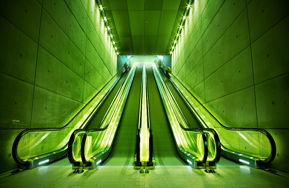
HOME | DD

Sandefoto โ€” Intens II

Published: 2007-02-15 21:29:27 +0000 UTC; Views: 700; Favourites: 28; Downloads: 15
Redirect to original
Description It's the same as "Intens" Only a bit color editing has been done. Anyways.. Which one do you like most?

[link] <-- Intens
Related content
Comments: 27

tunacrepe [2009-06-15 00:21:55 +0000 UTC]

this is a wonder full shot.the colors stand out yet they compliment each other. at least i think so
but what made me really notice this was that it looked like the Atari logo.

๐Ÿ‘: 0 โฉ: 0

alex-Oo [2009-06-02 06:43:22 +0000 UTC]

your amazing work has been featured here: [link]

๐Ÿ‘: 0 โฉ: 0

aiyoshi [2009-06-01 13:49:45 +0000 UTC]

lovely colors !

๐Ÿ‘: 0 โฉ: 0

Gemellary [2009-03-23 12:34:51 +0000 UTC]

Hi there,
youยดve been featured - [link] !

๐Ÿ‘: 0 โฉ: 0

JDSC20 [2008-03-30 16:57:30 +0000 UTC]

Hi there,Your work is featured here: [link]
I hope you don't mind.You can the article,if you like.I'd appeciate it.

๐Ÿ‘: 0 โฉ: 0

falname [2008-03-15 17:15:33 +0000 UTC]

absolutly that one!

๐Ÿ‘: 0 โฉ: 0

JacquiJax [2008-03-15 05:33:30 +0000 UTC]

This photo has been featured here: [link]

๐Ÿ‘: 0 โฉ: 0

JacquiJax [2008-03-14 18:39:44 +0000 UTC]

Amazing shot, the colors so vivid that looks surreal or of other planet! Is a one in a million!

๐Ÿ‘: 0 โฉ: 0

basketball24213 [2008-03-13 01:09:45 +0000 UTC]

i really like this one D

๐Ÿ‘: 0 โฉ: 0

Avangel27 [2008-03-12 15:51:42 +0000 UTC]

This one is much better

๐Ÿ‘: 0 โฉ: 0

arhcamt [2007-10-27 03:57:14 +0000 UTC]

like this one better! love it.

๐Ÿ‘: 0 โฉ: 1

Sandefoto In reply to arhcamt [2007-10-28 13:23:23 +0000 UTC]

Glad you liked it

๐Ÿ‘: 0 โฉ: 1

arhcamt In reply to Sandefoto [2007-10-28 16:01:06 +0000 UTC]

๐Ÿ‘: 0 โฉ: 0

EtienneSdg [2007-09-14 18:16:04 +0000 UTC]

love this one dude.

๐Ÿ‘: 0 โฉ: 1

Sandefoto In reply to EtienneSdg [2007-09-14 18:19:19 +0000 UTC]

Thanks

๐Ÿ‘: 0 โฉ: 0

CircleOfLight [2007-03-10 14:48:03 +0000 UTC]

Awesome shot!

๐Ÿ‘: 0 โฉ: 1

Sandefoto In reply to CircleOfLight [2007-03-10 14:49:18 +0000 UTC]

Thank you

๐Ÿ‘: 0 โฉ: 0

str4yk1tt3n [2007-02-20 16:31:36 +0000 UTC]

lovely...gorgeous color composition.

๐Ÿ‘: 0 โฉ: 1

Sandefoto In reply to str4yk1tt3n [2007-02-21 13:41:16 +0000 UTC]

Thank you

๐Ÿ‘: 0 โฉ: 0

RebekkaOpsal [2007-02-16 07:09:30 +0000 UTC]

Love it! Colours are great! And yes, I agree with everybody, much better

๐Ÿ‘: 0 โฉ: 1

Sandefoto In reply to RebekkaOpsal [2007-02-16 08:21:02 +0000 UTC]

Thank you

๐Ÿ‘: 0 โฉ: 0

Alexanderfoto [2007-02-16 06:19:37 +0000 UTC]

Much better

๐Ÿ‘: 0 โฉ: 1

Sandefoto In reply to Alexanderfoto [2007-02-16 08:19:51 +0000 UTC]

Weeee

๐Ÿ‘: 0 โฉ: 0

Hopland [2007-02-15 22:09:07 +0000 UTC]

This is the better version

๐Ÿ‘: 0 โฉ: 1

Sandefoto In reply to Hopland [2007-02-15 22:17:09 +0000 UTC]

hehe Thanks mate

๐Ÿ‘: 0 โฉ: 0

doder [2007-02-15 22:05:05 +0000 UTC]

great color and symmetry!

๐Ÿ‘: 0 โฉ: 1

Sandefoto In reply to doder [2007-02-15 22:05:53 +0000 UTC]

Thank you

๐Ÿ‘: 0 โฉ: 0