HOME | DD
 SandraMJ — Colouring Test 7

Published: 2013-01-03 17:48:40 +0000 UTC; Views: 7213; Favourites: 159; Downloads: 104
Redirect to original
Description
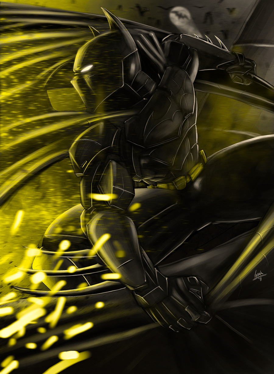
The artist is Jorge Jiménez, as usual. Colours by me. Again, he gave me instructions of how he'd like it. I was trying to give it really plain colours. The results may differ :IRelated content


Comments: 11


 (Smile)")

You know, I love the background. It is awesome and hits the mood just right. But the Dark Knight... I dunno. He seems a bit too... bright? At least where he isn't covered in shadows, where he blends right in and becomes indistinguishable from the shadow on the Gargoyle statue. Then again, that might be the point, else he's blend right into the city. Or become an ominous silhouette. Of course, I am not a professional artist and I do not have the professional artist's eye, so I don't know. I... also don't read the comics, so I may be also basing Batman off of the few impressions of him I have, which are dark, gritty, and ominous to all of his foes. In any case, these are my thoughts.
👍: 0 ⏩: 1

In the comics, characters and foreground items have to havea higher luminosity than backgrounds, otherwise they blend in and make the pic boring, as there's no sense of profundity. [link]
👍: 0 ⏩: 1
I can see that now. Like I said, I have no artist's eye.
Still I wonder if it can be done so it isn't quite so jarring...
At any rate, you're work is good and I am a moron, so don't mind my nagging.
👍: 0 ⏩: 0

Hot damn, that colouring is magnificent.
Can you see that?
Can you see the amazing?
Can you see it oozing of the page?
I can. It's making my eyes hurt.
But getting serious, wow. I'm really loving the lighting and shadows, and how well they compliment each other while being contrasting. The dark sky with an ominous looking background fits very well.
The colours are pretty much spot on really. Yellow utility belt, grey suit with black/navy blue-ish insignia and cape. The red-ish, grey smoke from the Arkham building. The colour of the gargoyle and buildings. It like it came straight from the comic. But seriously, the lighting and shadows, those are what really got me.
👍: 0 ⏩: 1
I'm really glad you think so! It took me quite a while to get it right. Mostly since my computer is old and died a couple times during the process :I
But it makes me really happy that you like it
")
👍: 0 ⏩: 0