HOME | DD
 SandraRush — CREMISI #2 Cover
#comic #cowboy #latino #manga #pages #panels #saloon #space #spacewestern #western #pagescomic #kickstarter #latinogirl #kickstarterproject
Published: 2018-01-02 20:00:06 +0000 UTC; Views: 1723; Favourites: 114; Downloads: 0
Redirect to original
Description

1000 in prizes and the Cremisi Comic itself to win! Everyone can join!
CHECK OUT THE CONTEST AND RAFFLE JOURNAL!
CREMISI CONTEST and RAFFLE (Win POINTS and Comic!) Cremisi Issue #1: Cremisi Issue #2 preview pages: 
[Status: OPEN]
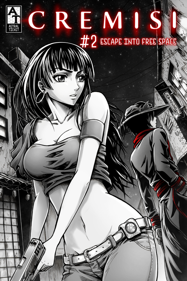
CREMISI Issue 2: Escape into Free Space is now available on Comixology!
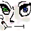
CREMISI is a manga style sci-fi fantasy/space western comic I'm working on with Isaax Fox, who provides the story
We use black, white, and crimson coloring ("BWC") to create a unique visual experience.
Its a great occasion for me to make a big Cremisi event for you all!
Decided to held a contest AND a raffle, meaning everyone can join the fun right now! But first...

Yo minna! Happy New Year 2018!!!
Here is the finished Cremisi Issue #2 cover, version for Comixology! It will be officially released on January 10th and I'll will be prepearing a special DA event for you that day, meaning a contest+raffle with the comic as a reward! (and some points too ). So stay tunned!!!
Cremisi Issue #1 on ComiXology!!

Related content


Comments: 43

👍: 0 ⏩: 0


In a completely unbiased opinion, this comic/manga is absolutely amazing.
👍: 0 ⏩: 0


Kind of reminds me of Forbidden Siren if you remember that game
 (Smile)")
👍: 0 ⏩: 1

I remembrer such title, but didn't get a chance to play it 
👍: 0 ⏩: 1
 (Wink)")

The art is incredible. Cant wait to see the rest!!
👍: 0 ⏩: 1
Thanks again! 

")
 (Cool)")
👍: 0 ⏩: 0
Your cover art is stunning! I'm enjoying your superb use of lighting with gray, white, and black.
👍: 0 ⏩: 1
Thank you again! glad you like it
👍: 0 ⏩: 0

Looks badass!! I especially like how you colored in parts of the guy's clothing to contrast with the overall monochrome, neo-noir-esque feel this comic is already exhuberating.
👍: 0 ⏩: 1
Thank you so much! Its just how it looks in the comic, we add crimson parts to the main characters and things we want to stand out, like blood and magic
👍: 0 ⏩: 0

")


Quick accepting critique from
I adore the tone work done on this piece. You have a great range of grey scale in here that really helps give depth to the main focus and details in the background.
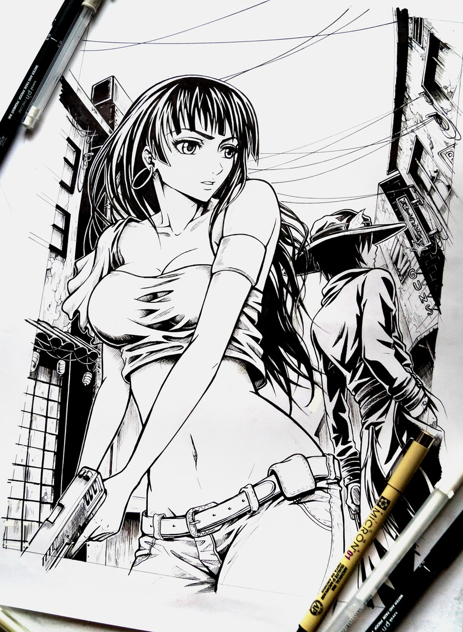
There are two anatomy issues on the main female that stand out to me though. The first one being the breast. You have given them the shape of orbs pressed up against the ribs. This isn't how breast actually work or hang. A good way to get a better idea of how they work is to think of them like water balloons with the knotted end fading into the collarbone area. I feel this is better explained visually so I found you a video tutorial on it here .
The other issue I noticed on the female is the length of the torso. This might be a style choice, in which case it's fine, but it does seem to me to be a bit too long for it to look natural. The arms which should fall to mid thigh when at rest, in this picture would fall to about the crotch line because of the length of the torso which makes it feel more off.
Outside of those two things I didn't see anything that stood out as wrong to me. I love all the details in your background. All the little things like one of the letters of the sign being burnt out or the wind blowing through the lanterns really sets a mood for the picture. The line work in this is also very expressionate and helps make the image pop out to a viewer.
I wish you the best of luck with your comic endeavors. Please keep up the wonderful work.
👍: 0 ⏩: 0


Thanks! and by the way Happy New Year, friend!
👍: 0 ⏩: 1

Nice also, I was add red detail for girl on front also, maybe belt?
👍: 0 ⏩: 1
Thanks for your advice! I kinda miss the red on her here too but she doesn't have red elements in the comic, so I needed to stay consistent with it
👍: 0 ⏩: 1
I'm understand, you make beautiful work, and I don't know this comics, sorry
👍: 0 ⏩: 0


Outstanding cover! Can't wait for January 10th then!
👍: 0 ⏩: 1
Thankie! 
👍: 0 ⏩: 1

Thanks as always!

👍: 0 ⏩: 1

