HOME | DD
 sangheili117 — ::Training::
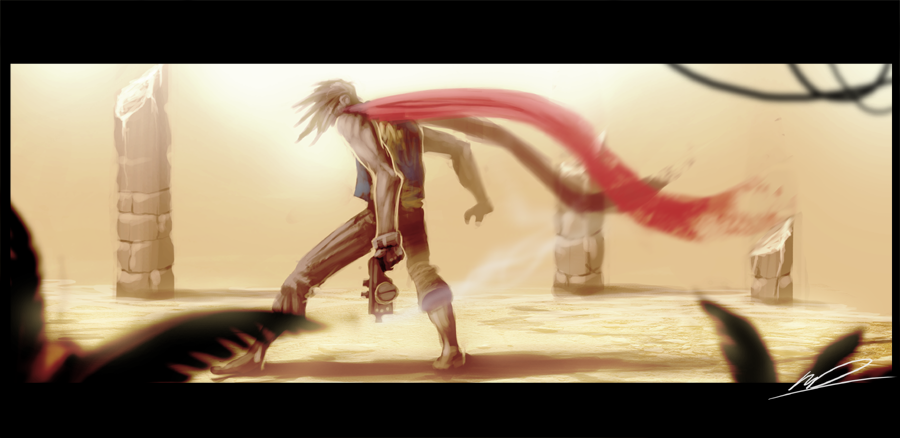
Published: 2009-03-14 21:46:12 +0000 UTC; Views: 2603; Favourites: 37; Downloads: 0
Redirect to original
Description
figured Id just paint this for fun and not try and focus on making it great and I find that this came out looking better than pieces that I try real hard on.gimme some critique, I be hungry for improvments.
Related content


Comments: 31

Overall


Vision
Originality
Technique
Impact
I really like the approach you took on this. Very stylized with the depth of field and letter box wide-screen format. Great flow to this, nice movement and wind blown effects.
The hair confuses me a bit though. I am assuming that his hair is in motion because he is spinning his head to look over his shoulder. While it looks pretty cool, it contradicts the wind direction in this. Looking at the amount of wind force affecting the cape and gunsmoke I would imagine his hair would already been blown clear back, head spinning or not.
The pillar on the left seems to lose definition on the top half as if unfinished. I would have liked to see the block pattern follow suit up through.
I think there is a lot of wasted space with the background sky. It is the same color as the ground and pillars and just sort of gets washed out and gives the impression of a lot of dead space. I think that something could have been done with all that space either with color or background etc to really add some nice contrast and add some further depth and impact to the piece, especially with your style.
There are some proportion issues with the body, especially the arms and legs. To help avoid this, flip the image every now and again. It will help you notice composition and proportion issues, you can then flip it back and work on the problem areas you didn't notice before. Your mind can get tricked looking at something a particular way for too long, so flipping the piece helps put things back in perspective . It's an old drawing trick, like putting your piece up to a mirror. Studying anatomy, poses and perspectives will help as well.
But all that being said, I really like this piece and it has style. Like something straight out of an Anime movie or vidoegame cut scene, it's very cool.
👍: 0 ⏩: 1

thanks 
👍: 0 ⏩: 0

no prob. I guessed so after looking at alot of your other work.
👍: 0 ⏩: 1
XD a popular trend of mine
👍: 0 ⏩: 1
haha! a very good trend
 (Smile)")
👍: 0 ⏩: 0
Very nice job! I love the scarf and and spikey hair
")
👍: 0 ⏩: 1
thanks it was always supposed to be spikey hair too
👍: 0 ⏩: 0

meh I dont really like this one to much
👍: 0 ⏩: 0

I love it!
I think it needs a bit more dark areas.
A matter of taste.. i would like things to be more specific, for example the hair, the feet the arm at the back.
👍: 0 ⏩: 1
I know what you mean , though I dont even like this piece it didnt take me very long at all
👍: 0 ⏩: 0

OK this is really good, nice but on the sketchy side, but the arm looks huge, and not the good huge. its to big and the trees are to dark for the pic, they kinda look out of place, but in all it a good pic

👍: 0 ⏩: 1
I know what you mean by the arm, thankfully this was a trial to see if I could just draw without considering proportions to much so it didnt fuss me to much but from here on Ill be sure to give a little more focus on the shape and size of focussed limbs.
👍: 0 ⏩: 1
good, men don't need to be muscularly to be look good
👍: 0 ⏩: 0

Well, practice always helps any art form. If you can, look over older images to see how much you've improved. I find that encourages me to draw more or revamp older pictures because they're so old!
The movement in this is lovely, I think it's due to the fact you were doing this for fun rather than any real point. His arms are a little long for his body but not by much. Otherwise, I'm very impressed with the anatomy study.
I think the slightly blured forground leaves could use some more motion. The bluring on the scarf and the smoke coming from the gun implies a strong breeze so they should have a little bit of bluring as well. Unless its his movements that are causing the fast flow of his garments, if so, ignore that last comment.
The colours and shading are well thought out and the hints of foreground is a lovely touch. The pilars look a bit off in the background but I think that's because the middle one has a bit too much shadow at it's base.
That's all I can think of, I hope some of this helps!
👍: 0 ⏩: 1
actually yeah that does help ")
👍: 0 ⏩: 0

The thing is, your feelings atm.
Just trying it to be more realistic wont make it better, ya see you go for a fun and sand, stones, leaf's and muscles/character pose came up almost like a picture.
But you wanted a realistic look on Warmech and even tought it looks pretty realistic, it still smiles like ''Hi! I'm a drawing ya know?''
I know that i suck, but even while i'm happy a hedgehog or pose cames up absolutely greater than my usual art, when im feeling like a crap , my art is just a crap.
Dont dont feel down, i'll make you go worse
I'll support you bro, you're already an expert, being a pro isn't that far when you compare with a novice (not even a regular) like me
 (Wink)")
👍: 0 ⏩: 1
thanks man I guess I'll keep art as just that looking like art
👍: 0 ⏩: 1
Just do what you usually do, improvement will come by itself (happens on me a lot)
👍: 0 ⏩: 0

Looks raw and full of energy.
Since you've asked for critique I shall give:
-In terms of motion, you've got the hair flowing one way, and the scarf billowing out in the other direction... this is sort of conflicting. Of course you can ignore this comment if your character is using super hair gel.
-The legs seem a tad bit off. The left foreleg seems too short to me.. the right leg is also kinda weird. It looks like an indecision or compromise between two different poses. If you wanted that leg to be shown as bent outward in the direction opposite the viewer, the foot should be farther ahead of the left foot, not on the same level. If you intended the right foot to be on the same level as the left foot then the right thigh should be lengthened and the entire pose angle would shift upwards a bit.
Anyways, if that's meaningless jargon to you, I invite you to ignore it. Great job as always.
👍: 0 ⏩: 1
thanks man I had a real hard time getting the right leg to look correct I'll be sure to heed your words for my next crazy leg pose
👍: 0 ⏩: 0

This came out great. Sometimes think that when we artist 'try' we fail, when we just 'do' we make really good stuff.
👍: 0 ⏩: 1
I know that's the case with my art.
👍: 0 ⏩: 0

Definite improvement. It feels a lot more confident and definitely more dynamic.
👍: 0 ⏩: 1
Now I truly understand what you mean, we [as artists] should be confident when painting or the piece will end up reflecting the way we feel as individuals, I should be more cheery when painting.
👍: 0 ⏩: 0
thanks man Im gonna try a few new things tomorrow and see what i come up with ^^
👍: 0 ⏩: 1

cant wait!
oh btw if ye got mario cart... 0431-4025-9367 ")
👍: 0 ⏩: 1
I'll send it ya in a note
👍: 0 ⏩: 1