HOME | DD
 sank — SA04_

Published: 2004-05-16 06:42:30 +0000 UTC; Views: 1526; Favourites: 19; Downloads: 833
Redirect to original
Description
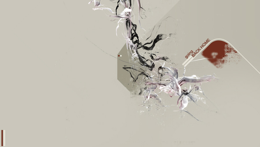
SankART Promo piece \\\\\\\\\Really liked working on this piece,first of all because working with vectors is really nice,anad second of all....i was working with my logo
")
-------
C&C and +favs are much appreciated
Related content


Comments: 44


definately a dope style, I luv the choice of color but somehow the circles at the bottom of the logo kill it, since they give the piece a sort of amateurish vector style. but other than that it rocks!
👍: 0 ⏩: 0

Cool combination of colors. Dont really like the overlappin' tho but still, it's a beautiful logo

👍: 0 ⏩: 0


mad colors.
power to the pink!
looks real clean!
awesome.
👍: 0 ⏩: 0

something like this for Injen will be a sure winner ! love the colours and the style! ... and plus you get the donkey and the stable

👍: 0 ⏩: 0

wow, really great work and logo design ! ;D
i definitly like it a lot !
 (Wink)")
👍: 0 ⏩: 0

So beautiful ^_^... I luv the flowers and your color choice^^.
👍: 0 ⏩: 0

 (Smile)")

nice!in my opinon it would be even nicer without that roses..
👍: 0 ⏩: 1

thnx.....i was thinking of taking it out by meh

👍: 0 ⏩: 0


Hmmm 

👍: 0 ⏩: 0

love the colors..looks great..hey check out my site i got it up u can add my button now [link]
👍: 0 ⏩: 0


Very very very awsome work man! I like the overlapping. Very cool. I like the lil' thumbnail of it in the bottom corner. Very nice. +fav.
👍: 0 ⏩: 0


very nice, very trendy. i really like it +fav
👍: 0 ⏩: 0

9/10 great aspect and i love the way the flowers look with your logo good job
👍: 0 ⏩: 0


looks very nice, I'm not very fond of the overlapping though
👍: 0 ⏩: 0

This is really done! Lovely, great choice of colours to. Flowers rule!
👍: 0 ⏩: 0


Beautiful layered effect and nice contrast between the flowers and the curves.
👍: 0 ⏩: 0


I like everything except the overlapping of images on the logo
👍: 0 ⏩: 1
i might add a version without the overlapping in a zip and attach it this deviation
👍: 0 ⏩: 0

Nice job. You could've used a lighter version of that blue/gray. It'll work nicely next to the pink. ^_^
👍: 0 ⏩: 0


nice, i really like the thing in the bottom left corner, i dunno if i'm diggin the low opacity pink vectors around the logo, but the ones on it work well.
👍: 0 ⏩: 0

