HOME | DD
 sannchen — Dis connect
Published: 2006-06-21 23:46:15 +0000 UTC; Views: 524; Favourites: 11; Downloads: 34
Redirect to original
Description
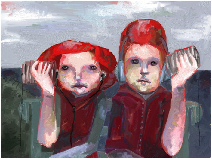
Most people do not communicate. This is my second version, the first is unfinished. I got so mad at it and locked it in the bedside table. This one is better I think.I'm thinking about adding some decorational dots and squares, but I'm not sure because I do think the way it's boring and the emptiness of it suits maybe the idea. Maybe not.
ps: I passionately hate the colors together
")
Related content


Comments: 15

It's great, you're not supposed to like your own art, it's a curse.
👍: 0 ⏩: 0

ah, great expression haha.. However, I find the subject matter to be a little too played out. Since the figures are looking at the viewer, it seems to be like a posed photograph. This may also be amplified by the headphone cliche.
Did you modify this on the computer after? Some of those lines feel so photoshopesc?
The contrast between the highly textured background, and foreground figures seperates the two, and brings focus to the figures... not to mention that beautifully bright red.
The lavendar of the upper portion of the background is nicely placed beside that strong red.. it also pushes it backwards, as well it's a complimentary color. I think the bottom half of the background, body, and the bench/couch could be either better articulated/emphasized, or washed out somewhat. At this point it still pulls my eyes, but doesn't give me enough detail to keep me.
👍: 0 ⏩: 1

Tried to scan the thing, but my camera didn't focus on it very well, so it was very blurry. I touched it up on the computer for mm, less blur.
I've been thinking about how this thingie worked out a lot, because I was very disappointed. You're absolutely right about the bench, I hardly put any time in it because I had already decided I sort of disliked the whole painting. The colors annoy me a whole lot, I'm not very good with just a couple of colors I guess. I really like throwing in dozens of color mixtures (sp?) and here I didn't because I was trying. Maybe I should follow Yoda's advice, do or do not, there is no try
Do you think it would have been better if the eyes would look to the side, away from eachother? I'm not planning on re-doing it because I don't care about this painting anymore, I think it's, like you said, cliché among other things, but I do think avoiding looks would have worked better, maybe.
I still have you on my MSN buddy list even though I'm hardly online anymore because of university, but I've been having this idea for a new painting for weeeeeeks (haven't had the time because of exams and papers) and maybe I can show it to you when I sketched it (I hardly ever do, do you? I'm very bad at making it dynamic so maybe I should sketch, to think things over...). If you want to look at it I would greaty appreciate your advise
Emm long comment
")
 (Smile)")

👍: 0 ⏩: 1
ah yea, i'd be very happy to talk with you more on MSN about your works and anything in general.
Are you currently at art school or university for something?
It's hard to say whether the eyes looking in a different direction may make it 'better'.. but it will undoubtably make it different.
It's smart of you to not dwell on this painting though. I am the same way. Instead of patching up the recent works and merely developing the end-product, why not restart and learn the whole process of painting - this is much more useful.
I can feel your humor and desire for certain human tensions/emotions in your paintings, it's a relief to see others similar to myself!
👍: 0 ⏩: 1
I study history (uni), not art related whatsoever. Originally I wanted to go to artschool but I sort of decided I needed to know more about the world and develop myself mentally, intellectually, culturally, socially, emotionally etc before going to artschool would make sense.
I miss my highschool artclass a lot though. When I'm busy with papers and reading and preparing for my classes there is nothing forcing me to take time to paint or anything, so it's my last priority. Untill I freak out because I feel clogged or something. I feel rusty when I hold my brush now, it's been so long :/
👍: 0 ⏩: 0

my favorite part is the eyes.
my favorite parts are the eyes.
my favorite part are their eyes.
and for the life of me, I can't think of a way to make that statement grammatically correct.
i dig the eyes.
what medium did you use?
👍: 0 ⏩: 1
It's gouache, nothing special
Thank you so much. I like their empty eyes too.
👍: 0 ⏩: 0

oh wow - it remembers me on my childhood, comunicating per tins, so good, !!!
👍: 0 ⏩: 0

Man, that's bomb. I fucking love your art. Goddamnit.
👍: 0 ⏩: 1


you hate the colors so much? i think they're great. the only thing i might suggest is a little more warmth in some of the colors.
but just a little.
i love their dull, unimpressed faces
👍: 0 ⏩: 2
I hate the colors because the whole just looks so dull now. How should I add some warmth? What color would you suggest and where? I'm sad liking the composition but still disliking it in general...
")
👍: 0 ⏩: 1
ahhh. . .. i'd say maybe just warm up some of the colors that are already there. . . . not necessarily changing anything and making new colors.
but. . .. i like it. . . quite a lot
👍: 0 ⏩: 0
