HOME | DD
 saturnspace —
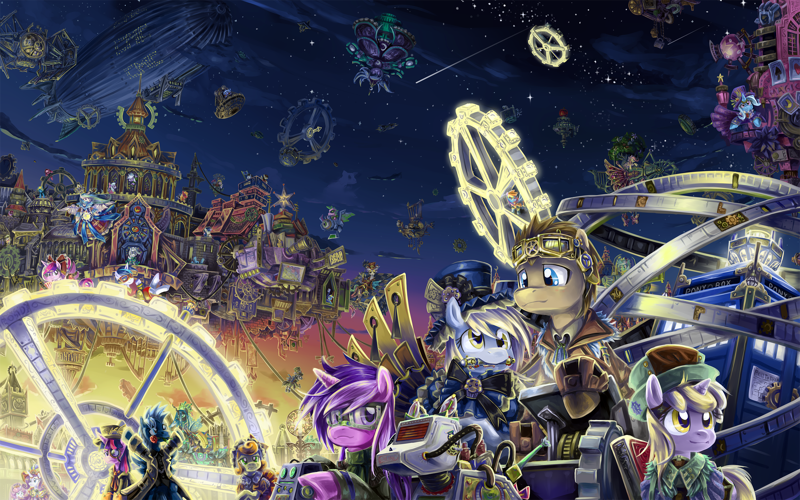
Celestial Crevasse
saturnspace —
Celestial Crevasse
Published: 2012-11-06 07:53:58 +0000 UTC; Views: 85057; Favourites: 5246; Downloads: 6717
Redirect to original
Description
[link]follow please
It took time, way lot then I expected & the college is so buzy but at least is done : }
the color is brighter than I expect hmmmm
As one of the project I always wanna do, Have some Clockwise and steampunk maybe : P
the ponyville took most the time, and I stop for 2 month for college studies.
At least is done or I'm done with it D :
reference is still much I can't help it, and I try for 2560X1600 so have fun : D
yup its still doc I can't help it D :
I should try another still next time hmm
its 11:47 and I gonna sleep : I maybe I edit the text later then
btw I do found Jack is the obvious one X D
comment plz 0 0
update, this have been features on daily deviation, its 200% cooler! : D
Related content


Comments: 581

👍: 0 ⏩: 0


I would like to say that this is probably one of the greatest pieces I've ever seen in MLP fanart history.
This has tons of color and the display is crystal clear. I like how you made Derpy hold the screwdriver because it makes her look very brave. When I first came across this I was at a loss for words for how beautiful the concept is and how much effort you put into this. The design is amazing and the background is just absolutely marvelous!
I am very proud of how you made this piece turn out. It looks fabulous and amazing!
Keep it up!! e.deviantart.net/emoticons/b/b… " width="15" height="15" alt="
")
👍: 0 ⏩: 0


I saw this and instantly thought of one of my favorite books: Larklight. I thought of that because it's a book that shows space as a big, full, and maybe slightly wild place that's filled with adventure and magic. You have a really good sense of color and detail. It really shows with your attention to minute parts of the painting. So often I've seen good MLP art, but this blows others out of the water because of the amazing prowess shone in depth, color and light. I really hope to draw like you one day, especially in this beautiful way.
As far as bad things, there isn't much to be sure. I ask myself the question of why the gears aren't attached to anything. Maybe it's because this is some kind of factory, I'm not sure. I'd also almost cut down on the details in the ponies in the foreground. I'm not talking about the detail of the art, I'm more saying they're a little packed together and it's a bit hard to tell where one pony sits as compared to another, etc. also they create almost a triangle as a focal point, but the bottom edge of the triangle is white space, and made my eye jump a tiny bit.
The back left is perfect, as far as I can tell. I love the light coming off the gear in the corner. I also love the details such as the Doctor Who reference and other such details. Great work!
👍: 0 ⏩: 0

Impact
Wow this is jut... Fantastic. I could sit and stare at this piece all day and marvel at its beauty.
Vision:
This looks like a professionally made promotional poster that you see in game stores or used to see in video stores. Shading, lighting, color, and detail are phenomenally executed, pulling it together tightly. Im a huge fan of how you did the background and it reminds me of bioshock.
Originality:
Never before have i seen what you do. Clockwise Hooves is truly a spectacle of ones mind not conjured from any other ideas. I am going to include all of your other works into this and say ive never seen anything like it. Your work is truly phenomenal and deserves five stars for originality.
Technique:
The strokes you use combined with the shading and highlights you provide make for excellent technique. I am a fan of the way you draw hooves and facial expressions and makes for wonderful style. All these factors really pull this drawing together for one big slice of epic pie.
Impact:
The only reason you're not getting five stars for impact is because ive seen some of your art before and i did not have the same feelings about this one as i had with the others. Its still a fantastic piece and my reaction to it was still through the roof. Although, when i saw derpy i fanboyed all over the place.
All in all, this piece is fantastic and i strongly believe that it is one of THE best pieces of pony art ive see to date.
👍: 0 ⏩: 0

Brilliant. Absolutely brilliant.
It's mind-numbing to see such fantastic pieces of art being made by fans of Friendship is Magic, and especially those who devote entire hours and days into creating something that essentially was spawned simply from a true love for a background character in a television show. It truly shows how imaginative fans of particular medium can be, driven by their love of a movie, book, television show, album or even comic.
The simple concept of Clockwise Whooves is something that should be appreciated more as well. This particular piece of art is definitive in its representation of what Clockwise Whooves is. It’s a shear artistic phenomenon; the fusion of what is usually a dark, dirty and rough art style, Steampunk, and giving it a massive splash of colour, dignity and pure beauty. Something I don’t think I’ve ever seen before; and I have been writing a Steampunk novel for the past seven or eight months!
This imprint onto a digital geometric square created through an art editing program is a true testament to the imagination. We all have the ability to create a world of our own full of whatever we want, because it’s ours; and we can share that imagination with others as well!
It goes to show that whatever you’re a fan of, you can be sure that someone out there, someone is doing something extraordinary with their passion.
Keep up the hard work saturnspace! You're an inspiration to many!
👍: 0 ⏩: 0

Men your the most awesome guy doing this doctor stuf God damit you need to do a stream some time plz tell me in your tumblr when you do it plzzzz i love your art and i want to do what you can do ok men im your fan so can you do a draw of dusk shine with the doctor of something like this plz and publish in dusk love life this can be an awesome contribution your the best and i love derpy with the Doctor stuff... ok any way good work and keep it up men XD
👍: 0 ⏩: 1

i know and if he can do a dusk like this every one look your page XD
👍: 0 ⏩: 0

Now, I've only seen a FEW of the whole Doctor and MLP bit, but I CAN say that I loved it.
Then I found this.
I think I stared at this picture for a good ten minutes trying to take in everything in this picture as a whole. The sheer AMAZING amount of amazing things to this picture could really be summed up in a few words, but I'll split it up as I see fit through the ratings.
Vision: This piece has SO much to see, that it took me a minute to take it all in, let alone PROCESS it. from the clockwork Tai Fighter, to the Doctors big blue Police Box, (no I don't think he'll EVER fix that Chameleon circuit,) this picture is PACKED with steampunked idea's that could throw anyones mind for a loop.
Originality: Okay, granted I see this as based off the adventures of the doctor in the land of Equestria, but that MATTERS NOT! For the SHEER BRILLIANCE of the designs and re-imaginings of the town and land over ride that like a tank over a pop can.
Technique: Everything flows together, both outshining each other and working together in perfect harmony. So much so that it might take a person several looks to notice everything. And even with that, nothing is drowned out. truly inspiring.
Impact: Now as I said before this piece moves together as smooth as silk, while hitting you like a 2X4 fired from a cannon. Without even trying it catches anybodies eyes just by being there, and as they look more and more at it, they become enraptured by the sheer enormity and depth you went into to re-imagine the land into a steampunk/Doctor Who mash-up of truly gigantic proportions. On behalf of everyone who likes this I say. "Thank you for bringing up a piece of epic art"
👍: 0 ⏩: 0

Before I begin, I would like to point out the fact that words are undoubtedly an inferior and inadequate means of expressing the sheer awe and euphoria conveyed here.
Vision: Unarguably, five stars, no questions asked. Just as I take in the four ponies closest to the viewer, visions of fan fiction and epic tales and full length films are ignited within my mind and I can't make them stop. I've had this as my wallpaper for days, and I keep noticing new details that I previously did not register due to the sheer volume of effort; Five stars.
Originality: For a piece this breathtaking I would normally give a 4.5 just to keep in mind the fact that the characters were created by somebody else, but the raw depth and variety of details in this piece does so much more than make up for the insignificant fact that you didn't originally invent them. I can't bring myself to withhold five stars.
Technique: It genuinely makes my mood a little less happy that I should even flatter myself by thinking that there's anything I need to point out about your technique; I genuinely teared up a bit as I took in the full image.
Impact: With all metaphors and hyperbole aside, the overall quality of this piece was of such magnitude that it heavily damages my motivation to work on my own artistic capability, because I simply cannot envision myself being the one who has wrought something even to compare to this; Five stars.
This drawing is good and you should feel good. This is the kind of art that makes me so, so scared inside knowing that this fandom may have never existed because of gender stereotypes. But it didn't; Five stars.
I'm tearing up again. Thank you so much for creating this.
👍: 0 ⏩: 0

I really love this picture. Every single detail is thought out perfectly. However, I am going to go down by category and praise you that way.
Vision: I'm so happy there are finally more steampunk My Little Pony pictures. i would make my own but I'm lazy. Plus, thumbs up for Zecora and the Royal Married Couple in the background. I love their design.
Originality: Like I said in Vision, I'm glad there are more steampunk MLP pictures. Future ideas all together are a bit lacking in the brony fandom, and I'm glad someone is taking the time to make one. I haven't seen a steampunk MLP picture in a while.
Technique: I love the airbrush kind of feel to this picture. Gives a more "epic" feel to it. I would like it if someone tried a different style but now I'm just nitpicking and trying to find something wrong with this, but it's so hard!
Impact: This, repeating what I said in Technique, had an epic fell to the entire picture that made me fall in love with it. The way every single little detail is though out carefully makes it look full and perfect. I can't find anything that's wrong with it. Great picture and keep up to good work!
👍: 0 ⏩: 0

Holy fuck.
Normally, I'd give a much more detailed and encompassing opening statement for my critiques, as I've always done for years, but this particular piece is amazing. And I'm not just saying that it's amazing on its own right, but it's amazing in comparison to other amazing works like from はせ or extvia.
I'm totally digging the "Steampunk in a dimensional space rift" theme. The cog motif helps to move the eye towards the background, and the foreground use of Doctor x Derpy allows the viewer to look towards the foreground characters that are the apparent main focus of the work. The Tardis is somewhat obscured by the ring things that are around it, but it can't be denied that they definitely look pretty cool.
The ridiculous amount of detailwork that went into this must've been astounding. Even though I don't get a few of the references made, like the purple OC-looking pony next to Derpy, or the Master-looking character next to Twilight, much of pic hides easter eggs for the dutiful spectator.
Trixie's magic tower, Fluttershy's treeship, the CMC blimp, and even the whole of Steampunk Canterlot was something I failed to notice until I downloaded the pic and saw Cadance and Shining Armor in their full 2560x1600 glory. I don't know why, but Cadance's expression just looks all kinds of awesome
Just about everything is included in this piece. Luna lander, Surprise/Ctenoc-opter, Octi/Scratch harpship, and even the Galaxy Express ship is in there.
If there were formal artistic criteria for Epic, this would meet and surpass them.
👍: 0 ⏩: 1

I think the purple pony is Sparkler, if I remember her name right- one of Derpy's fanon sometimes-adopted/sometimes-biological daughters.
👍: 0 ⏩: 1

Fanon name Sparkler, Canon name Amethyst Star, but either way right on the bullseye

👍: 0 ⏩: 1
Thanks. :3 Wow, everyone has loads of names, don't they? (Says someone who can't settle on a ponysona name or appearance for more than 2.5 seconds. ")
👍: 0 ⏩: 1
Oh lord, go to the mlp fanon wiki and look up the list of ponies. It's a clustercuss.
👍: 0 ⏩: 1
I have, I have... Dear sweet Celestia, they have so many aliases it's like Equestria's Most Wanted. XD
👍: 0 ⏩: 1
Fandom aside, I'm kinda annoyed with characters having a toy name and show name. Like Bon Bon; her recently-announced other name is Sweetie Drops. How the hell do we work with that? Bon Bon de la Sweetiedrops?
Sorry, I get ticked when there is a lack of continuity in something so simple.
👍: 0 ⏩: 1
What we have here is a failure to communicate...
👍: 0 ⏩: 1

Spectacular! The level of detail is just beautiful!
The only thing that I can really find wrong, is symmetry in the roundness of gears and architecture. Though, I can't say that I could do too much better, free hand, lol
The lighting, I feel, just fits. it adds to the whole "different scenes" feel, and overall complexity that makes this fun to look at ^_^
I have seen a lot of steampunk, typically lackluster, or overly complicated. You seem to have found a perfect balance, here.
The sky is simply beautiful! heavy stars in pitch black, then fading them out into the lighter sky.
Overall, great work!
👍: 0 ⏩: 0

Technique
Very well done. I'm sincerely impressed. You obviously put a lot of effort into this, and the amount of details (both big and small) have so much put into them that it's borderline worrying. My biggest complaint, in all honesty, is that it isn't bigger. I want to be able to zoom in on those little details and ponies next to the town, or see Twilight's expression better. That's what upsets me the most.
The K9 is a nice touch. Seriously, I can't stress that enough.
My only artistic complaint is your shape of the pony's faces. They're very rounded, with little point or ridge, which strikes me as inaccurate, as the ponies in the actual show have sharply pointed noses, rather than the soft, blunt ones here. Your art style is one I've seen adopted throughout fanart for the ponies, and I'm honestly not a big fan of it. I can't complain, however, because your shading skills make up for it tenfold.
Very nice.
👍: 0 ⏩: 0

Hmmm... is it even possible for me to catch mistakes for something with so much effort put into this?
Nothing about the composition seems wrong to me... it may seem like a giant heap of mess, but you seem to know hetter and had a relatively empty sky and plenty of characters in the foreground to take up a ton of space. This peice ends up being a little adventure where one can dive in to see what they can find. There are probably a handful of characters I haven't found yet so it's a bit like a Where's Waldo game.
Lighting though... that's something that's a bit tough for me... you have a ton of light sources here, and possibly added sources that are off-screen (canvas?) Shining armor's leg looks credit-card flat, but that's probably the only leg that looks like it, probably because his hoof doesn't appear to be there on that leg. I can't really agree with having a lit line right between the edge of that shape and a shaded area on that exact leg as I don't think I have seen real lighting work like that. I see a similar thing done on the floating rings on the right. Rings on the bottom seem alright to me though.
The blue guy in front of the giant gear on the bottom left appears darker than other ponies in the area. The lighting probably shouldn't be so dramatic unless Twilight's lighting is even more dramatic since she's closer. Golden Harvest's shading seems odd as the lit part of her nose seems to suggest a light right above her.
I also think I should be seeing a lot more red highlights because you have a setting (rising?) sun as a light source on top of yellow light sources all over.
Glancing everywhere else, lighting doesn't seem that coherent in many other places but only because I actally sought for mistakes in an attempt to make a useful critique.
Overall, a fun peice to look at, but it falls short of being as real as it could be if you really dig into this deep enough.
👍: 0 ⏩: 0

Impact
its so cool! i like how you put little things in the background too! close up and far away. you did a wonderful job!!!!! e.deviantart.net/emoticons/s/s… " width="15" height="15" alt="
 (Smile)")
i LOVE the technique you used its so clean and as for originality; 5 stars ive never seen anything like it before! its almost 3D! <3 this art work is one of my favorites by far! keep up the good work and stay creative! i will make sure to favorite this art work and watch you. (that doesnt sound creepye.deviantart.net/emoticons/s/s… " width="15" height="15" alt="
e.deviantart.net/emoticons/b/b… " width="15" height="15" alt="
👍: 0 ⏩: 0
Dear Lord, where do I start?
The style is absolutely brilliant! The shading, the lighting effects, the dimensions (I can go on and on about it), they are all done marvelously.
I've seen plenty of steampunk pony art in my time, but this ... this tops them all. The floating city and the various hovering vehicles such as the bright shining wheels and the massive zeppelin in the background, as well as the plethera of ponies in the appropriate attire, add to the liveliness and indistrial sophistication of the picture.
Nothing else to say other than a very original piece done with skill and patience that can make other artists green with envy. And I think I just found my new wallpaper. Well done, mate. Well done.
👍: 0 ⏩: 0

Impact
as a non doctor who fan, who haven't seen the show, there are some features in this picture i cannot understand, i don't think it's completely necessary to enjoy this art but it is a thing to take notice on while the reading this critique. e.deviantart.net/emoticons/a/a… " width="19" height="19" alt="

here we have one of those incredible pictures that has taken more time and dedication than most people really understand. not alone the shading and coloring but as in planing, sketching, designing, choosing the small characters in background, MAKING all the small characters in the background. EACH of these mentioned features in this picture could very well have taken more time and creative progress than one whole picture would alone. seriously don't underestimate this e.deviantart.net/emoticons/s/s… " width="15" height="15" alt="

some examples: i can see Trixie in her general fashion looking arrogant as she is even with this tiny space for details. nice touch with the matching building.
i can see what looks like a tie-fighter from Star wars, with a pretty nice design crossing along the steampunk.
i spot my favorite ponies cloud chaser and flitter hanging out in that building in the background.
i spy a Big Ben in the downer left corner of the picture. and a ton of other references. seriously this is stacked up with content blowing my scale if amazement.
all the characters in the background is well visible and recognizable, but on a negative note that is a little..... how to say.... unrealistic? in a real perspective most of those ponies would be a bit more faded. some may think it's nice to see all the lovely ponies so i guess it's a little out of opinion, personal i like it.
the ponies in from also look amazing, could have been a picture with them alone and it'll still look awesome no background needed. (but i think we can all agree it nicer with that background XD)
doctor whooves looks great in that pose and with that smile aside Derpy, suggesting a bit of shipping but who doesn't like that? XD though i find it worth to mention that his hoof looks very different from his face, seams like traditional while his face looks digital. i'm not sure if it's part traditional and part digital of if it's just a digital that looks a bit traditional but unfortunately it's not something i fancy: the picture should preferably keep to one style in this case and that my opinion.
the design f clothes is also a masterpiece in itself fitting each pony perfect.
when you make something this great, with so many details and so many characters EVERYTHING MUST also be perfect and it's pulled off quite nice. except for one lone tower with some boring holes as windows, it's not a bad thing, but it kind of stands out as something that is not amazing, like a tiny black spot on a perfect white shirt it's a but visible to me.
the artist itself kind of admits that it is a little bright, and i assume that is a matter of opinion too, but i sorta agree on that. it was the first thing that hit me besides the GLORIOUS artwork it is.
so all in all.........breathtaking. this is the result of a mad scientist who build a machine to harness all the creativity and talent in the world, sucked it out of every single artist out there and every single artwork and SPLASHED it upon and mortal hardware, not worthy the receive that belonging and honor.
P.S remember to check what Vision, Originality, Technique and Impact means, because it's crucial to understanding the stars i give.
👍: 0 ⏩: 0

What can I say about this?.....to be honest, I can't spot anything negative about this picture. The colors really stand out and make a beautiful contrast. It reminds me of a sunrise I witnessed after watching a starry night sky. The gears were also clever-I've seen the inside of a clock (one of my art projects was to make one). That really shows the connection to time. Finally the family....I'm confused-should it be Whooves, or Hasbro's Hooves....I'm rambling, aren't I. Anyways, the outfits and expressions were just brilliant! The calm dad, cheerful wife, serene older daughter and mystified younger daughter. You set a new standard-keep it up!
👍: 0 ⏩: 0


THIS IS THE COOLEST... THIS IS THE COOLEST FANART EVER
👍: 0 ⏩: 0


amazing drawing!!! so many details congrats!! it's lovely! o3O ♥ ♥ ♥
👍: 0 ⏩: 0

This is just screaming for someone to make into a story. Alas, if my plate wasn't already so full...
👍: 0 ⏩: 0

Oh god, your attention to detail is just breath taking! Is there a story surrounding this steam-punked MLP world?
👍: 0 ⏩: 0


(Drools excessively) Sweet Gyros... This... is staggering! I love it!
👍: 0 ⏩: 0


Holy melon squash spread with butter with a side milky sweatness! This is amazing!😄
👍: 0 ⏩: 0

OH MY HOOFIN' CELESTIA THIS IS AWESOME!!!!!!!!!!!!!!!!!
this is 200,000,000,000,000,000% cooler
👍: 0 ⏩: 0

I know nothing of Clockwise, Doctor Who or Steampunk but this art is absolutely amazing and a huge eye opener! I love that the airship has "CMC" on it.
👍: 0 ⏩: 0
I love this, I love this, I love this. I have our ad a screen saver and can't get tired of it. I love it!
👍: 0 ⏩: 1


I give 100/10 for EVERYTHING!! It's just... perfect.
👍: 0 ⏩: 0

so, epic. there is so much going on. I feel like I need to keep looking at it because I'll notice more things that make me smile. so much steampunk, so much ponies. so much of my yes.
👍: 0 ⏩: 0

Is that walpurgisnacht at the top of the page in the middle?z
👍: 0 ⏩: 0


Woooaaahh...!!! This looks just... woah... 


I simplt love all the details here!!! There's so much to look!!!
Excellent job!!!
")
 (Wink)")
👍: 0 ⏩: 0

sta.sh/0284lel8ab1m
got it printed as a friend's birthday present :3 (18.75'' x 30'')
👍: 0 ⏩: 0
| Next =>