HOME | DD
 sayra — shadows of time
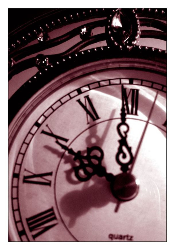
Published: 2004-12-12 09:19:16 +0000 UTC; Views: 527; Favourites: 14; Downloads: 40
Redirect to original
Description
my own photo + bad lightingcropping/contrast/tones added in photoshop 7
Related content


Comments: 19

this would be SO COOL shot if it wasn't so grainy and a bit blurry 

👍: 0 ⏩: 1

yeah the lighting that i was using was really bad, i may redo it, thank you
 (Smile)")
👍: 0 ⏩: 0

Nearly 10 o'clock, looks like you planned the lighting, the shadows look good... I like the reddish tint, nice job
👍: 0 ⏩: 1


Wow, I've been taking photos of clocks for about a month now trying to get a really cool one. This beats the pants off them
")
👍: 0 ⏩: 1


Oh crud, I missed this one in my commenting. I really like it - perfect range of darks and lights, and nice tone choice. Also I like the title.

👍: 0 ⏩: 1


