HOME | DD
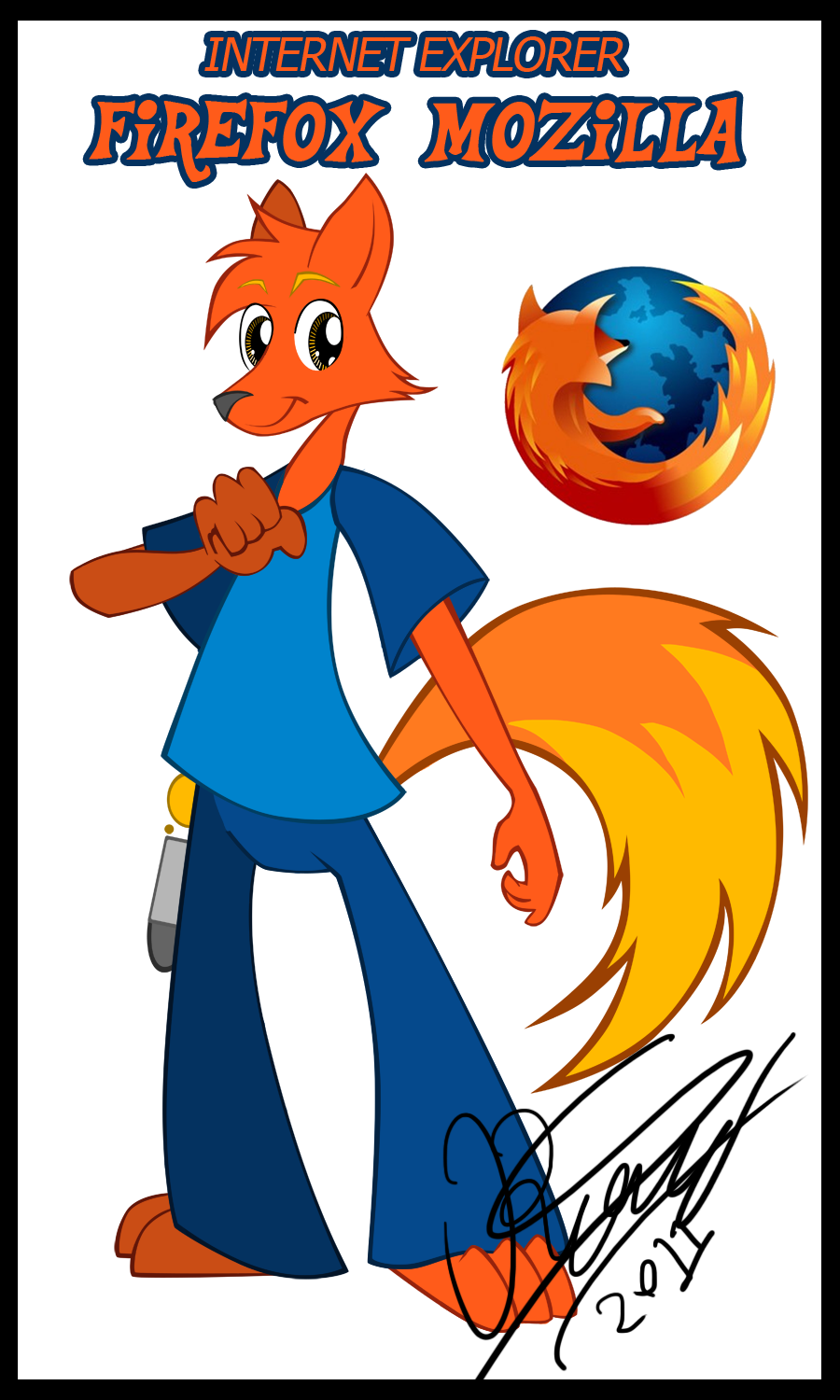
 Sc0t1n4t0r — Firefox Mozilla
by-nc-nd
Sc0t1n4t0r — Firefox Mozilla
by-nc-nd
Published: 2011-09-20 06:31:11 +0000 UTC; Views: 1457; Favourites: 16; Downloads: 17
Redirect to original
Description
This vector was done trying to imitate a ton of styles going from the famous MLP FIM Lineart vectoring cartoon to the least known Dreamkeepers anatomy style including as well some other aspects of drawing such as including mostly triangles to the character.-----------
I'm glad I did vector this, and I mostly tried to imitate the style of My Little Pony: Friendship is Magic and I simply adore how Mozilla looks!
I'd just wish I could do this a TV show!
one day... one day...
------------------
(Insert show sinopsis here)
I'm not telling you, sorry.
Mozilla Firefox icon and name is owned by the Mozilla company
Character and art is all me
EDIT:
My little pony font owned by Hasbro and creator Lauren Faust
Older version of Mozilla: [link]
Related content


Comments: 17


sí, además que tiene mas identidad así.
👍: 0 ⏩: 0

jejejaja recuerdo cuando lo estabas dibujando jeje , asi se habala amigo!
👍: 0 ⏩: 0

Something about... those eyes.
I click on his symbol every day.
👍: 0 ⏩: 1

the eyes are designed specially to represent a digital soul
👍: 0 ⏩: 0

Ohhh looks good! I think you could had a secondary color to the face (like on the tips of the ears and under the chin) similar to what you have on the tail to get more of the fire look.
👍: 0 ⏩: 1
it would be a bit too overcolored though...
👍: 0 ⏩: 1

Doesn't convey the "fire" theme as well as the icon does. Only the tail has the slightest hint of that, and while the icon only has the lighter transition in the tail, it is more effective because it has no branching parts, whereas yours does.
And your signature looks so much more "authentic" than mine. D:
👍: 0 ⏩: 0


Firefox?!!? D: Chrome for the win!!!1!
Anyways, on a serious note: Nice looking one there. I really like your style!
👍: 0 ⏩: 1
I haven't thought for a design for chrome yet...
👍: 0 ⏩: 1