HOME | DD
 scarlet-visions — Eureka7-It's nice, isn't it?

Published: 2007-04-26 14:48:57 +0000 UTC; Views: 2552; Favourites: 79; Downloads: 79
Redirect to original
Description
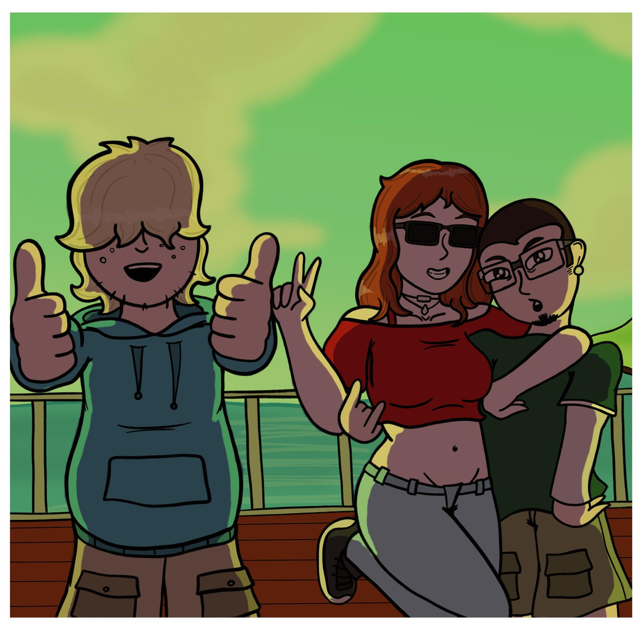
I know Eureka doesn't look like Eureka.... *tears*I am thinking of printing this to sell at Artist Alley.
PLEASE CRITIQUE. >_<
Related content


Comments: 32


JAW DROPPING!!! Eureka is an extremely complex character, I've read so many interviews with people who drew her and people who attempt and it is extremely hard to get her face right.
You did an amazing job in trying to re create this, don't feel bad over it because it is a really hard character to get right.
👍: 0 ⏩: 0

OMG THIS IS SO PRETTY!!!! ;-;
And Eureka looks like herself! Just a little girl version of herself. XD
👍: 0 ⏩: 0

It's really pretty. I like it a lot.
As for critiquing... Renton's arms look too short. The one in the foreground is understandable, since you're looking at it straight on, but the one in the background you can proportion to his head, and you can tell its too short.
👍: 0 ⏩: 0


Great art. Very nice colour choices. It's just something about Eureka's face that makes her look like a demon.
👍: 0 ⏩: 0

Absolutley amazing E7 art. I love the soft textures on it  (Smile)")
👍: 0 ⏩: 0

omg i love it! eureka is so cute here, with a sweet lil smile and her boots hanging over the edge. i like how renton is reaching up for something, its a cool effect. and, of course... sky fishies !
👍: 0 ⏩: 0


This is quite good, and quite unique in that it seems more abstract the other drawings with similar settings.
👍: 0 ⏩: 0


pretty ~ ^^ ~ I wated this series during my winter exams lol, it was a nice break lets say
👍: 0 ⏩: 0

Such a beautiful composition!
I've never watched Eureka, but I loved this!
It's so pretty, with the soft fuzzy colors and the flowing green things hehe! (I have no idea of what they are lol)
I don't have anything to criticize about. x.x;

")
👍: 0 ⏩: 1

thank you!! You are yoo kind ;_;
Watch Eureka Seven if you have the chance, it's awesome!
👍: 0 ⏩: 0

I like the soft colours and lines a lot. It's a lovely piece
👍: 0 ⏩: 1
Thank you so much! Ahhahaha I've got comment from my brother saying that he doesn't like the softness if this... OTL
👍: 0 ⏩: 0

very cute picture and nice scenery
👍: 0 ⏩: 1
As in... make the colours sharper?
👍: 0 ⏩: 1
eh, just brighter colors in general, less towards the grayish side and more towards the sunlight.
👍: 0 ⏩: 0

omg that is sooo adorible!!! i personally think that Eureka looks great. the whole peice reminds me of something from a dream way to go!!!
👍: 0 ⏩: 1

Colours should be stronger. You really like wispy colouring don't you?
👍: 0 ⏩: 1
no, more like this is the only colors that I can work with in a large scale. LOLLOL OTL
👍: 0 ⏩: 1

I go critique: RENTON IS TOO TALL LOLOLLOLLL sorry when you said critique it's the only thing that went through my head.
noes you phail you never gave me the rest of the episodes I only got through 8 ;a; <-- ugly Lambo face
👍: 0 ⏩: 1

Oh god i was thinking about their height thing too **LOL But it's actually because Renton is drawn bigger in general. If you look at the proportions they are not the same in size.
In terms of printing, to be honest the majority blue is a very difficult color to generate - meaning the print may look quite different from what you see on screen. Also to produce a higher quality looking print, i suggest some more craft/details on the clouds.
👍: 0 ⏩: 1
I actually ran a test print at school today... omg this thing needs tons of refining LOL I seriously need to get into the habit of painting at actual size.
The size .... I fixed it already... but OTL failll
👍: 0 ⏩: 0

ohh very kawai ^^! ......................................................
👍: 0 ⏩: 0
