HOME | DD
 Scazza — gq.mock.up

Published: 2006-06-24 13:02:43 +0000 UTC; Views: 4262; Favourites: 36; Downloads: 303
Redirect to original
Description
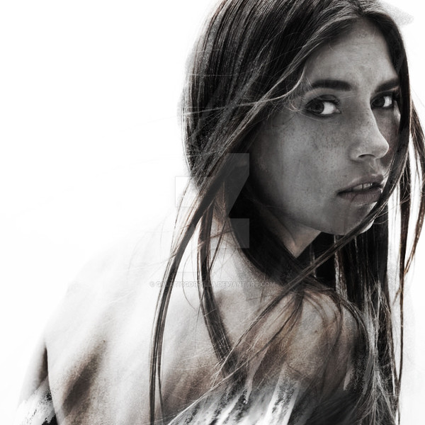
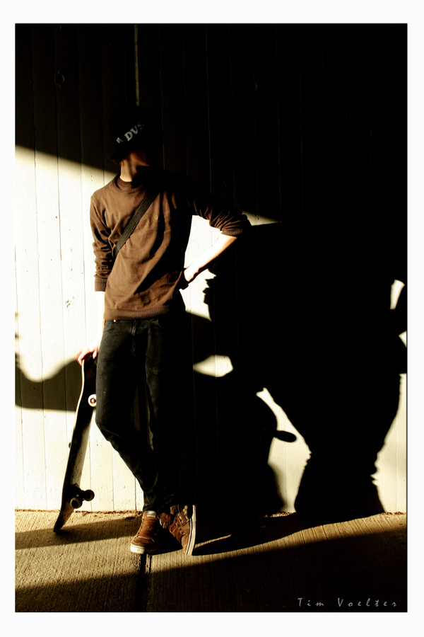
all the people who follow my vectors know that i am a huge fan of gq magazine. so here is a mock up of a double page spread of a feature about my town and its double side with the urban town and it being surrounded by countryside and its fashion. this spread is the start of the feature on the countryside part of taunton.really gettin into magazine layouts and that, don't know why and it's really good to be able to do it using my own resources. picked up the font from dafont.com, its made by StereoType (i think).
Related content


Comments: 72

It's called Madredeus, I got it from [link]
👍: 0 ⏩: 1


 (Smile)")

")


digging everything except the font.
Bit difficult to read.
👍: 0 ⏩: 1
Its just a bit difficult to read, and I'm not sure a magazine would find it all appropriate because of its thinness. It does look good though
 (Wink)")
👍: 0 ⏩: 0

'really looks like a spread--the placement of text and all
👍: 0 ⏩: 1

i love that font.
ive downloaded it and used it in the past.
👍: 0 ⏩: 1
tis is a nice font, but has to be used big!
👍: 0 ⏩: 0

wow..... that kicks ass..... gr8 typo and whlw composition
]
👍: 0 ⏩: 1


very cool. i thinhk the white type in the bottom corner is slightly hard to read. especially the word jeans. though thats just a minor thing.
👍: 0 ⏩: 1


Whats that font dude ? & where can i get my hands on it ?
Nice
")
👍: 0 ⏩: 1
its caalled Madredeus and can be found at dafont.com
👍: 0 ⏩: 1


nice, but the font looks like a tech style more than Country.
👍: 0 ⏩: 1

I like this. It looks great. I like the lighting and pose. Nice work.
👍: 0 ⏩: 1


I really like this a lot, I think the composition is clean and the tone is great. However, I think you could work the title of the piece a it more. The font that you chose was a good chocie, but I think you canpush it further. GQ is known for its sophisticated titles, thanks to Fred Woodward. But I really like where this is going! Congrats!
👍: 0 ⏩: 1
thanks, thats the only thing that i suffer from, i piss poor font library lol. i think im just gonna have to spend a whole day searching the net and building up a decent font library
👍: 0 ⏩: 1
Haha yea good luck! dafont has some great fonts and if you go to [link] there are tons of resources there, including fonts. Lemme know if you need anything else
👍: 0 ⏩: 1
thanks for the link bro. looks good. will definatly give you shout if i need anything else
👍: 0 ⏩: 0

wow, been a lonnnnnnngggggg time since u commented on one of my peices dude hehe. as for that being me in the photo, thats a negative. its my friend nick
👍: 0 ⏩: 1
| Next =>