HOME | DD
 Scazza — post-production.
Published: 2006-01-18 17:54:33 +0000 UTC; Views: 4267; Favourites: 56; Downloads: 334
Redirect to original
Description
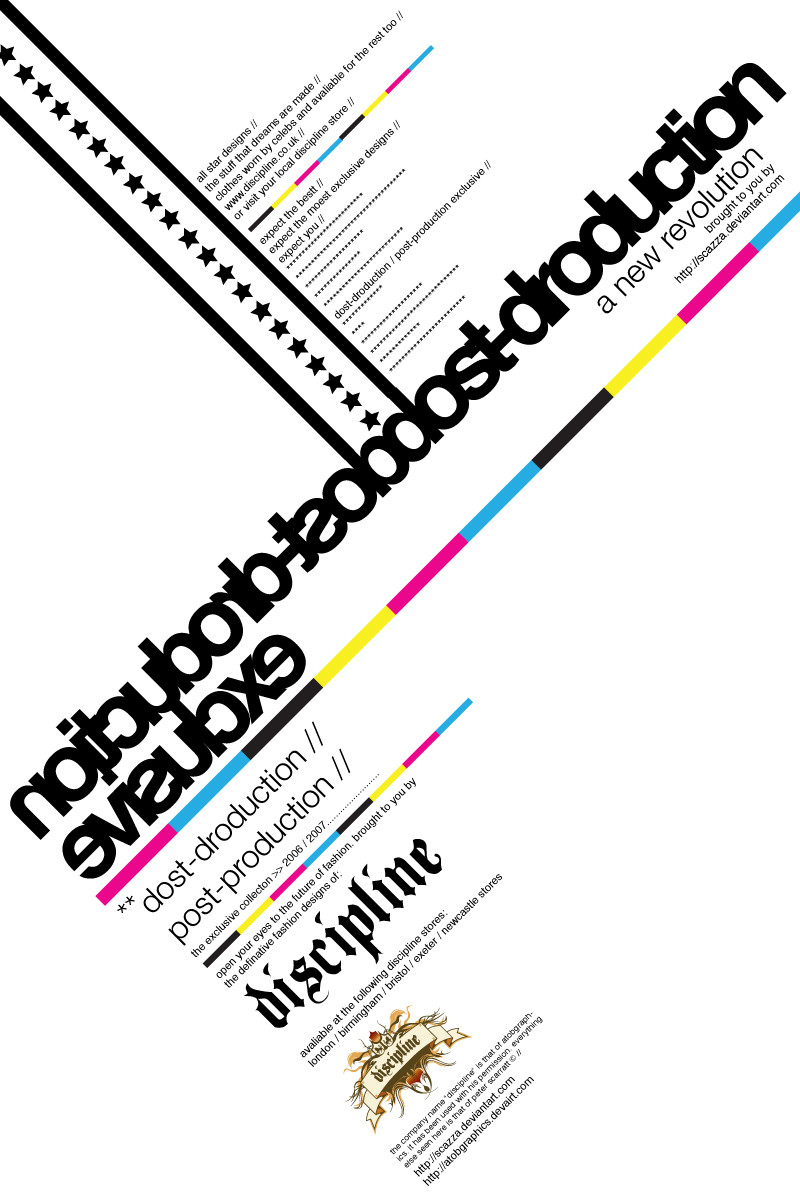
this is something really basic i just put together as i went along. based it round an advertisement for a new range being launched by "discipline" (again its fake). mainly concentrated on the typography here (Smile)")
comments and feedback would be appreciated on this one as would be nice to see how people react to it
i think it will be like marmite, u either hate it or love it ")
*note: also, i no funk rush uses this colour scheme, i think its cool so used it
Related content


Comments: 64

dost-droduction...hehehe.
I kinda got confused by the big text...oh I see...
Looks clean, very much a formal invitation...Every time you make one of these the company gets more and more tangible...
?eace.
👍: 0 ⏩: 1

lol, its something different and it all goes well together i think
👍: 0 ⏩: 0

i like it alot
it took two looks but not a sweat at all to understand
great work again!
👍: 0 ⏩: 1
yea thats what i kinda went for, if you saw it, u wudnt no what exactly it was about, so u would take another look and then you would know exactly what it was advertsing
👍: 0 ⏩: 1
figured, silly but creative scazza at work
👍: 0 ⏩: 1
")

you knows it!! theres so many different things you can do to this font!!
👍: 0 ⏩: 1

indeed! It looks so damn good in almost any situation.
'Tis a fantastic peice of typographic design.
I like your peice btw, I've always liked design with limited use of colours - and black and white - and use of striking layout.
👍: 0 ⏩: 1

<= Prev |