HOME | DD

Scazza — post-production.

Published: 2006-01-18 17:54:33 +0000 UTC; Views: 4267; Favourites: 56; Downloads: 334
Redirect to original
Description 
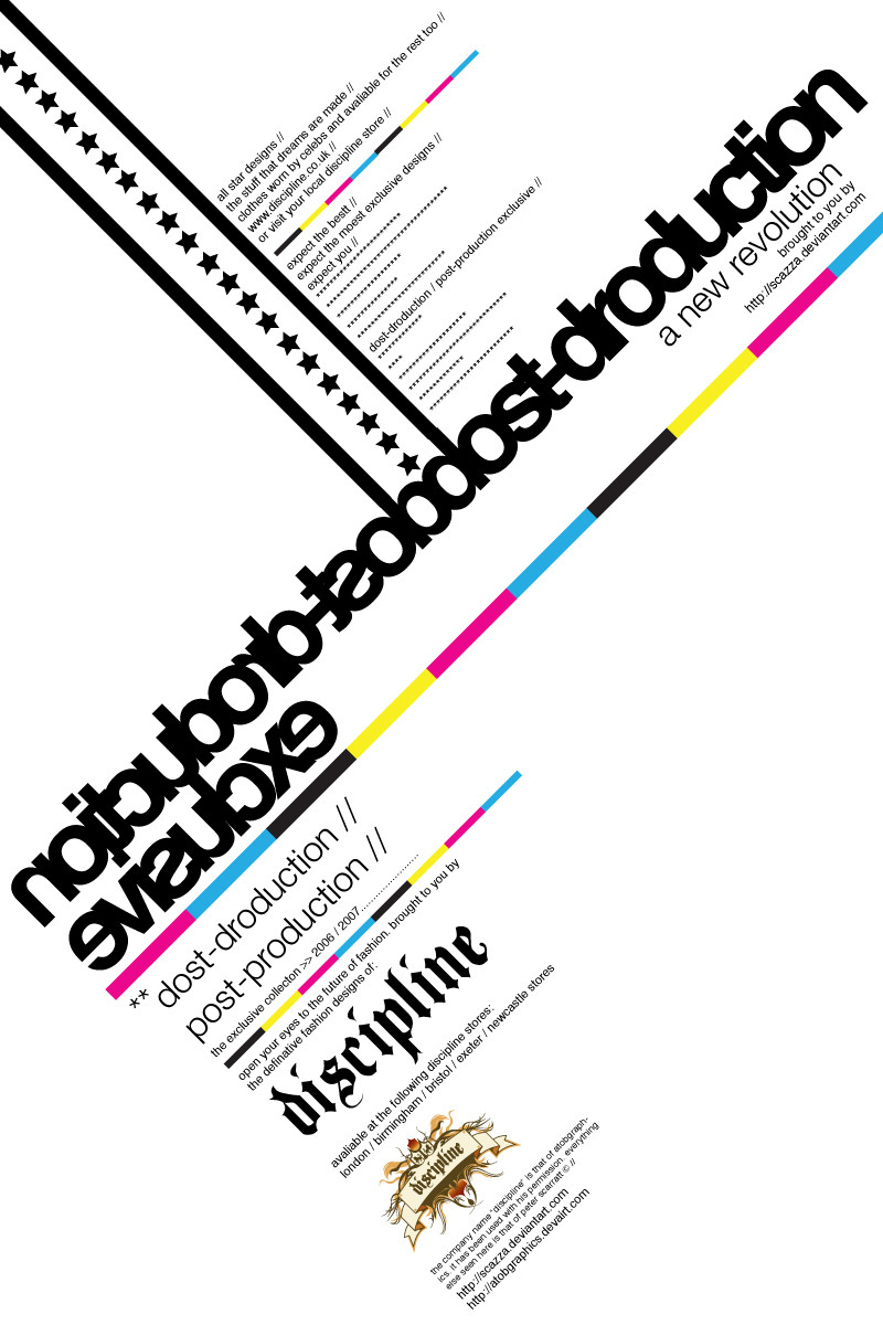
this is something really basic i just put together as i went along. based it round an advertisement for a new range being launched by "discipline" (again its fake). mainly concentrated on the typography here

comments and feedback would be appreciated on this one as would be nice to see how people react to it i think it will be like marmite, u either hate it or love it

*note: also, i no funk rush uses this colour scheme, i think its cool so used it
Related content
Comments: 64

Scazza In reply to ??? [2007-01-18 20:38:10 +0000 UTC]

👍: 0 ⏩: 0

lefthand-design [2006-11-23 18:59:02 +0000 UTC]

Really excellent design.

👍: 0 ⏩: 1

Scazza In reply to lefthand-design [2006-11-25 09:28:37 +0000 UTC]

thanks lefty

👍: 0 ⏩: 1

lefthand-design In reply to Scazza [2006-11-26 09:39:30 +0000 UTC]

No problem.

👍: 0 ⏩: 0

incognitoWolfe [2006-11-06 20:47:38 +0000 UTC]

Very nicely laid out... great use of white space and CMYK colors Very Swiss Design like.

👍: 0 ⏩: 1

Scazza In reply to incognitoWolfe [2006-11-08 18:35:20 +0000 UTC]

thanks

👍: 0 ⏩: 0

Heba-K [2006-11-03 20:23:22 +0000 UTC]

i really like it...

👍: 0 ⏩: 1

Scazza In reply to Heba-K [2006-11-03 21:54:15 +0000 UTC]

thanks

👍: 0 ⏩: 0

hybrid101 [2006-11-02 07:37:52 +0000 UTC]

simple, yet very effective
fave

👍: 0 ⏩: 1

Scazza In reply to hybrid101 [2006-11-02 15:16:15 +0000 UTC]

thanks for the fav

👍: 0 ⏩: 0

DanielDytrych [2006-10-17 12:26:30 +0000 UTC]

Helvetica is the king of fonts. I really like this. If helvetica wasn't here, I wouldn't like no way near as much.

👍: 0 ⏩: 1

Scazza In reply to DanielDytrych [2006-10-18 08:57:08 +0000 UTC]

Yea, King of all Kings

👍: 0 ⏩: 0

Solarpitch [2006-05-17 23:50:07 +0000 UTC]

Hey . . I like this. Its very basic but works very well . . . I might try my own soon and you can check mine out

👍: 0 ⏩: 1

Scazza In reply to Solarpitch [2006-05-18 00:52:45 +0000 UTC]

thanks, if you do, let me know and i will check it out

👍: 0 ⏩: 0

riseTM [2006-04-13 17:16:27 +0000 UTC]

This is great. I need to do more type work. That one thing i'm lacking...

👍: 0 ⏩: 1

Scazza In reply to riseTM [2006-04-14 07:37:46 +0000 UTC]

hehe, you gotta love type

👍: 0 ⏩: 0

PeNr1 [2006-03-24 10:01:25 +0000 UTC]

Really cool, but I see 3 spelling mistakes in a minute .

👍: 0 ⏩: 1

Scazza In reply to PeNr1 [2006-03-24 11:26:04 +0000 UTC]

doh.

👍: 0 ⏩: 0

epbs [2006-03-05 23:01:49 +0000 UTC]

this looks alot like a poster by the bahaus. thats spelt wrong lol. very cool layout. x

👍: 0 ⏩: 1

Scazza In reply to epbs [2006-03-06 00:15:20 +0000 UTC]

yea, should start proof readin my work, bad habbits hehe

👍: 0 ⏩: 0

spookit [2006-01-19 13:45:50 +0000 UTC]

I love the use of the cmyk colours here. What really bothers me though are two things:
1: the uncomfortable space on the edges with the large use of postproduction. Its not a small enough space to be cropped, but its not large enough to flow I feel and it creates some bad tension on the sides.
2: the heavy lines with the stars throws the symetry (sp?) off a little, making the top left sides heavier than the rest of the piece.
Aside from the face that its Helvetica (I loathe this font ) its a good piece. I like the flow and the layout. Nice job.

👍: 0 ⏩: 1

Scazza In reply to spookit [2006-01-19 14:35:09 +0000 UTC]

thanks for the crit

👍: 0 ⏩: 1

spookit In reply to Scazza [2006-01-20 18:15:36 +0000 UTC]

np. im practicing too. lol. we do crits alot in class now. >.<

👍: 0 ⏩: 0

alexbipbip [2006-01-19 13:12:56 +0000 UTC]

oh this is great!!!!!!!

i love the way u use typography!


love it

👍: 0 ⏩: 1

Scazza In reply to alexbipbip [2006-01-19 14:35:22 +0000 UTC]

thank you

👍: 0 ⏩: 0

missingperson11 [2006-01-19 06:06:30 +0000 UTC]

CMYK love it, wonderful theme

👍: 0 ⏩: 1

Scazza In reply to missingperson11 [2006-01-19 11:16:25 +0000 UTC]

thanks

👍: 0 ⏩: 1

missingperson11 In reply to Scazza [2006-01-20 04:27:50 +0000 UTC]

anytime

👍: 0 ⏩: 0

lemontea [2006-01-19 04:20:38 +0000 UTC]

Awesome typography and I really like those trendy colours.

👍: 0 ⏩: 1

Scazza In reply to lemontea [2006-01-19 11:17:57 +0000 UTC]

thanks 'lemontea, appreciate it

👍: 0 ⏩: 0

CreativeFX [2006-01-19 02:24:46 +0000 UTC]

hehe sweet typography work n design!

👍: 0 ⏩: 1

Scazza In reply to CreativeFX [2006-01-19 11:19:18 +0000 UTC]

thanks pete

👍: 0 ⏩: 0

phrantyx [2006-01-19 01:25:01 +0000 UTC]

Love the mirror image of the text, it has some real-life flair to it, rather than just putting a whole typography there.

👍: 0 ⏩: 1

Scazza In reply to phrantyx [2006-01-19 11:19:42 +0000 UTC]

thanking you for the kind words D

👍: 0 ⏩: 0

untitledSG [2006-01-19 00:34:54 +0000 UTC]

really like....really like the treatment of the type setting and also the hiearchy created by the use of 2 completly different typefaces

also like the colours/ lack of!

👍: 0 ⏩: 1

Scazza In reply to untitledSG [2006-01-19 11:20:03 +0000 UTC]

i am glad you like it

👍: 0 ⏩: 0

feel-numb [2006-01-18 21:28:34 +0000 UTC]

mmmmmmmmmm typos

👍: 0 ⏩: 1

Scazza In reply to feel-numb [2006-01-18 22:47:09 +0000 UTC]

haha, i should really brush up on reading my work once its finished lol.

👍: 0 ⏩: 0

smashmethod [2006-01-18 20:55:00 +0000 UTC]

Looks good. The CMYK scheme works well. You wouldn't happen to remember the name of the font in which "discipline" is written in, would you?

👍: 0 ⏩: 1

Scazza In reply to smashmethod [2006-01-18 22:46:01 +0000 UTC]

i believe its called "Baskerville".

👍: 0 ⏩: 1

smashmethod In reply to Scazza [2006-01-18 23:39:31 +0000 UTC]

Baskerville is a super-old school angular serif. Like this: [link]

👍: 0 ⏩: 1

Scazza In reply to smashmethod [2006-01-19 00:04:32 +0000 UTC]

opps, justchecked and its called "Beckett Regular"

👍: 0 ⏩: 2

lemontea In reply to Scazza [2006-01-19 04:20:23 +0000 UTC]

Rock on! I totally love that font.

👍: 0 ⏩: 1

Scazza In reply to lemontea [2006-01-19 11:18:33 +0000 UTC]

thank for introducing it to me

👍: 0 ⏩: 0

smashmethod In reply to Scazza [2006-01-19 00:28:27 +0000 UTC]

Thanks.

👍: 0 ⏩: 1

Scazza In reply to smashmethod [2006-01-19 11:20:13 +0000 UTC]

no problem

👍: 0 ⏩: 0

taejo [2006-01-18 19:59:24 +0000 UTC]

Really cool. It's not often you see a bit of good typography.

One thing:the d in the big dost-drocuction doesn't line up exactly with the line that comes out of it (if you know what I mean). Looks unintentional. Is it?

👍: 0 ⏩: 1

Scazza In reply to taejo [2006-01-18 22:45:34 +0000 UTC]

yea, thats a mistake lol.

👍: 0 ⏩: 0

spritek [2006-01-18 18:54:35 +0000 UTC]

I prefer the bottom part, and I'm not sure about putting "both" together: something strange

👍: 0 ⏩: 1

Scazza In reply to spritek [2006-01-18 19:05:02 +0000 UTC]

yea, i prefer the bottom too, but the top was way too blank to leave it so i decided it needed to be have something there.

👍: 0 ⏩: 0


| Next =>