HOME | DD
 Scazza — temp_001

Published: 2006-11-28 21:02:09 +0000 UTC; Views: 2088; Favourites: 21; Downloads: 60
Redirect to original
Description
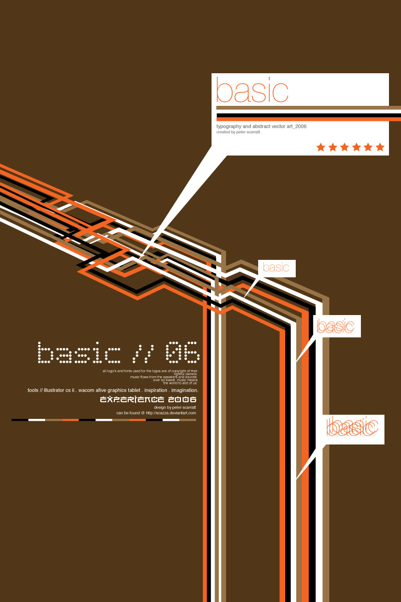
Well I said something was coming soon but I didn't think this soon. I designed this as a template, don't know if it will get chosen, but I like how it looks.Obviously if its chosen people will have their own logo, name and images but I had to use my own for this.
So tell me what you think, should I change some things? Should I keep it how it is? Feedback is good, we like feedback.
UPDATE:
Made the White background slightly transparent so the cool background comes through slightly
 (Smile)")
UPDATE 2:
Toned the BG down.
Related content


Comments: 29

I love your design, your style just clean and minimalist

👍: 0 ⏩: 1


Nice one! this is the dogs b******s! loving the background, did you do the pattern? If not where did you get it from... I could use something like that.
I wouldn't change anything on this, pretty much perfect right now!
Levis
👍: 0 ⏩: 1

umm i cant remember where I got this. Sorry bro. But im glad you like it
")
👍: 0 ⏩: 0


Great stuff
But i think it would be better if the mainpage was less transparent.
Just my 2cents worth
👍: 0 ⏩: 2

lol...i tought it would be cooler if he'd make it transparent, now he makes it transparent ^^
and u start to wine !! lol
(no offence huh ")
i like it waaay better this way!
👍: 0 ⏩: 0

You know, this is really cool, me and a couple of my friends were looking for someone to design and maybe maintain a website for us. Idon't know...just a thought. Good luck with your stuff man.
👍: 0 ⏩: 0

Personally i'd lower the opacity on the floral design to around 10% so that it's actually apart of the background and doesn't distract viewers from the portoflio.
👍: 0 ⏩: 1

this is great.
reflects your style so much
and has alot of your trade marks.
i think its brilliant. and has a real
fresh modern look on boarding
and skate fashion!
👍: 0 ⏩: 1
cheers, glad you like it,going to tweak it abit more so it is even better
👍: 0 ⏩: 1
I like it
maybe you could try making the white background a little transparent so the pattern comes trough,
cuz the pattern looks really nice.
👍: 0 ⏩: 1
now thats an idea, i will defo try that, if it looks better, expect to see the dev change soon
👍: 0 ⏩: 1

very clean design man, although the background image fits, i'm finding it a little noisy.. *shrugs*
👍: 0 ⏩: 1
cheers, yea, im gonna work on the bg, i like Yuurib0za's idea, so will try that
👍: 0 ⏩: 1
yeah, i like the sound of that too. keep me posted
👍: 0 ⏩: 0

That one kicks ass
I would def. use that style for my website.
I'll use this one as an inspiration if thats ok!?
👍: 0 ⏩: 1
well, u might be able to buy the template soon
Hopefully with a few more tweaks, it wil be up @ [link] hehe
but then again, if u want inspiration and do it urself then fair do's
👍: 0 ⏩: 0

like the way you chose a simple navigation style -- always nice when you can get your way around a site -- like the way you seperated the parts -- an interesting result -- later days
👍: 0 ⏩: 1
an interesting result -- just make sure that the slight transparency does not take the focus away from the actual content -- later days
👍: 0 ⏩: 1

i log in my dA account, and i see '5 new messages' so i click it, and then i saw two your works, and my reaction was something like 'aa! scazza's submittin!'
great background
 (Wink)")
👍: 0 ⏩: 1
Hehe
👍: 0 ⏩: 0