HOME | DD
 SchluffyMuffin — You're Ruining My Moment!

#aquamarine #screenshotredraw #stevenuniverse #stevenuniversefanart #suaquamarine
Published: 2017-05-13 20:13:47 +0000 UTC; Views: 734; Favourites: 21; Downloads: 0
Redirect to original
Description
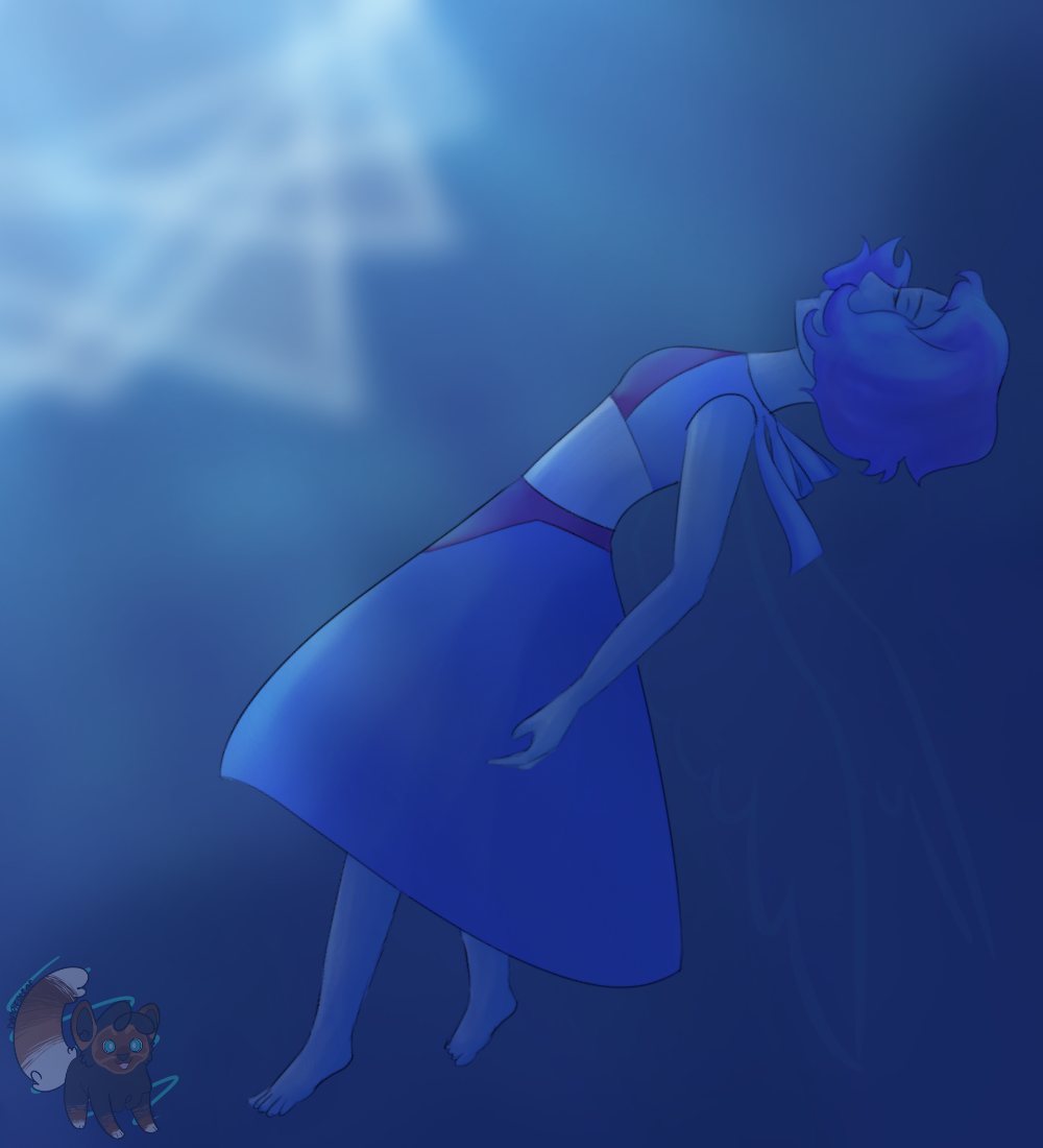
Su screenshot redraw AAAAAAGH I LOVE HER SO MUCH FWKUETUTSYKUFULIT I know this is terrible, but I had to.Related content


Comments: 14

Found this on and having just watched the episodes it references wanted to give a few hopefully helpful pointers.
I like that you've tried to impart your own style on this piece rather than trying to perfectly replicate the shows style. With a show as stylistic as Steven Universe, its tempting to just copy exactly, but you've added enough little details to make it your own. A few places you can look to improve
Pose/Anatomy: The way she is drawn is very stiff, with sharp, unnatural angles. Think about the shape the back will take based on how her weight is distributed. In the original image, she's supporting herself with her upper back and her arm, lying back. Note where her body seems to be touching the chair. In your version, there seems to be a lot less of this contact, like she isn't quite at the same angle as the seat. Taking a look at some photographs or pose references may help you visualize this distribution of weight a bit better. Her legs are also at a bit of an awkward angle, and one seems to be longer than the other. Try to make them look like they are hanging down, not stiffly sticking out.
"Clothing": Even though gems don't have traditional "clothing", they tend to follow the same basic principles, especially characters like Aquamarine, with her skirt. Her shoulders are the biggest issue here, because it seems that the "shirt and vest" aren't really connected to anything, instead looking like they have just been placed over her like a paper doll. Making the "cloth" parts go over her shoulders, rather than coming to a very narrow point at the top will probably give you a better effect. The skirt should be draping a bit more. This isn't a very big deal here, but something to keep in mind for future practice.
Shading: The shading is a bit weird. When setting out to shade a picture, be sure to choose a set light source for your shadows (Like you are holding an offscreen flashlight for example). Think about where the shadows will fall based on where the light is coming from specifically, not just what feels like it needs a shadow. The shading is pretty inconsistent, creating shadows in places where there really shouldn't be any and vice versa. The blurred shading and lineart also kind of undermines the sharp, geometric angles of Gem technology and makes your background very indistinct.
You did a nice job with capturing her personality and expressions here though. All in all, its a good effort and most of these issues just take practice to improve! Good job!
👍: 0 ⏩: 1

Thank you for your critique! I think I can safely agree with you about everything....especially the anatomy.
")
👍: 0 ⏩: 0

Holy- Where shall I start?
Line Art- Messy, and not very clean. If you are not using "sketching" already then try it- (example of my sketches: Ultimate Sketch of Upcoming artwork (btw, the description has aquamarine in it, which is quite a coincidence)
Preportions-
-Hair: I think you should put a bit of more strands and be careful where you place it (I mean why is her hair on covering half her eye? The hair should be behind the face not on it)
-Arms: The lineart messed it up. Upper arm of foreground is increasing in size, not decreasing
-Legs: Her legs are not touching the floor and one is shorter and fatter than the other.
-Torso: She looks like she is bending foward, when on the actual picture you can see that she is resting her back on the chair.
-Fingers: Actual came out pretty good!
-Eye: While the eye's "body" is pretty good, the pupils don't really feel like they are matching the rest of the picture.
-Gem: Her gem doesn't feel natural.
Coloring- Actually not bad either!
Shading- In the episode we could see her right infront of a huge computer. Computer=Light. The shading faces the direction of the Computer, which is not how physics work. The lighting is supposed to face her body, as the light source is right infront of her.
Background- Same problem as with pupil.
👍: 0 ⏩: 1
Ok...well...thanks for the critique, even if it was a bit blunt. I can agree, the picture's a "bit" trashy, but we all improve. Glad you like the hands though, they're definitely the hardest for me.
👍: 0 ⏩: 1
Lol, I was trying my hardest to not be harsh. Guess I fail a lot, don't I?
👍: 0 ⏩: 1
Hey, it's no problem, sometimes it's better to be harsh than sugarcoat everything.
👍: 0 ⏩: 0

Comment project member I guess.
+First off its kind funny seeing her with a neck.
-Second While it's obvious you put in a lot of effort I'd still wish to give a few pointers. Starting with the shading/lighting. While detailed it's too scattered. I can't tell where the light is coming from. Like in the original, you can tell the light is coming from the right hand corner because the shading is on the left side. I suggest you follow suit.
+Though I have to give you props for adding a drop shadow, nice touch.
-Next off the arms seem to be bulky on the top but not on the forearm. Try keeping it consistent throughout. The legs are also kinda different lengths.
- The posing is stiff but I don't know how to help with that.
+the colored lines do help in making this look energetic though.
there's more, but those are the ones that really matter.
👍: 0 ⏩: 1
Thank you! I appreciate you being frank, sometimes it's better to be given it straight. I can agree with you on every single one of these points. Lighting is meh, I didn't really know what I was doing. Anatomy is HARD. I'm getting better, but I still have a loooong way to go. Neck: idk found it weird that she didn't have one.
Thanks again though!
👍: 0 ⏩: 1
No problem! And trust me, you'll get much better. I mean I went from crap to pretty good in the same year.
👍: 0 ⏩: 0

This is adorable! I love your style, you really captured the mood of the scene well!!
👍: 0 ⏩: 0

Ssrgdtnydnydgxghfyjgujutk thankyousomuchyluisaangel
👍: 0 ⏩: 1

Itsreallygoodmkay
👍: 0 ⏩: 0