HOME | DD
 Scortis — Travellers

Published: 2009-10-30 16:08:54 +0000 UTC; Views: 18850; Favourites: 326; Downloads: 514
Redirect to original
Description
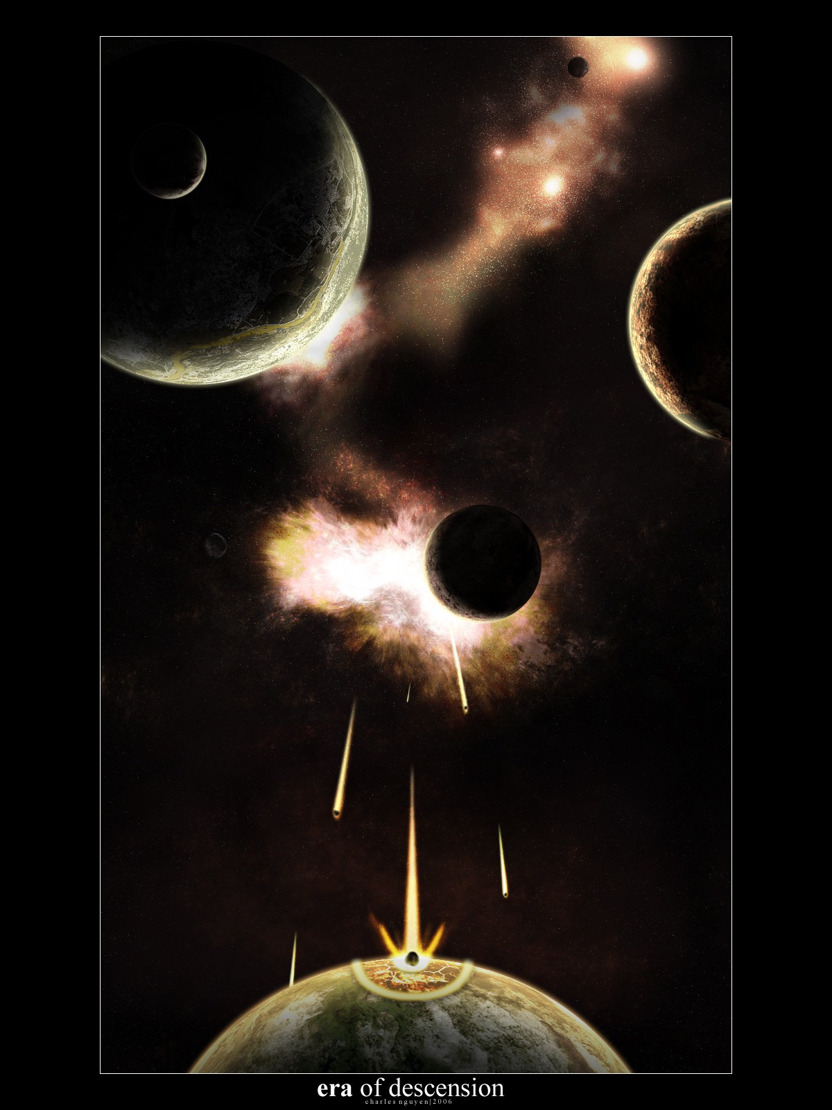
Somewhere in space, there was a very advanced race called "Travellers" that even reached the space.
In their system was only one planet and it had one moon. But the exploration of space brought also some negative things. They found even more advanced race than they are. They races made an nonaggression pact but our second race has turned traitor and almost defeated Traveller race on planet.
But what they didn't know about was the fact that Travellers also colonised their moon and then developed the moon shield ,superweapon and interstellar drive drawing energy from the core.
Then they rached homeworld of the traitor race and now they are using their superweapon to take vengeance on them.
The rest can you see on the image
 (Wink)")
Technical parameters:
 6000x4000 (without borders)
 about two weeks of workPSD file size reaching one gigabyte
") Photoshop CS4, Cinema 4D, Vue
Photoshop CS4, Cinema 4D, VueWallpaperpack available!
Standard
 1024x7681280x10241600x12002048x1536
Widescreen 16:10
1280x8001680x10501920x1200Widescreen 16:9 (Have special borders
)1366x7681920x1080 FullHDComments & Critiques & Faves are welcome
 (Smile)")
Related content


Comments: 44

Overall


Vision
Originality
Technique
Impact
First - I'm glad you removed that terrible 3D ship.
It's obvious this is probably the best piece you've done so far. Although - nothing is perfect. I'll get back to it later, first - the highlights.
This piece has that beautiful classic SA feeling (except it's not hand made). At first glance I wouldn't even recognize all the other 3D aspects. Original sci-fi idea only supports this classical mood when all the Space Art artists were not influenced by science and their imagination had no boundaries.
Color mood is laso one of the highlights - no big contrast, but calm, soft colors that don't distract from details.
There are just 2 things that concern me a bit - the first one you already know - it's that composition - not really wrong, but a bit messed up. Too much objects together on small space. Space needs to breathe.. ..it's vast and silent - your is just.. ..crowded. e.deviantart.net/emoticons/b/b… " width="15" height="15" alt="
")
The other problem is with the overal "plastic" feel when I look a bit closer. Not a really big deal, but I must mention it. Probably caused by that 3D machinery.
Anyway - a good piece in right time. That's the way to go!
👍: 0 ⏩: 0

sounds like the new game that's coming out called destiny by bungie....
👍: 0 ⏩: 0


I haven't been here for a long time, so I'm responding very late. Thank you very much
👍: 0 ⏩: 0

Am I not seeing this correctly? Am I blind? Cuss why did this pic won? i mean no offence dude congratz for winning and all but i don't find this that good :/ the lighting look very strange... it seems there is no prespective here... i find this a starter work. and not a work that should be the winner for the contest! i have seen other great works in this contest... but i don't find yours that whorty :/
👍: 0 ⏩: 1
It's also the opinion. I was also very surprised I won. Judges probably liked an idea or dunno. I know of the messed perspective etc. but I did this work in my 16
👍: 0 ⏩: 0


It's a classic story of hubris. It's probably more likely that the two species evolved from a similar original lifeform to account for their relative closeness of advancement. Really great work!
👍: 0 ⏩: 0


That'd be cool if we here on Earth had that! ...but then again, what the heck.
👍: 0 ⏩: 0

i donno what yur talkin' about, but i saw the heart down at the bottom of the pic where it merors idk how to spell word
and the idea is a good one
👍: 0 ⏩: 1
Probably know what do you think - the asteroid by the text and its reflection. You're right looks like heart but it wasn't planned and i noticed that once when you told it to me
👍: 0 ⏩: 1

reminds me of the Death Star
very nice picture, and congrats!
👍: 0 ⏩: 0


Congrats on winning the contest! It was truly well-earned. And yes, revenge is effing sweet!
👍: 0 ⏩: 0

Are You Serious This Was A gigabyte?!?!?!?!?!?!
👍: 0 ⏩: 0


wouldn't it cause allot of problems on their home planet to move their moon?
👍: 0 ⏩: 1
Yeah, they would probably lose their tidal waves and such
👍: 0 ⏩: 0

lovely entry, and many congratulations on the WIN
👍: 0 ⏩: 0


And all this time the race on theplanet didn't notice anything going on on their moon? 

👍: 0 ⏩: 1
This race just killed all the population on the planet of Travellers, nothing more. Their homeworld was on other place in galaxy, so they couldn't know what the Travellers are doing
Thank you for comment
👍: 0 ⏩: 0

HAHAHA back-stabbing motherfuckers got pwned. I like the structure of that superweapon on the moon.
👍: 0 ⏩: 1
Líbí - klasická tradiční sci-fi malba... ...akorát dělaná v PS a né na plátnu (i se všemi patřičnými neduhy).
Snad jen ta šílená 3D loď.
A ty 2 lodě... ...že sem s nima kdy vůbec začínal
👍: 0 ⏩: 1
Díky moc. Tu šílenou loď dám pryč, dneska ještě udělám edit. A díky za

👍: 0 ⏩: 0

strašný psycho
👍: 0 ⏩: 0

Very cool. Added to "Devious" Collection here [link]
👍: 0 ⏩: 0

Tyjo, to vůbec není š
")
Pěkný příběh
👍: 0 ⏩: 1
Díky. Abych pravdu řekl, ten výbuch se nelíbí ani mě, ale nevím prostě jak to udělat aby to vypadalo trochu reálně. "Červy" dám asi taky pryč, uvidíme co z toho ještě zítra vyleze
👍: 0 ⏩: 1
Nemáš zač
...
👍: 0 ⏩: 0

No nevim co k tomu napsat. Mám trochu smíšenej pocit. Určitě bych pochválil ná
Ale proboha proč je to tak přeplácaný. Vždyť tam neni kousek prázdnýho místa. Dokonce loď i přes meteority
Ale nelíbí se mi tam toho víc. Zaprvý nebuly jsou na tebe dost š
👍: 0 ⏩: 1
Zkusim s tim ještě do zítřka udělat co se dá. A s tou malou planetou máš pradvu - je placatá, ale to se dá jednoduše spravit. Loď dám pryč, původně sem chtěl udělat nejakou bitvu, ale to mi nedopřál můj největší nepřítel - čas, a tak sem chtěl toho modelu lodi prostě nějak využít. Protuberance na hvězdě(červy
P.S.: Můžu se jen zeptat co myslíš tím "Pak je divný jak vidět zkrz černý pruhy" nejak jsem to nepochopil k čemu se to vztahuje
👍: 0 ⏩: 1
Myslel jsem ty pruhy co jsou po stranách, nahoře a dole. Já je dělám ú
Ty nebuly nejsou š
Jinak napsal jsem to trochu tvrdě. Myslím, že technicky jsi na tom dobře, ale hrozně to přeplácáš a to je škoda. V tomhle díle je snad vše, co jde v SA udělat(lodě v dálce, jedna ve předu, planety paprsek, výbuch na planetě, slunce, meteority, osídlení na planetě
👍: 0 ⏩: 0