HOME | DD
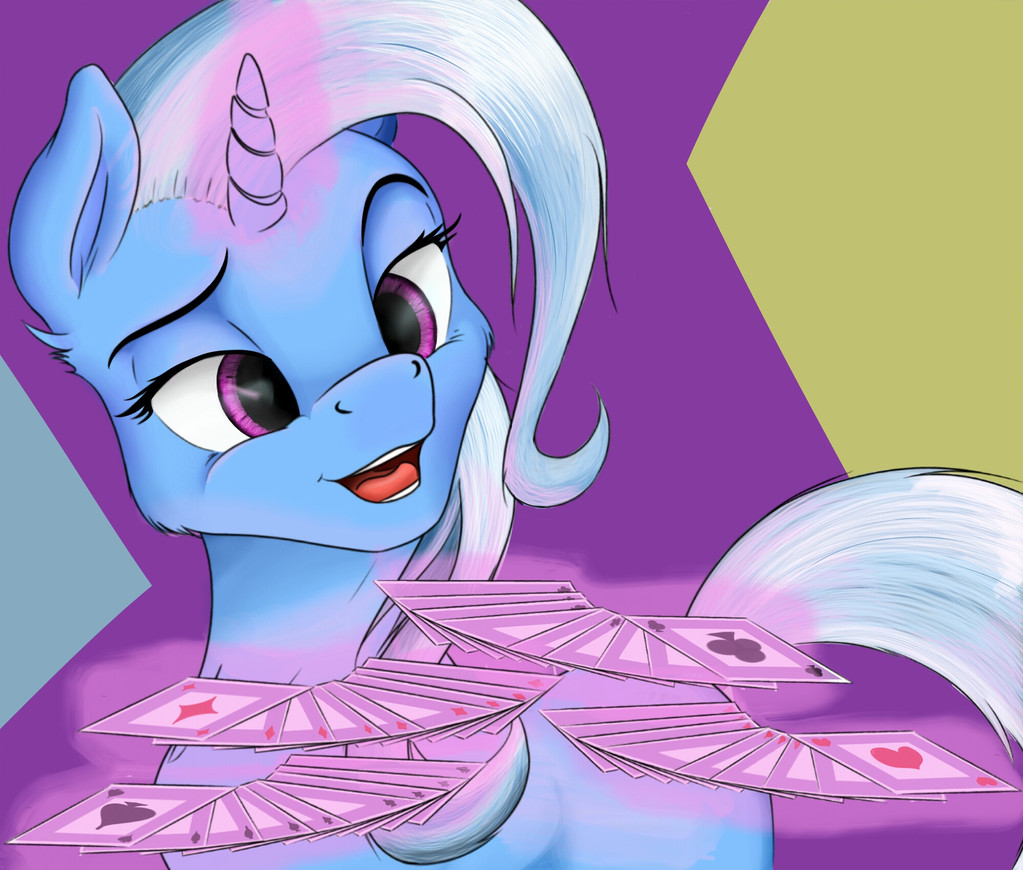
 Scrap-Lord — Pick a card, any cart !
#fan #blue #card #digitalart #digitalpainting #magic #tricks #mlpmylittlepony #friendshipismagic #trixielulamoon
Published: 2017-07-05 10:10:11 +0000 UTC; Views: 1192; Favourites: 46; Downloads: 42
Redirect to original
Description
Ain't Trixie just the best pony, we all know she is.Original sketch by
Colored with his permission.
You can also find me on.
Drawcrowd - drawcrowd.com/yakshida Tumblr - yakshidoodles.tumblr.com/ Twitter - twitter.com/Scrap_Lord
Related content


Comments: 4


Vision

This critique is a little harder since it is hard to separate where one artists ends and the other start.
So, starting for the most obvious difference; the colors. You did a very good job on coloring Trixie, you even did the glow of her magic aura which sometimes artists forget. However you did overlook some bits, mainly outside her facial area. In this position Trixie is almost sideways so her whole tail is reflecting the light from the cards and horn, you did it so but it is too dim.
The threads of her hair are reflecting light in two ways which I don't think work together. To the outside light, Trixie tail and hair are reflecting with a metallic texture( like in here: p.globalsources.com/IMAGES/PDT… ) while her magic light is opaque (much like in here: sc01.alicdn.com/kf/HTB1UNgUGVX… ), the opaque reflection is better used in her fur, where the individual threads are small enough so it looks more like a mass, this don't apply well to her hair and tail here.
Other than that, the technique is amazing, you adapted well the gray toned image to the colored version.
Your gallery is well diverse and this picture add to that portion of originality. Adding the cards were a very nice touch to the picture, since Trixie is looking at the viewer it draw the viewer attention more into the picture, as if she was interacting with him. This shows you can create very good and interesting scenes for your drawings. The background however was bad, the colors are too bright and draws much attention, this is bad because this picture works by focusing the attention into Trixie offering the cards, a background with less contrasting colors like at nigh or even a blurry would be a better choice.
👍: 0 ⏩: 1

Backgrounds man, backgrounds are a nightmare.
But other than that thank you for the critique.
I do see your point on 2 direrent llight sources, I'll keep that in mind next time.
👍: 0 ⏩: 0

Ye man, drawing those cards was a nightmare doe xD
Pulled my own deck as a reference and then ended up copy pasting the same thing 4 times anyway or i'd never finish.
👍: 0 ⏩: 0