HOME | DD
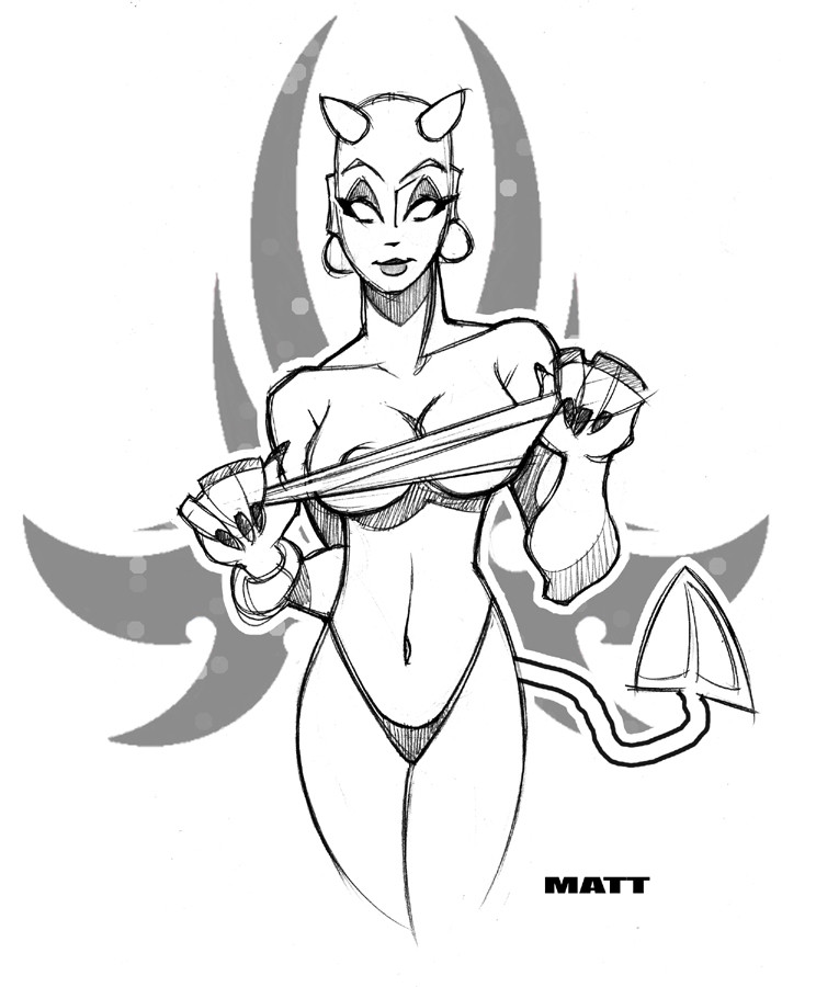
 scupbucket — Devilicious
Published: 2005-04-25 03:53:23 +0000 UTC; Views: 14389; Favourites: 200; Downloads: 482
Redirect to original
Description
Dammit... why do the B&W versions always look better?!?!?!Related content


Comments: 12

I agree too, well... for me its the sketch!
I never want to ink...too afraid to ruin stuff.
I love her pose.
👍: 0 ⏩: 0


I agree with 
👍: 0 ⏩: 0

nice emblem in the back. like the pose and the pic itself
👍: 0 ⏩: 0

I know what you mean...but who cares, if it's hot, it's hot! Great drawing...sexy.
👍: 0 ⏩: 0

dem some hot (no pun intended!) damn lines...nice shape, dig the smirk!
👍: 0 ⏩: 0


yes they do my friend... yes they do
 (Smile)")
👍: 0 ⏩: 0

I think its the bright red... it detracts. nice sketchy quality!
👍: 0 ⏩: 0

I wouldn't say it looks better.... I'd say it looks really sweet though.. but both are good for they're own reasons.
👍: 0 ⏩: 0

Good question! It looks awesome in any case, I love the curves of her hips!
👍: 0 ⏩: 0