HOME | DD
 ScytheDesigner — INHALING A REMIX

Published: 2005-03-31 23:04:25 +0000 UTC; Views: 3951; Favourites: 60; Downloads: 891
Redirect to original
Description
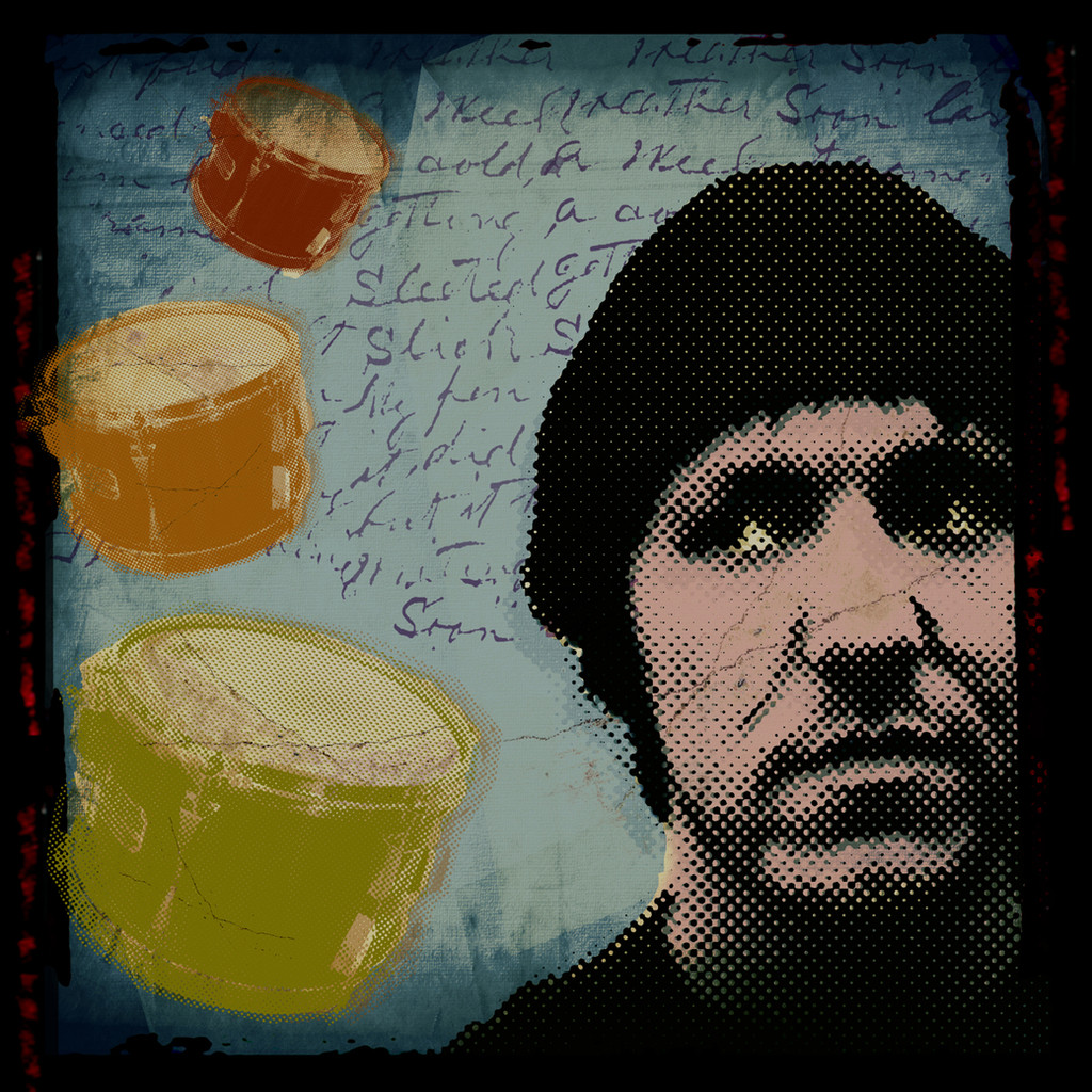
First off mad props to Fashion-Victim [link] for letting me remix her work [link] . Check her gallery out, she is quite the talented one....and she's a hotty. hahaHer original is quite tight. I just felt like doing something on the spur of the moment and I happend to be looking at her work during that time. She allowed me to go "ape shit" on it. So I guess you could call this my first collab.
Please let me know what you all think, things you would change, things you like and things of that nature. Critques are always welcome.
Tuneage: Listening to Radio 1's coverage of the WMCs in Florida. I couldn't ask for anything more inspirational.
Related content


Comments: 80

wow i love works like these... with subtle colours yet the details are still so obvious. beautiful!
👍: 0 ⏩: 0


glad you dig the additions
👍: 0 ⏩: 0

very delicate style. awsome colous... all very light and refreshing, good composition too.
👍: 0 ⏩: 0

thanks brotha, much appreciated, very glad you like it
👍: 0 ⏩: 0

??? is that a good or a bad thing
👍: 0 ⏩: 0

Many thanks brotha.
👍: 0 ⏩: 0

the image itself is wonderful (loving the soft colours) but the typo is pretty bad and really kills it for me. not every image needs to have the title plastered on it
👍: 0 ⏩: 1
I see what you are saying, and for the most part I don't put the title on my pieces, but being how I am only a remixer of this piece I felt that I should leave as much of the original as possible while giving it a little of my flavor. In this case it included the title. I agree that not every work needs a title on it.
👍: 0 ⏩: 0

Thats so hot.
I love those drips and abstract shapes that you used.
Great job.

👍: 0 ⏩: 1
Many thanks brotha, glad you dig it.
👍: 0 ⏩: 0

")
But else, I like it a lot
👍: 0 ⏩: 1


the choice of color in this is beautiful! *sniff sniff* I guess the choice of color credit goes to Fashion-Victim, but the remix by you is AWESOME too! 

👍: 0 ⏩: 1
Yeah, give the color choice credit to Fashion. I hope it gives it a sense of motion, thanks.
👍: 0 ⏩: 0

haha i thought you riped it, just from looking at the thumbnail, looks really cool man, nicely done remix
👍: 0 ⏩: 1
Haha, yeah I'm not about ripping. Thanks mate.
👍: 0 ⏩: 0


Lovely dude, awesome colours, only dont like the 'remix font' but its still a fav to me
👍: 0 ⏩: 1
Many thanks brotha, looks like I'm going to have to do something about the remix, lot of comments have dealt with that. Thanks for the input brotha.
👍: 0 ⏩: 0

nice color, a lil too light, but good concept overall
👍: 0 ⏩: 1
Yeah I wanted to keep a lot of her original work and I was found of her color choice which is why I kept it. Glad your found of the concept though. Thanks very much.
👍: 0 ⏩: 0


Nice enhancement of the original, you certainly kept a lot of the style of the piece but you did add the "something" that was missing
Good work, I just don't like the font / technique you used for the word remix...but maybe that's only me.
👍: 0 ⏩: 1
Many thanks for the input brotha.
👍: 0 ⏩: 0


Hey man, been a while since i've seen some more of your stuff been missing ya bro hehe, come to think of it i've done fuck all lately as have been uber busy at work... crazy shit ... anywayyyy like it man love your colour pallette, you really have an eye for that, I get a bit worried that my stuff is too samey colour wise, mostly bright and obvious hmm.. anywy nice one dude ")
👍: 0 ⏩: 1
Thanks, but your stuff being the same colour wise.... no way. Its fresh and appealing, not to mention your compositions are always solid. Been waiting for you to show up with something new.
👍: 0 ⏩: 1
Hi man, well thanks for the comments bud  (Wink)")
👍: 0 ⏩: 0

ouaaahhh.....I love pastel colors...very good composition and création....simple....a pleasure for eyes...
👍: 0 ⏩: 1
Many thanks brotha, glad you find it soothing to the eyes.
👍: 0 ⏩: 0


fuckin badass man. the curved frame u used makes the image all the more smooth and soothing. the muted colors work great, and the white streaks compliment the focal point perfectly. i would love to see different colors of this piece. awsome work bro, keep it up.
👍: 0 ⏩: 1
Many thanks brotha, appreciate it. Colors huh? Maybe I'll do that and let you know about it.
👍: 0 ⏩: 0

hello hello mistah
very nice done  (Smile)")
woah like that shape and tha textures
more more more mooooore
eve

👍: 0 ⏩: 1
eh u know.. nothing to thanks
👍: 0 ⏩: 0

Yay! Nice one bro! I just love those slick circles ^^
But colors are bad for me (just not my fav combo)
Great technique as usual

👍: 0 ⏩: 1
As always thanks for the support brotha.
👍: 0 ⏩: 0
| Next =>