HOME | DD
 sec — DG69_Gen

Published: 2004-03-15 14:02:34 +0000 UTC; Views: 6953; Favourites: 209; Downloads: 2191
Redirect to original
Description
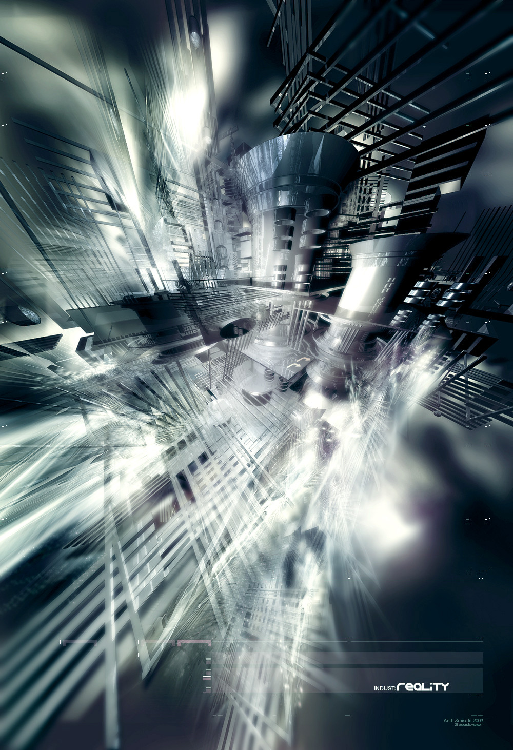
Experimenting with typo and some perspective differencies.hope u like it.
Related content


Comments: 96

kickass design. the typo looks like arial though. I'd switch the pitch up.
👍: 0 ⏩: 0

nice contrast, cool colour u used
very nicely done i think..
👍: 0 ⏩: 0

Yeah this is great too, nice again!
3 in one day... wow
👍: 0 ⏩: 0


Reminds me an indutrial poster. the render is good and the soft colors are very nice. you have a 
👍: 0 ⏩: 0

I dont see were you get time to do all this amazing work, but damn nice stuff. What can I say, umm everything fits and this piece rocks.
👍: 0 ⏩: 0

woooaaa I really like this style.. amazing.. sweet colors
👍: 0 ⏩: 0


Nice and technical, although the white could be removed and more red added? Really cool render and slick 2d though.
👍: 0 ⏩: 0

tis a glorious bastard. i'm speechless with speech.
👍: 0 ⏩: 0

i don't like the blurry side so much, but the rest is great! 
👍: 0 ⏩: 0


i like it alot. you made the extreamly caotic thing into a nice composition (not calm  (Smile)")
👍: 0 ⏩: 0

i really like this one.. but then again i like all of your pieces.. however I think this one is one of my favs.. very nice job.
👍: 0 ⏩: 0

Hieno kuva todellakin. Olen aina pitänyt 2d-työstäsi ja se on tässäkin todella nättiä.
👍: 0 ⏩: 0

Awesome man, my eyes can't even handle all the different perspectives you've used here. One of your best structural renders.
👍: 0 ⏩: 0


this is omfuckingtasting 
👍: 0 ⏩: 0

damn thats cool :]
looking real sweet a whole bud, everything seems to fit, typo is nice too
👍: 0 ⏩: 0


Hey thats great, I like the style, the typography is great and so it the hole thing
👍: 0 ⏩: 0

 (Wink)")

damn, that's what I call hell of a lot of detail ")
👍: 0 ⏩: 0

i like it very much the piece is unique enough and very detailed! great 
👍: 0 ⏩: 0


three words, amazing my friend!
amazing work on the render and the 2d
Keep it up!
👍: 0 ⏩: 1

bff, sorry i havent had time to reply any comments as im at army all the weeks, but thx for all of ur comments u have given, i highly appreciate it
👍: 0 ⏩: 1
no problem, we have developed soo fast since we made that collab.
👍: 0 ⏩: 0

thx. im glad u like it. and i also appreciate u have patiente to comment (all of) my work
👍: 0 ⏩: 1

i love it, it's awsome!!! nice colors too, nice with the green and red combination
👍: 0 ⏩: 0


Quality, nice piece. Tidy presentation with good use of colour, you've even made that default texture look good ;]
really tho, its sweet. +fav
Fa11.
👍: 0 ⏩: 0

mm i don't really see the perspective stuff....but this looks really technical and all
i really like the colours..contrast between red and green.
👍: 0 ⏩: 1
jau jau it was just one 3dsmax thingie i wanted to try :>
👍: 0 ⏩: 0

wow, this is awesome. good job on the 2d typos! I really like the blurring along the edges as well, keep it up!
👍: 0 ⏩: 0
wow, this is awesome. good job on the 2d typos! I really like the blurring along the edges as well, keep it up!
👍: 0 ⏩: 0

<= Prev |