HOME | DD
 secondseraph — The Nature of Expectations
Published: 2005-08-18 03:34:02 +0000 UTC; Views: 499; Favourites: 7; Downloads: 42
Redirect to original
Description
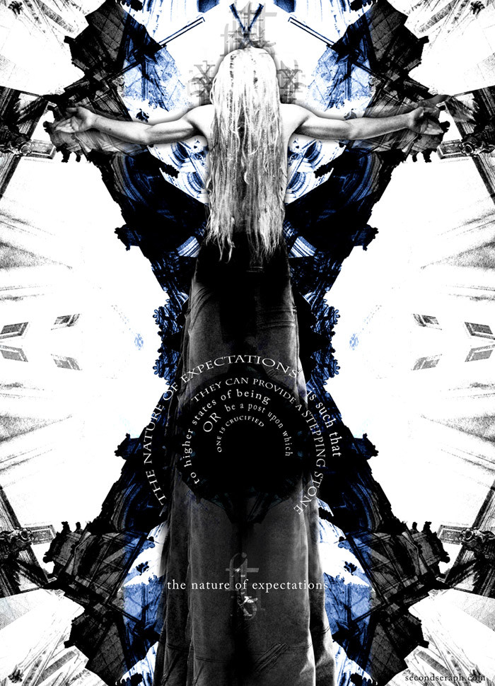
A mandatory summer project turned full-fledged art piece, this was prompted by a school assignment to "give your interpretation of the term 'expectations'".Any color medium was allowed so, naturally, I went digital. This, to date, is probably one of my best pieces.
First, the meaning (as I interpret it): the crux of what I'm trying to say is in the text. The visuals provide the symbology and drive the point home. The first thing I thought of when I heard "expectations" was duality. It's easy to pin expectations as an oppressive thing that others pin on you in order to fit a mold or to take upon a responsibility that you feel they have no right to order upon you.
However, expectations—depending on what they are and what their nature is—can be a guiding force, a tool, and a powerful lesson that better us and move us to "higher states of being", as I write in the piece. Hence, the double-edged sword: "The nature of expectations is such that they can be a stepping stone to higher states of being, or be a post upon which one is crucified."
Compositionally: after I had the meaning pinned, the crucifix idea came easily. I seem to have a recurring motif of religious symbolism when it comes to idealogical pieces, and The Nature of Expectations is no different—however, this is more about the posture itself rather than Jesus's crucifixion. I took a photo of myself standing on my desk after having showered, my hair still wet, and wearing my favorite pair of long, curtain-like raver jeans. I had to set the timer on the camera, of course, run on top of my desk, and take the picture.
The background is just the same photograph of a cathdral, looking upwards at an angle, duplicated and layer mode'd (I love Hard Light mode <3), then cut in half and flipped over. You get the idea—quite useful for transforming boring photography and making strange, repeating patterns. The rest was clone stamping my jeans so they looked like a denim clock tower, adding the text, making the colors fit (which ended up much simpler and intense than I expected), and cutting off/rotating my left arm so it was level with the other.
The style is somewhat like `precurser [link] and `deaddreamer [link] who both have amazing stuff and always inspire me. I wanted to go for endeffect/precurser's look a little bit more with the sharp contrast and jagged look, and because of that experimentation this piece is a real progression in style for me. I feel like it really brings me into my own now. Of course, we'll always have to see what the future brings…
 (Wink)")
Thanks for veiwing, I hope you enjoy…
-secondseraph
Related content


Comments: 7

I know it isn't, but I get such a feeling on someone on a motorcycle from the piece riding woth arms and legs spread out. It was my first impression and even after reading you description and seeing it full view I still feel that. Impressive.
👍: 0 ⏩: 0


::Applauds.:: ^^
👍: 0 ⏩: 1

you might like the "upclose of a mechanical device" one. I put on some Rammstein, took a really closeup picture of some nail clippers, and then drew them XD
they looked really cool. you can get creative and interesting even with the boring assignments. and when there's no way around it, i always use the music to keep me going.
don't know if that helps, but i hope it does.
👍: 0 ⏩: 1
Haha, alright. ^^ Thanks for the suggestion. I'll have to try that out. XD
👍: 0 ⏩: 0
